Not too long ago, the jQuery team released jQuery Mobile 1.2. This new release has some fantastic changes! In this article, we're going to review some of the new widgets available to developers, take a look at changes made to existing widgets, and glance over a few impactful enhancements that could affect your jQuery Mobile application. Let's get started, shall we?
Firstly, we'll need to download the bits and bytes. Head over to the jQuery Mobile download page and download the option that best meets your needs. Alternately you can just use the boilerplate code provided below.
Additionally, now might be a good time to quickly discuss the Download Builder that the jQuery Mobile team is building. It's still in Alpha, but it allows you to customize your download to include only the parts of jQuery Mobile that you require, and nothing more. You can exclude specific events, transitions, form elements, or widgets that you don't care about. It's meant for the developers who are ultra-concerned with grasping the highest level of performance out of his or her application.
A quick note, for the sake of brevity: all of the code samples below will use the following boilerplate HTML. The jQuery Mobile CSS and JS files (including jQuery) are hotlinked using the jQuery CDN for your convenience.

 You can also use 1.2's collapsible lists in popups. Here's a quick example:
 It's worth noting that data-inset="true" is required on the
 By default, popups center themselves over the object which triggered them. There's an optional attribute which you'll see in the next three examples. It's data-position-to="window" and you apply it to the element which triggers the popup. Try adding that to the Login button above to see what happens.
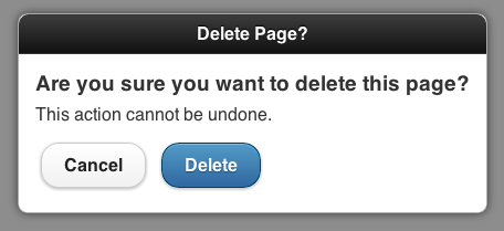 In the popup content container, note another new attribute for your use: data-overlay-theme="a". This attribute is what applies the shaded background to the dialog box. It's affected by your theme, so be careful when working with themes created with ThemeRoller.
 How did they do that? Within the context of a popup, the
You can get pretty fancy with popups including, but not limited to, displaying inline video and even interactive maps. Check the jQuery Mobile documentation for popups and iframes.
The tradeoff is that the jQuery Mobile team decided that it was time to sunset support for jQuery 1.6. This may be unfortunate for some folks out there who are still using older versions of jQuery, but it’s a fair trade.
 Into:
Into:
 Note that this does not manage sorting, grouping, or filtering. For that sort of functionality, consider trying my jQuery Mobile Tinysort plugin.
I hope that some of these improvements will help to improve your applications. Remember that the jQuery Mobile team is on your side! If you see something that you think would be valuable, ask for it: create an issue in their Github repository, and suggest it. Better yet, fork their repo and add some code yourself!
Source: http://net.tutsplus.com/

read more
Firstly, we'll need to download the bits and bytes. Head over to the jQuery Mobile download page and download the option that best meets your needs. Alternately you can just use the boilerplate code provided below.
Additionally, now might be a good time to quickly discuss the Download Builder that the jQuery Mobile team is building. It's still in Alpha, but it allows you to customize your download to include only the parts of jQuery Mobile that you require, and nothing more. You can exclude specific events, transitions, form elements, or widgets that you don't care about. It's meant for the developers who are ultra-concerned with grasping the highest level of performance out of his or her application.
Widgets
The beating heart of any jQuery Mobile application are its widgets. Arguably they're the most visible part of the page, and the part that allows users to interact with the page in such an easy manner. The jQuery Mobile team has spent countless hours testing, building, and refining their widgets to make sure that they're the best they can be. In version 1.2, the team has really knocked it out of the park with a widget that developers have been asking for since the framework was first released: popup modals.Popups
A popup modal is a small section of the page that overlays other parts of the page. They're most typically used as tooltips, or to display photos, maps, and additional content. This information is usually not important enough to warrant another page, but is still important to need displaying by itself. The way jQuery Mobile 1.2 has implemented popups is perfect. Let's learn how easy it is to add popups to a project.A quick note, for the sake of brevity: all of the code samples below will use the following boilerplate HTML. The jQuery Mobile CSS and JS files (including jQuery) are hotlinked using the jQuery CDN for your convenience.
<!DOCTYPE html>
<html>
<head>
    <meta name="viewport" content="width=device-width, initial-scale=1">
    <title>jQuery Mobile 1.2</title>
    <link rel="stylesheet"  href="http://code.jquery.com/mobile/1.2.0/jquery.mobile-1.2.0.min.css" />
    <script src="http://code.jquery.com/jquery-1.8.0.min.js"></script>
    <script src="http://code.jquery.com/mobile/1.2.0/jquery.mobile-1.2.0.min.js"></script>
</head>
<body>
    <div data-role="content">
        <!-- your content goes here -->
    </div>
</body>
</html>
Adding a popup to a page in your application is a two-step process. First you'll need some means of triggering the popup. This is generally a link, or button, or something the user interacts with. To trigger element, we add the following attribute:data-rel="popup"Second, you need the content to be displayed. This could range from a single
div to a menu, a form, or even photos. The content element gets its own attribute:data-role="popup"Finally, for simple link buttons, the
href attribute must correspond to the id of the content to be displayed. Let's review the complete implementation.<a href="#simplepopup" data-rel="popup">Open Popup</a>
<div data-role="popup" id="simplepopup">
<p>This is a completely basic popup, no options set.<p>
</div>
What you'll see on the page should look something similar to this:
Tooltips
Now that you know how to create a popup, let's look at other possibilities. One common use is a tooltip; help text or expanded text shown when a user clicks on a button. Set up the code the same as before:<a href="#tooltip" data-rel="popup" data-role="button">Find out more</a>
<div data-role="popup" id="tooltip" data-theme="e">
<p>You found out more!.</p>
</div>
This time, we're styling the resulting content using the e swatch from jQuery Mobile to give it a more pleasant appearance. This helps us remember that popups are first class jQuery Mobile citizens, and can be treated just like anything else on the page.Menus
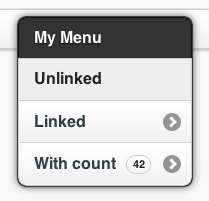
Let's move on to something a bit more complicated: a menu. That's a popular approach to page navigation. Give the user the a menu right at their fingertips. So what does that look like with popups?<a href="#menu" data-rel="popup" data-role="button">Menu</a>
<div data-role="popup" id="menu" data-theme="a">
<ul data-role="listview" data-theme="c" data-inset="true">
<li data-role="divider" data-theme="a">My Menu</li>
<li>Unlinked</li>
<li><a href="methods.html">Linked</a></li>
<li><a href="methods.html">With count</a><span class="ui-li-count">42</span></a></li>
</ul>
</div>
And the resulting output should resemble this:
<a href="#nestedmenu" data-rel="popup" data-role="button">Nested Menu</a>
<div data-role="popup" id="nestedmenu" data-theme="none">
    <div data-role="collapsible-set" data-theme="b" data-content-theme="c" data-collapsed-icon="arrow-r" data-expanded-icon="arrow-d" style="margin:0; width:250px;">
        <div data-role="collapsible" data-inset="false">
            <h2>Colors</h2>
            <ul data-role="listview">
                <li><a href="#">Red</a></li>
                <li><a href="#">Blue</a></li>
            </ul>
        </div>
        <div data-role="collapsible" data-inset="false">
            <h2>Shapes</h2>
            <ul data-role="listview">
                <li><a href="#">Circle</a></li>
                <li><a href="#">Square</a></li>
            </ul>
        </div>
    </div>
</div>
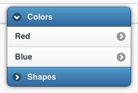
And the results:
listview or the corners of your list will show up. Try and you'll see.Forms
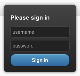
Another popular UX approach is to show a login form hovering over the top of a page. That's now possible with jQuery Mobile popups. Here's a simple username/password form.<a href="#login" data-rel="popup" data-position-to="window" data-role="button">Login</a>
<div data-role="popup" id="login" data-theme="a">
<form style="padding:10px 20px;">
<h3>Please sign in</h3>
<label for="un" class="ui-hidden-accessible">Username:</label>
<input type="js" name="user" id="un" placeholder="username" />
<label for="pw" class="ui-hidden-accessible">Password:</label>
<input type="password" name="pass" id="pw" placeholder="password" />
<button type="submit" data-theme="b">Sign in</button>
</form>
</div>
Which gives you:
Dialogs
A common need for web applications is the ability to interact with the user. We just reviewed one approach: a login form. But, sometimes, you need to prompt the user with questions. A dialog is a perfect solution for this; and what do you know, popups have you covered! So what does that code look like? Here's a simple example:<a href="#dialog" data-rel="popup" data-position-to="window" data-role="button" data-transition="pop">Dialog</a>
<div data-role="popup" id="dialog" data-overlay-theme="a" data-theme="c">
<div data-role="header" data-theme="a">
<h1>Delete Page?</h1>
</div>
<div data-role="content" data-theme="d">
<h3>Are you sure you want to delete this page?</h3>
<p>This action cannot be undone.</p>
<a href="#" data-role="button" data-inline="true" data-rel="back" data-theme="c">No</a>
<a href="#" data-role="button" data-inline="true" data-rel="back" data-theme="b">Yes, Delete it</a>
</div>
</div>

Photos
I can't count the number of times I've seen jQuery Mobile developers ask for some better way of handling image galleries. While popups aren't the perfect solution for large numbers of images, they're great for a handful of images that need to be viewed larger. Even better, it’s incredibly easy; check it out:<a href="#photo" data-rel="popup" data-position-to="window" data-role="button" data-transition="fade">Photo</a>
<div data-role="popup" id="photo" data-overlay-theme="a" data-theme="d" data-corners="false">
<a href="#" data-rel="back" data-role="button" data-theme="a" data-icon="delete" data-iconpos="nojs" class="ui-btn-right">Close</a><img src="http://lorempixel.com/450/300/food/" />
</div>
The above code gives you an elegant photo centered to the window, including a close window button.
anchor tag has attributes which behave slightly different than when used in other locations on the page. Specifically, the ui-btn-right class positions the image in the corner of the image rather than the side, while the data-icon and data-iconpos attributes allow you to style the button just as you would a regular button.You can get pretty fancy with popups including, but not limited to, displaying inline video and even interactive maps. Check the jQuery Mobile documentation for popups and iframes.
Collapsible List Views
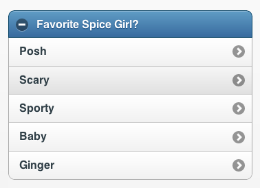
Another great new feature is the ability to combine collapsible sets with list views. Call 'em “Collapsible List Views” and you've got a brand new widget in jQuery Mobile 1.2. How do they work? I'm glad you asked. Simply create any list you like, then wrap it in a collapsible set. Collapsible List Views also support multiple lists – so get crazy!<div data-role="collapsible" data-theme="b" data-content-theme="c">
<h2>Favorite Spice Girl?</h2>
<ul data-role="listview">
<li><a href="index.html">Posh</a></li>
<li><a href="index.html">Scary</a></li>
<li><a href="index.html">Sporty</a></li>
<li><a href="index.html">Baby</a></li>
<li><a href="index.html">Ginger</a></li>
</ul>
</div>
The code above would result in this Collapsible List View:
Enhancements
In addition to new widget types, jQuery Mobile 1.2 provides a number of useful enhancements to existing functionality. Let's take a look at some of the more valuable ones.jQuery Support Changes
One of the biggest enhancements made in version 1.2 is the added support for jQuery 1.8. This brings some significant performance increases in the form of a completely rewritten Sizzle.js (the selector engine for jQuery), along with numerous other improvements.The tradeoff is that the jQuery Mobile team decided that it was time to sunset support for jQuery 1.6. This may be unfortunate for some folks out there who are still using older versions of jQuery, but it’s a fair trade.
List View Autodividers
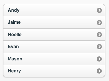
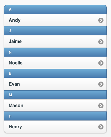
If you've ever had to manage a list of constantly changing people, places, or things in jQuery Mobile then, you've probably had to write some tricky code to display dynamic listview headers. Bummer that you spent all that time, because the jQuery Mobile team made it as easy as dropping in a single attribute.data-autodividers="true"That turns this list:


Read-Only Lists
jQuery Mobile offers "read-only" list views, but it was difficult to tell that they weren't clickable. Version 1.2 removes the list gradient, making the row a flat color. This should provide a better visual cue to your users.Better Width adjustments on Form Elements
Version 1.2 fixes a semi-annoying issue with form elements, whereby they wouldn't take up the full width of their parent element in some cases.Additional Devices Added
You might have noticed that new devices are being added almost on a daily basis. The jQuery Mobile team does their best to test against as many of these devices as possible. Newly added to the A grade platform list are the following devices/operating systems/browsers: iOS 6, Android 4.1 (Jellybean), Tizen, Firefox for Android, and Kindle Fire HD.Full List of Changes
You can find a complete list of the changes made for version 1.2 on the jQuery Mobile blog.I hope that some of these improvements will help to improve your applications. Remember that the jQuery Mobile team is on your side! If you see something that you think would be valuable, ask for it: create an issue in their Github repository, and suggest it. Better yet, fork their repo and add some code yourself!
Source: http://net.tutsplus.com/


 Posted in:


