


Guide to Website Navigation Design Patterns: "
In web design, there are certain common design patterns that are used for interaction. Site navigation has a wide variety of common and familiar design patterns that can be used as a foundation for building effective information architecture for a website.
This guide covers popular site navigation design patterns. For each site navigation design pattern, we will discuss its common characteristics, its drawbacks, and when best to use it.
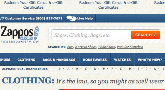
Top horizontal bar navigation is one of the two most popular kinds of site navigation menu design patterns out there. It’s used most frequently as the primary site navigation menu, and is most commonly located either directly above or directly below the site header of all web pages in a site.
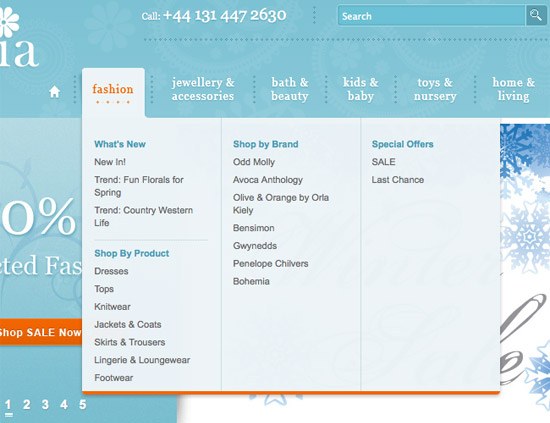
The top horizontal bar navigation design pattern is sometimes paired with drop-down menus whereby hovering on a navigation item reveals second-level child navigation items.
The biggest drawback to top horizontal navigation is that it limits the number of links you can include without resorting to sub-navigation. For sites with only a few pages or categories, this isn’t a hindrance, but for sites with complex information architecture and many sections, this is not an ideal primary navigation menu option without the help of sub-navigation.
Top horizontal bar navigation is perfect for sites that only need to display 5-12 navigation items in the main navigation. It is also the only option for primary navigation for single-column website layouts (aside from footer navigation, which is generally used as a secondary navigation system). When combined with dropdown sub-navigation, the top horizontal bar navigation design pattern can hold more links.
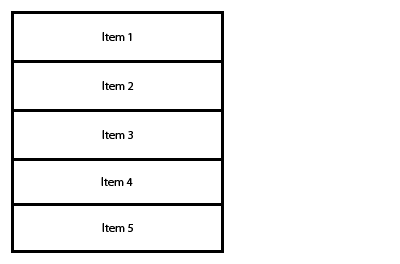
Vertical bar/sidebar navigation is when navigation items are arranged in a single column, one on top of another. It’s often found on the top-left column, preceding the main content area — according to a usability study on navigation patterns on left-to-right readers, vertical navigation bars on the left performs better than vertical navigation bars on the right.
The vertical bar/sidebar navigation design pattern is seen all over the place, on virtually every kind of website. Part of that is because vertical navigation is one of the most versatile patterns out there, able to accommodate a long list of links.
It can be used alongside sub-navigation menus, or on its own. It’s easily used for primary site navigation that contains a lot of links. Vertical bar/sidebar navigation can be integrated into almost any kind of multi-column design layout.
Vertical menus, because of their ability to handle many links, can sometimes get overwhelming to users when they are too lengthy. Try to limit the number of links you include, and instead, use fly-out sub-navigation menus for sites with more content. Also, consider dividing the links into intuitive categories to help users find links of interest quicker.
Vertical navigation is suitable for almost any kind of site, but especially sites that have more than a handful of main navigation links.
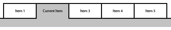
Tabs navigation can be styled virtually any way you want, from realistic, textured tabs that look straight out of a notebook to glossy, rounded tabs and simple, squared-edge tabs. They’re seen on virtually every kind of site, and can be incorporated into almost any visual style.
Tabs have one distinct advantage over other types of navigation: they have a positive psychological effect on visitors. People associate tabs with navigation, because people are used to seeing tabs in notebooks or binders, and associate it with turning to a new section. This real-world metaphor makes tabs navigation intuitive.
The biggest drawback to tabs is that they’re more work to design than simple top horizontal bars; they generally require more markup, image assets, and CSS depending on the visual complexity of the tabs.
The other drawback to tabs is that they don’t work well for navigation with a lot of links, unless they’re arranged vertically (and even then, they can look awkward if there are too many).
Tabs are appropriate for virtually any main navigation, though they are limited in the number of links they can display, especially when used horizontally. Using them for main navigation with a different style of sub-navigation for larger sites is a good option.
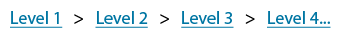
Breadcrumbs, which get their name from the Hansel and Gretel fairy tale of leaving breadcrumbs along the journey so they could find their way back home, show you where you are on a website. They are a form of secondary navigation, helping support the site’s primary navigation system.

Breadcrumbs are useful in sites with multiple levels of web page hierarchy. They help orient visitors as to where they are relative to the entire site. If a visitor wants to go back a level, they can just click on the appropriate breadcrumb navigation item.
Breadcrumbs don’t work well on sites with shallow navigation. They can also be confusing when a site doesn’t have clearly compartmentalized and categorized content.
Breadcrumbs are best suited to sites that have clearly defined sections and multiple levels of content categorization. Without distinct sections, breadcrumbs can do more to confuse visitors than to help them.
Tags are commonly used on blogs and news sites. They’re often organized into a tag cloud, which may arrange the navigation items alphabetically (often with different-sized links to indicate how much content is filed under a particular tag), or in order of popularity.
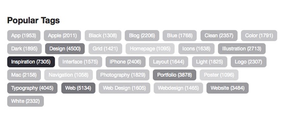
Tags are excellent secondary navigation and are rarely seen as primary navigation. They can aid in findability and site exploration. Tag clouds usually appear on either a sidebar or footer.
If a tag cloud isn’t present, then tags are often included in the meta information at the top or bottom of a post; this format makes it easy for users to find similar content.
Tags are strongly associated with blogs and news sites (and, to a lesser extent, e-commerce sites), so if your site is of a different nature, it might not be useful to you. Tags also require a certain amount of work on the part of your content creators, as each post needs to be accurately tagged in order for the system to be effective.
Tagging content with keywords is good if you cover plenty of topics; if you only have a few pages (perhaps your website is a company site), then tagging content may not be needed. Whether you decide to also incorporate a tag cloud or just include tags in meta information will depend on your design.
Site search has become a popular navigation method in recent years. It’s well-suited for sites with tons of content (like Wikipedia), which are difficult to navigate otherwise. Search is also seen commonly on blogs and news sites, as well as e-commerce sites.
Search is useful to visitors who know exactly what they’re looking for. But including a search option isn’t an excuse to ignore good information architecture. It’s still important to make sure that your content is findable for visitors who might not know exactly what they’re looking for or are browsing to discover potentially interesting content.
One of the biggest drawbacks to search is that not all search engines are created equal. Depending on what solution you have chosen, your site’s search feature may not produce accurate results or may be missing things such as post meta data. Search navigation, for a majority of the sites, should be a secondary form of navigation. Search is the fallback option the user will choose when they cannot navigate to what they’re looking for.
For sites with tons of pages and complex information architecture, you certainly need to include a search feature. Without it, users are likely to get frustrated having to wade through links and multiple levels of navigation to get to the specific information they want.
E-commerce sites are another area where search is important, though it’s vital that search results on e-commerce sites are filterable and sortable depending on the size of the site’s inventory.
Fly-out menus (used with vertical bar/sidebar navigation) and drop-down menus (typically used on top horizontal bar navigation) are great for robust navigation systems. They keep the overall look of your site uncluttered, but also make deeper sections easily accessible.
They’re generally used in conjunction with horizontal, vertical navigation, or tabs as part of the site’s primary navigation system.
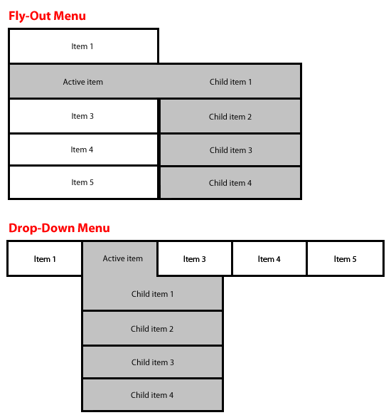
Unless you put some indication (often an arrow icon) next to your main navigation links, visitors might not realize there’s a drop-down or fly-out menu with sub-navigation items. It’s important to make this obvious. Also, drop-downs and fly-outs can make navigation on mobile devices very difficult, so be sure your mobile stylesheets takes into account this situation.
If you want to visually hide a large or complex navigation hierarchy, drop-downs and fly-outs are a great option as they let the user decide what they want to see, and when they want to see them. They can be used to display a large number of links on demand without cluttering up the web page. They’re also excellent for displaying child pages and local navigation without requiring visitors to click through to a new page first.
Faceted/guided navigation (also called faceted search or guided search) is most commonly seen on e-commerce sites. Basically, guided navigation presents you with additional filters of content attributes. Say you’re browsing for a new LCD monitor, the guided navigation options might list things like size, price, brand, and so on. Based on these content attributes, you are able to navigate to items that match your criteria.
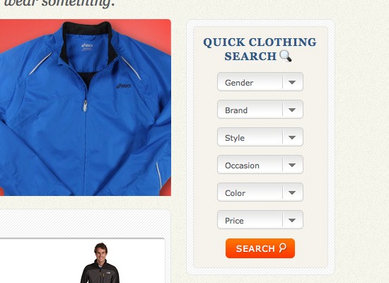
Guided navigation is invaluable on large e-commerce sites with a huge and varied inventory. Straight search options often make it difficult for a user to find what they want, and increase the likelihood that they might miss a product. For example, they might search for a product in "taupe" when you’ve got it marked as "tan" or "beige", even though it’s exactly what they were looking for.
Guided navigation can be confusing for some users. In addition, there’s no guarantee that the user will be looking for one of your pre-defined categories.
Faceted navigation is very useful on large e-commerce sites. It makes it easier for users to tailor their shopping experience, and to find exactly what they’re looking for. It can also be useful on other directory-style sites.
Footer navigation is mostly used as secondary navigation, and may contain links that don’t fit within the main navigation, or include a simplified site map of links.
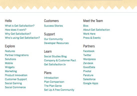
Visitors who can’t find what they’re looking for in the primary navigation menu often look at footer navigation afterwards.
If your pages are long, no one’s going to want to scroll to the bottom to get to your footer just to navigate your site. With longer pages, footer navigation is best left to repeating links and serving as a condensed site map. It should not be relied upon as a primary form of navigation.
Most sites have some kind of footer navigation, even if it’s just repeating navigation that’s elsewhere. Consider what would be useful to have there, and what your visitors will most likely be looking for.
Most websites use more than one navigation design pattern. For example, a website might have a horizontal top bar as a primary navigation system, with a vertical bar/sidebar navigation system to support it, along with footer navigation for redundancy, convenience, and auxiliary pages.
When selecting which navigation design patterns to base your navigation system on, you must choose ones that support the information structure and nature of your website. Navigation is an important part of a website’s design, and having a solid foundational design is imperative to its effectiveness.
 Cameron Chapman is a professional web and graphic designer with over 6 years of experience in the industry. She’s also written for numerous blogs such as Smashing Magazine and Mashable. You can find her personal web presence at Cameron Chapman On Writing. If you’d like to connect with her, check her out on Twitter.
 "
"
read more
In web design, there are certain common design patterns that are used for interaction. Site navigation has a wide variety of common and familiar design patterns that can be used as a foundation for building effective information architecture for a website.
This guide covers popular site navigation design patterns. For each site navigation design pattern, we will discuss its common characteristics, its drawbacks, and when best to use it.
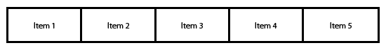
Top Horizontal Bar Navigation
Top horizontal bar navigation is one of the two most popular kinds of site navigation menu design patterns out there. It’s used most frequently as the primary site navigation menu, and is most commonly located either directly above or directly below the site header of all web pages in a site.
The top horizontal bar navigation design pattern is sometimes paired with drop-down menus whereby hovering on a navigation item reveals second-level child navigation items.
Common Characteristics of Top Horizontal Bar Navigation
- Navigation items are text links, button-shaped, or tabbed-shaped
- Horizontal navigation is often placed directly adjacent to the site’s logo
- It is often located above the fold
Drawbacks of Top Horizontal Bar Navigation
The biggest drawback to top horizontal navigation is that it limits the number of links you can include without resorting to sub-navigation. For sites with only a few pages or categories, this isn’t a hindrance, but for sites with complex information architecture and many sections, this is not an ideal primary navigation menu option without the help of sub-navigation.
When to Use Top Horizontal Bar Navigation
Top horizontal bar navigation is perfect for sites that only need to display 5-12 navigation items in the main navigation. It is also the only option for primary navigation for single-column website layouts (aside from footer navigation, which is generally used as a secondary navigation system). When combined with dropdown sub-navigation, the top horizontal bar navigation design pattern can hold more links.
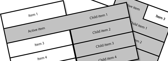
Vertical Bar/Sidebar Navigation
Vertical bar/sidebar navigation is when navigation items are arranged in a single column, one on top of another. It’s often found on the top-left column, preceding the main content area — according to a usability study on navigation patterns on left-to-right readers, vertical navigation bars on the left performs better than vertical navigation bars on the right.
The vertical bar/sidebar navigation design pattern is seen all over the place, on virtually every kind of website. Part of that is because vertical navigation is one of the most versatile patterns out there, able to accommodate a long list of links.
It can be used alongside sub-navigation menus, or on its own. It’s easily used for primary site navigation that contains a lot of links. Vertical bar/sidebar navigation can be integrated into almost any kind of multi-column design layout.
Common Characteristics of Vertical Bar/Sidebar Navigation
- Text links for navigation items are very common (with and without icons)
- Tabs are rarely used (except for the stacked tabs navigation pattern)
- Vertical navigation menus usually have plenty of links
Drawbacks of Vertical Bar/Sidebar Navigation
Vertical menus, because of their ability to handle many links, can sometimes get overwhelming to users when they are too lengthy. Try to limit the number of links you include, and instead, use fly-out sub-navigation menus for sites with more content. Also, consider dividing the links into intuitive categories to help users find links of interest quicker.
When to Use Vertical Bar/Sidebar Navigation
Vertical navigation is suitable for almost any kind of site, but especially sites that have more than a handful of main navigation links.
Tabs Navigation
Tabs navigation can be styled virtually any way you want, from realistic, textured tabs that look straight out of a notebook to glossy, rounded tabs and simple, squared-edge tabs. They’re seen on virtually every kind of site, and can be incorporated into almost any visual style.
Tabs have one distinct advantage over other types of navigation: they have a positive psychological effect on visitors. People associate tabs with navigation, because people are used to seeing tabs in notebooks or binders, and associate it with turning to a new section. This real-world metaphor makes tabs navigation intuitive.
Common Characteristics of Tabs Navigation
- Generally resemble and function like real-world tabs (as seen in filing systems with folders, notebooks, binders, etc.)
- Usually horizontally-oriented but occasionally vertical (stacked tabs)
Drawbacks of Tabs Navigation
The biggest drawback to tabs is that they’re more work to design than simple top horizontal bars; they generally require more markup, image assets, and CSS depending on the visual complexity of the tabs.
The other drawback to tabs is that they don’t work well for navigation with a lot of links, unless they’re arranged vertically (and even then, they can look awkward if there are too many).
When to Use Tabs Navigation
Tabs are appropriate for virtually any main navigation, though they are limited in the number of links they can display, especially when used horizontally. Using them for main navigation with a different style of sub-navigation for larger sites is a good option.
Breadcrumb Navigation
Breadcrumbs, which get their name from the Hansel and Gretel fairy tale of leaving breadcrumbs along the journey so they could find their way back home, show you where you are on a website. They are a form of secondary navigation, helping support the site’s primary navigation system.
Breadcrumbs are useful in sites with multiple levels of web page hierarchy. They help orient visitors as to where they are relative to the entire site. If a visitor wants to go back a level, they can just click on the appropriate breadcrumb navigation item.
Common Characteristics of Breadcrumb Navigation
- Usually formatted as a horizontal list of text links, often with left-pointing arrows between them to denote hierarchy
- Never used for primary navigation
Drawbacks of Breadcrumb Navigation
Breadcrumbs don’t work well on sites with shallow navigation. They can also be confusing when a site doesn’t have clearly compartmentalized and categorized content.
When to Use Breadcrumb Navigation
Breadcrumbs are best suited to sites that have clearly defined sections and multiple levels of content categorization. Without distinct sections, breadcrumbs can do more to confuse visitors than to help them.
Tags Navigation
Tags are commonly used on blogs and news sites. They’re often organized into a tag cloud, which may arrange the navigation items alphabetically (often with different-sized links to indicate how much content is filed under a particular tag), or in order of popularity.
Tags are excellent secondary navigation and are rarely seen as primary navigation. They can aid in findability and site exploration. Tag clouds usually appear on either a sidebar or footer.
If a tag cloud isn’t present, then tags are often included in the meta information at the top or bottom of a post; this format makes it easy for users to find similar content.
Common Characteristics of Tags Navigation
- Tags are a common feature content-centered sites (blogs and news sites)
- Only text links
- Links are often of varying sizes when arranged in a tag cloud to denote popularity
- Often included in a post’s meta information
Drawbacks of Tags Navigation
Tags are strongly associated with blogs and news sites (and, to a lesser extent, e-commerce sites), so if your site is of a different nature, it might not be useful to you. Tags also require a certain amount of work on the part of your content creators, as each post needs to be accurately tagged in order for the system to be effective.
When to Use Tags Navigation
Tagging content with keywords is good if you cover plenty of topics; if you only have a few pages (perhaps your website is a company site), then tagging content may not be needed. Whether you decide to also incorporate a tag cloud or just include tags in meta information will depend on your design.
Search Navigation
Site search has become a popular navigation method in recent years. It’s well-suited for sites with tons of content (like Wikipedia), which are difficult to navigate otherwise. Search is also seen commonly on blogs and news sites, as well as e-commerce sites.
Search is useful to visitors who know exactly what they’re looking for. But including a search option isn’t an excuse to ignore good information architecture. It’s still important to make sure that your content is findable for visitors who might not know exactly what they’re looking for or are browsing to discover potentially interesting content.
Common Characteristics of Search Navigation
- Search bars are usually located in the header or near the top of a sidebar
- Search bars are often repeated on auxiliary sections of a page layout, such as the footer
Drawbacks of Search Navigation
One of the biggest drawbacks to search is that not all search engines are created equal. Depending on what solution you have chosen, your site’s search feature may not produce accurate results or may be missing things such as post meta data. Search navigation, for a majority of the sites, should be a secondary form of navigation. Search is the fallback option the user will choose when they cannot navigate to what they’re looking for.
When to Use Search Navigation
For sites with tons of pages and complex information architecture, you certainly need to include a search feature. Without it, users are likely to get frustrated having to wade through links and multiple levels of navigation to get to the specific information they want.
E-commerce sites are another area where search is important, though it’s vital that search results on e-commerce sites are filterable and sortable depending on the size of the site’s inventory.
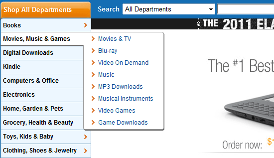
Fly-Out Menu and Drop-Down Menu Navigation
Fly-out menus (used with vertical bar/sidebar navigation) and drop-down menus (typically used on top horizontal bar navigation) are great for robust navigation systems. They keep the overall look of your site uncluttered, but also make deeper sections easily accessible.
They’re generally used in conjunction with horizontal, vertical navigation, or tabs as part of the site’s primary navigation system.
Common Characteristics Fly-Out Menu and Drop-Down Menu Navigation
- Used for multi-level information architecture
- Uses JavaScript and/or CSS for hiding and showing the menus
- Links displayed in the menus are child items of the primary item
- Menus are most often activated by mouse hover, but sometimes also mouse click
Drawbacks of Fly-Out Menu and Drop-Down Menu Navigation
Unless you put some indication (often an arrow icon) next to your main navigation links, visitors might not realize there’s a drop-down or fly-out menu with sub-navigation items. It’s important to make this obvious. Also, drop-downs and fly-outs can make navigation on mobile devices very difficult, so be sure your mobile stylesheets takes into account this situation.
When to Use Fly-Out Menu and Drop-Down Menu Navigation
If you want to visually hide a large or complex navigation hierarchy, drop-downs and fly-outs are a great option as they let the user decide what they want to see, and when they want to see them. They can be used to display a large number of links on demand without cluttering up the web page. They’re also excellent for displaying child pages and local navigation without requiring visitors to click through to a new page first.
Faceted/Guided Navigation
Faceted/guided navigation (also called faceted search or guided search) is most commonly seen on e-commerce sites. Basically, guided navigation presents you with additional filters of content attributes. Say you’re browsing for a new LCD monitor, the guided navigation options might list things like size, price, brand, and so on. Based on these content attributes, you are able to navigate to items that match your criteria.
Guided navigation is invaluable on large e-commerce sites with a huge and varied inventory. Straight search options often make it difficult for a user to find what they want, and increase the likelihood that they might miss a product. For example, they might search for a product in "taupe" when you’ve got it marked as "tan" or "beige", even though it’s exactly what they were looking for.
Common Characteristics of Faceted/Guided Navigation
- Mostly seen on e-commerce sites
- Usually let users filter multiple times for different characteristics
- Almost always uses text links, broken down by category or in drop-down menus
- Often paired with breadcrumb navigation
Drawbacks of Faceted/Guided Navigation
Guided navigation can be confusing for some users. In addition, there’s no guarantee that the user will be looking for one of your pre-defined categories.
When to Use Faceted/Guided Navigation
Faceted navigation is very useful on large e-commerce sites. It makes it easier for users to tailor their shopping experience, and to find exactly what they’re looking for. It can also be useful on other directory-style sites.
Footer Navigation
Footer navigation is mostly used as secondary navigation, and may contain links that don’t fit within the main navigation, or include a simplified site map of links.
Visitors who can’t find what they’re looking for in the primary navigation menu often look at footer navigation afterwards.
Common Characteristics of Footer Navigation
- Footer navigation is often used as a catch-all for navigation items that don’t fit elsewhere
- Usually uses text links, occasionally with icons
- Often used for links to pages that aren’t mission-critical
Drawbacks of Footer Navigation
If your pages are long, no one’s going to want to scroll to the bottom to get to your footer just to navigate your site. With longer pages, footer navigation is best left to repeating links and serving as a condensed site map. It should not be relied upon as a primary form of navigation.
When to Use Footer Navigation
Most sites have some kind of footer navigation, even if it’s just repeating navigation that’s elsewhere. Consider what would be useful to have there, and what your visitors will most likely be looking for.
Conclusion
Most websites use more than one navigation design pattern. For example, a website might have a horizontal top bar as a primary navigation system, with a vertical bar/sidebar navigation system to support it, along with footer navigation for redundancy, convenience, and auxiliary pages.
When selecting which navigation design patterns to base your navigation system on, you must choose ones that support the information structure and nature of your website. Navigation is an important part of a website’s design, and having a solid foundational design is imperative to its effectiveness.
Related Content
- 50 Examples of Drop-Down Navigation Menus in Web Designs
- 20 Excellent JavaScript Navigation Techniques and Examples
- 50 Stylish Navigation Menus for Design Inspiration
- Related categories: User Interface and Web Design
About the Author
Cameron Chapman is a professional web and graphic designer with over 6 years of experience in the industry. She’s also written for numerous blogs such as Smashing Magazine and Mashable. You can find her personal web presence at Cameron Chapman On Writing. If you’d like to connect with her, check her out on Twitter. Posted in:

 Brad Shorr is Director of Content Marketing for
 Raphael Caixeta is a PHP and iOS developer and co-founder of


