• Feed RSS

How to Build a Kick-Butt CSS3 Mega Drop-Down Menu

How to Build a Kick-Butt CSS3 Mega Drop-Down Menu: "
Often used on e-commerce or large scale websites, mega menus are becoming more and more popular, as they offer an effective solution to displaying a lot of content while keeping a clean layout. In this tutorial, we’ll learn how to build a cross-browser, awesome CSS-only drop-down mega menu, using nice CSS3 features.


Step 1: Building the Navigation Bar


Let’s begin with a basic menu, built with an unordered list and some basic CSS styling.

<ul id="menu">
<li><a href="#">Home</a></li>
<li><a href="#">About</a></li>
<li><a href="#">Services</a></li>
<li><a href="#">Portfolio</a></li>
<li><a href="#">Contact</a></li>
</ul>

Creating the Menu Container


We’ll now apply some basic CSS styling. For the menu container, we define a fixed width that we center by setting the left and right margins to “auto”.

#menu {
list-style:none;
width:940px;
margin:30px auto 0px auto;
height:43px;
padding:0px 20px 0px 20px;
}

Now, let’s see how we can improve it with some CSS3 features. We need to use different syntaxes for Webkit-based browsers (like Safari) and for Mozilla-based browsers (like Firefox).

For rounded corners, the syntax will be :

-moz-border-radius: 10px
-webkit-border-radius: 10px;
border-radius: 10px;

For the background, we’ll use gradients and a fallback color for older browsers. To keep consistency when choosing colors, there is an awesome tool called Facade that helps you find lighter and darker tones of a basic color.

background: #014464;
background: -moz-linear-gradient(top, #0272a7, #013953);
background: -webkit-gradient(linear, 0% 0%, 0% 100%, from(#0272a7), to(#013953));

The first line applies a simple background color (for older browsers); the second and third lines create a gradient from the top to the bottom using two colors : #0272a7 and #013953.

We can now add a darker border and polish the design with a “fake” inset border created with the “box-shadow” feature. The syntax is the same for all compatible browsers: the first value is the horizontal offset, the second one is the vertical offset, the third one is the blur radius (a small value makes it sharper; it will be 1 pixel in our example). We set all offsets to 0 so the blur value will create a uniform light border :

-moz-box-shadow:inset 0px 0px 1px #edf9ff;
-webkit-box-shadow:inset 0px 0px 1px #edf9ff;
box-shadow:inset 0px 0px 1px #edf9ff;

Here’s the final CSS code for the #menu container :

#menu {
list-style:none;
width:940px;
margin:30px auto 0px auto;
height:43px;
padding:0px 20px 0px 20px;

/* Rounded Corners */

-moz-border-radius: 10px;
-webkit-border-radius: 10px;
border-radius: 10px;

/* Background color and gradients */

background: #014464;
background: -moz-linear-gradient(top, #0272a7, #013953);
background: -webkit-gradient(linear, 0% 0%, 0% 100%, from(#0272a7), to(#013953));

/* Borders */

border: 1px solid #002232;

-moz-box-shadow:inset 0px 0px 1px #edf9ff;
-webkit-box-shadow:inset 0px 0px 1px #edf9ff;
box-shadow:inset 0px 0px 1px #edf9ff;
}

Styling Menu Items


We will begin with all menu items aligned to the left and space them with a margin-right (the padding will be necessary for the hover state) :

#menu li {
float:left;
display:block;
text-align:center;
position:relative;
padding: 4px 10px 4px 10px;
margin-right:30px;
margin-top:7px;
border:none;
}

For the hover state and the drop down, I have chosen a grey color scheme for the background.

The fallback color will be a light grey (#F4F4F4) and the gradient will be applied from the top (#F4F4F4) to the bottom (#EEEEEE). Rounded corners will be applied only on top corners as we’ll have the drop down sticking right under the menu items.

background: #F4F4F4;
background: -moz-linear-gradient(top, #F4F4F4, #EEEEEE);
background: -webkit-gradient(linear, 0% 0%, 0% 100%, from(#F4F4F4), to(#EEEEEE));

The left and right padding is slightly smaller here because we have a border of 1 pixel appearing on hover. If we keep the same padding, menu items will be pushed two pixels on the right because of the left and right borders added on mouse hover. To avoid that, we’ll remove 1 pixel of padding on both sides, so we have 9 pixels instead of 10.

border: 1px solid #777777;
padding: 4px 9px 4px 9px;

Then, we add rounded corners to the top only so the drop down will stick perfectly under the parent menu item :

-moz-border-radius: 5px 5px 0px 0px;
-webkit-border-radius: 5px 5px 0px 0px;
border-radius: 5px 5px 0px 0px;

Here is the final CSS for the menu items on hover :

#menu li:hover {
border: 1px solid #777777;
padding: 4px 9px 4px 9px;

/* Background color and gradients */

background: #F4F4F4;
background: -moz-linear-gradient(top, #F4F4F4, #EEEEEE);
background: -webkit-gradient(linear, 0% 0%, 0% 100%, from(#F4F4F4), to(#EEEEEE));

/* Rounded corners */

-moz-border-radius: 5px 5px 0px 0px;
-webkit-border-radius: 5px 5px 0px 0px;
border-radius: 5px 5px 0px 0px;
}

For the links, we’ll apply a nice text shadow using a simple syntax : the first and second values are horizontal and vertical offsets for the shadow (1 pixel in our example), the third one is the blur (1 pixel too) and then we have the (black) color :

text-shadow: 1px 1px 1px #000;

Here is the final CSS for the links :

#menu li a {
font-family:Arial, Helvetica, sans-serif;
font-size:14px;
color: #EEEEEE;
display:block;
outline:0;
text-decoration:none;
text-shadow: 1px 1px 1px #000;
}

On mouse hover, as the background is grey, we’ll use a darker color (#161616) for the links and the white color for the text shadow :

#menu li:hover a {
color:#161616;
text-shadow: 1px 1px 1px #FFFFFF;
}

Finally, we need a way to indicate if there’s a drop down or not by using a simple arrow image as background, it will be positioned on the right using padding and the top margin will align to it properly. On hover this top margin will be set to 7 pixels instead of 8 as we have an additional border appearing on mouse hover (otherwise, the arrow would be pushed 1 pixel down on hover) :

#menu li .drop {
padding-right:21px;
background:url('img/drop.png') no-repeat right 8px;
}
#menu li:hover .drop {
background:url('img/drop.png') no-repeat right 7px;
}

Here is our final code for the menu container and links; only the “home” item doesn’t have any drop down content for now :

<ul id="menu">
<li><a href="#">Home</a></li>
<li><a href="#" class="drop">About</a></li>
<li><a href="#" class="drop">Services</a></li>
<li><a href="#" class="drop">Portfolio</a></li>
<li><a href="#" class="drop">Contact</a></li>
</ul>

#menu {
list-style:none;
width:940px;
margin:30px auto 0px auto;
height:43px;
padding:0px 20px 0px 20px;

/* Rounded Corners */

-moz-border-radius: 10px;
-webkit-border-radius: 10px;
border-radius: 10px;

/* Background color and gradients */

background: #014464;
background: -moz-linear-gradient(top, #0272a7, #013953);
background: -webkit-gradient(linear, 0% 0%, 0% 100%, from(#0272a7), to(#013953));

/* Borders */

border: 1px solid #002232;

-moz-box-shadow:inset 0px 0px 1px #edf9ff;
-webkit-box-shadow:inset 0px 0px 1px #edf9ff;
box-shadow:inset 0px 0px 1px #edf9ff;
}

#menu li {
float:left;
display:block;
text-align:center;
position:relative;
padding: 4px 10px 4px 10px;
margin-right:30px;
margin-top:7px;
border:none;
}

#menu li:hover {
border: 1px solid #777777;
padding: 4px 9px 4px 9px;

/* Background color and gradients */

background: #F4F4F4;
background: -moz-linear-gradient(top, #F4F4F4, #EEEEEE);
background: -webkit-gradient(linear, 0% 0%, 0% 100%, from(#F4F4F4), to(#EEEEEE));

/* Rounded corners */

-moz-border-radius: 5px 5px 0px 0px;
-webkit-border-radius: 5px 5px 0px 0px;
border-radius: 5px 5px 0px 0px;
}

#menu li a {
font-family:Arial, Helvetica, sans-serif;
font-size:14px;
color: #EEEEEE;
display:block;
outline:0;
text-decoration:none;
text-shadow: 1px 1px 1px #000;
}

#menu li:hover a {
color:#161616;
text-shadow: 1px 1px 1px #FFFFFF;
}
#menu li .drop {
padding-right:21px;
background:url('img/drop.png') no-repeat right 8px;
}
#menu li:hover .drop {
background:url('img/drop.png') no-repeat right 7px;
}

And the result is :

Building a CSS3 Mega Drop Down Menu


Step 2: Coding the Drop Down


A “classic” drop down menu usually contains lists nested within parent list items and looks like:

<ul id="menu">
<li><a href="#">Item 1</a><
<ul>
<li><a href="#">Subitem 1</a></li>
<li><a href="#">Subitem 2</a></li>
<li><a href="#">Subitem 3</a></li>
</ul>
</li>
<li><a href="#">Item 2</a><
<ul>
<li><a href="#">Subitem 1</a></li>
<li><a href="#">Subitem 2</a></li>
</ul>
</li>
</ul>

General Structure


For our Mega Menu, instead of nested lists, we’ll simply use standard DIVs, which will work like any nested list :

<ul id="menu">
<li><a href="#">Item 1</a>
<div>
Drop down Content
<div>
</li>
<li><a href="#">Item 2</a>
<div>
Drop down Content
<div>
</li>
</ul>

This will be the basic structure for the drop down. The idea behind it is to be able to include any kind of content, such as paragraphs, images, custom lists or a contact form, organized into columns.

Drop Down Containers


Containers with different sizes will hold the entire drop down content. I’ve chosen the tag names according to the number of columns they will contain.

To hide the drop downs, we’ll use absolute positioning with a negative left margin :

position:absolute;
left:-999em;

The background fallback color is the same as the one used for the menu items. Modern browsers will display a gradient starting with #EEEEEE at the top (to match the parent menu item gradient) and ending with #BBBBBB at the bottom:

background:#F4F4F4;
background: -moz-linear-gradient(top, #EEEEEE, #BBBBBB);
background: -webkit-gradient(linear, 0% 0%, 0% 100%, from(#EEEEEE), to(#BBBBBB));

We’ll again use rounded corners, except for the top left one :

-moz-border-radius: 0px 5px 5px 5px;
-webkit-border-radius: 0px 5px 5px 5px;
border-radius: 0px 5px 5px 5px;

.dropdown_1column,
.dropdown_2columns,
.dropdown_3columns,
.dropdown_4columns,
.dropdown_5columns {
margin:4px auto;
position:absolute;
left:-999em; /* Hides the drop down */
text-align:left;
padding:10px 5px 10px 5px;
border:1px solid #777777;
border-top:none;

/* Gradient background */
background:#F4F4F4;
background: -moz-linear-gradient(top, #EEEEEE, #BBBBBB);
background: -webkit-gradient(linear, 0% 0%, 0% 100%, from(#EEEEEE), to(#BBBBBB));

/* Rounded Corners */
-moz-border-radius: 0px 5px 5px 5px;
-webkit-border-radius: 0px 5px 5px 5px;
border-radius: 0px 5px 5px 5px;
}

To illustrate this, let’s see how it would look if we hadn’t paid attention to detail:

Building a CSS3 Mega Drop Down Menu

Now here is our example:

Building a CSS3 Mega Drop Down Menu

As you can see, the drop down sticks nicely to its parent menu item.

In order to have a perfect drop down container, we need to specify the width for each one :

.dropdown_1column {width: 140px;}
.dropdown_2columns {width: 280px;}
.dropdown_3columns {width: 420px;}
.dropdown_4columns {width: 560px;}
.dropdown_5columns {width: 700px;}

And to show the drop downs on mouse hover, we’ll simply use :

#menu li:hover .dropdown_1column,
#menu li:hover .dropdown_2columns,
#menu li:hover .dropdown_3columns,
#menu li:hover .dropdown_4columns,
#menu li:hover .dropdown_5columns {
left:-1px;top:auto;
}

Using the Drop Down Containers


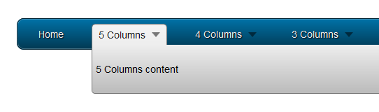
Our classes are ready to be included in our menu. We’ll use each one of them starting from the 5-column, layout to the single column drop down :

<ul id="menu">
<li><a href="#">Home</a></li>
<li><a href="#" class="drop">5 Columns</a>
<div class="dropdown_5columns">
<p>5 Columns content</p>
</div>
</li>
<li><a href="#" class="drop">4 Columns</a>
<div class="dropdown_4columns">
<p>4 Columns content</p>
</div>
</li>
<li><a href="#" class="drop">3 Columns</a>
<div class="dropdown_3columns">
<p>3 Columns content</p>
</div>
</li>
<li><a href="#" class="drop">2 Columns</a>
<div class="dropdown_2columns">
<p>2 Columns content</p>
</div>
</li>
<li><a href="#" class="drop">1 Column</a>
<div class="dropdown_1column">
<p>1 Column content</p>
</div>
</li>
</ul>

Here is a preview of the code above :

Building a CSS3 Mega Drop Down Menu


Step 3: Creating the Drop Down Container Columns


Now that we have the containers ready, we’ll create columns of increasing sizes, following the principles of the 960 grid system.

.col_1,
.col_2,
.col_3,
.col_4,
.col_5 {
display:inline;
float: left;
position: relative;
margin-left: 5px;
margin-right: 5px;
}
.col_1 {width:130px;}
.col_2 {width:270px;}
.col_3 {width:410px;}
.col_4 {width:550px;}
.col_5 {width:690px;}

Using Columns


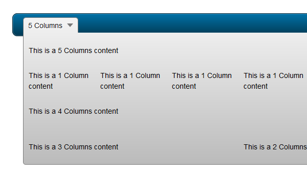
Here is an example of a drop down containing several columns. In this example, we have different combinations using all kinds of columns :

<ul id="menu">
<li><a href="#" class="drop">5 Columns</a>
<div class="dropdown_5columns">
<div class="col_5">
<p>This is a 5 Columns content</p>
</div>
<div class="col_1">
<p>This is a 1 Column content</p>
</div>
<div class="col_1">
<p>This is a 1 Column content</p>
</div>
<div class="col_1">
<p>This is a 1 Column content</p>
</div>
<div class="col_1">
<p>This is a 1 Column content</p>
</div>
<div class="col_1">
<p>This is a 1 Column content</p>
</div>
<div class="col_4">
<p>This is a 4 Columns content</p>
</div>
<div class="col_1">
<p>This is a 1 Column content</p>
</div>
<div class="col_3">
<p>This is a 3 Columns content</p>
</div>
<div class="col_2">
<p>This is a 2 Columns content</p>
</div>
</div>
</li>
</ul>

Code preview :

Building a CSS3 Mega Drop Down Menu


Step 4: Aligning to the Right


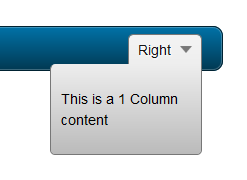
Now, let’s see how we can align our menu and the drop down content to the right edge of the navigation bar; not only the menu item, but the drop down container should also be changed.

To accomplish this, we’ll add a new class called .menu_right to the parent list item, so we reset the right margin and float it to the right :

#menu .menu_right {
float:right;
margin-right:0px;
}

Next, let’s see the drop down. In the previous CSS code, rounded corners were applied to all corners except the left-top one to, in order to match the background of the parent menu item. Now we want this drop down to stick to the right edge of the parent menu item. So, we’ll overwrite the border-radius values with a new class called .align_right, and set the top-right corner to 0.

#menu li .align_right {
/* Rounded Corners */
-moz-border-radius: 5px 0px 5px 5px;
-webkit-border-radius: 5px 0px 5px 5px;
border-radius: 5px 0px 5px 5px;
}

Last but not least, we want to make the drop down appear on the right; so we’ll use our new class and reset the left value, then make it stick to the right :

#menu li:hover .align_right {
left:auto;
right:-1px;
top:auto;
}

Now it’s ready to be used in the menu :

<li class="menu_right"><a href="#" class="drop">Right</a>
<div class="dropdown_1column align_right">
<div class="col_1">
<p>This is a 1 Column content</p>
</div>
</div>
</li>

And a small preview of the code above :

Building a CSS3 Mega Drop Down Menu


Step 5: Adding and Styling Content


Now that we have the whole structure ready, we can add as much content as we want: text, lists, images, etc.

General Stylings


Let’s begin with some basic styling for paragraphs and headings :

#menu p, #menu h2, #menu h3, #menu ul li {
font-family:Arial, Helvetica, sans-serif;
line-height:21px;
font-size:12px;
text-align:left;
text-shadow: 1px 1px 1px #FFFFFF;
}
#menu h2 {
font-size:21px;
font-weight:400;
letter-spacing:-1px;
margin:7px 0 14px 0;
padding-bottom:14px;
border-bottom:1px solid #666666;
}
#menu h3 {
font-size:14px;
margin:7px 0 14px 0;
padding-bottom:7px;
border-bottom:1px solid #888888;
}
#menu p {
line-height:18px;
margin:0 0 10px 0;
}
.strong {
font-weight:bold;
}
.italic {
font-style:italic;
}

We can apply a nice blue color to the links within the drop down :

#menu li:hover div a {
font-size:12px;
color:#015b86;
}
#menu li:hover div a:hover {
color:#029feb;
}

Lists Stylings


Let’s revamp our lists; we have to reset some styling such as the background color or the borders which are used in the navigation bar :

#menu li ul {
list-style:none;
padding:0;
margin:0 0 12px 0;
}
#menu li ul li {
font-size:12px;
line-height:24px;
position:relative;
text-shadow: 1px 1px 1px #ffffff;
padding:0;
margin:0;
float:none;
text-align:left;
width:130px;
}
#menu li ul li:hover {
background:none;
border:none;
padding:0;
margin:0;
}

Styling Images


.imgshadow {
background:#FFFFFF;
padding:4px;
border:1px solid #777777;
margin-top:5px;
-moz-box-shadow:0px 0px 5px #666666;
-webkit-box-shadow:0px 0px 5px #666666;
box-shadow:0px 0px 5px #666666;
}

And to create a paragraph with an image on the left :

.img_left {
width:auto;
float:left;
margin:5px 15px 5px 5px;
}

Text Boxes


To highlight some content, here is an example of a dark box with rounded corners and a subtle inset shadow :

#menu li .black_box {
background-color:#333333;
color: #eeeeee;
text-shadow: 1px 1px 1px #000;
padding:4px 6px 4px 6px;

/* Rounded Corners */
-moz-border-radius: 5px;
-webkit-border-radius: 5px;
border-radius: 5px;

/* Shadow */
-webkit-box-shadow:inset 0 0 3px #000000;
-moz-box-shadow:inset 0 0 3px #000000;
box-shadow:inset 0 0 3px #000000;
}

Restylings Lists


And to finish, here’s another way to style your lists using, again, some CSS3 :

#menu li .greybox li {
background:#F4F4F4;
border:1px solid #bbbbbb;
margin:0px 0px 4px 0px;
padding:4px 6px 4px 6px;
width:116px;

/* Rounded Corners */
-moz-border-radius: 5px;
-webkit-border-radius: 5px;
border-radius: 5px;
}
#menu li .greybox li:hover {
background:#ffffff;
border:1px solid #aaaaaa;
padding:4px 6px 4px 6px;
margin:0px 0px 4px 0px;
}


Step 6: Handling Browser Compatibility and IE6


All browsers handle hover on non-anchor tags . . . except Internet Explorer 6; so our Mega Menu is still not working with this old browser. We can fix this problem thanks to a behavior file that will add this functionality. You can find it here, and use conditional comments to target IE6 only; more explanations can be found via this article from CSS-Tricks.

To target IE6, we’ll use the following code :

<!--[if IE 6]>
<style>
body {behavior: url("csshover3.htc");}
</style>
<![endif]-->

I’ve used a few PNG files in this tutorial, and, as everyone knows, IE6 doesn’t support transparency so we have different solutions :

  • Convert them to GIF or PNG-8 format
  • Use a script
  • Set a background color other than the default grey with TweakPNG for example

I’ll let you choose the one that fits to your needs. Now, let’s review a full working example.


Final Example


HTML Part


<!DOCTYPE html PUBLIC "-//W3C//DTD XHTML 1.0 Transitional//EN" "http://www.w3.org/TR/xhtml1/DTD/xhtml1-transitional.dtd">
<html xmlns="http://www.w3.org/1999/xhtml">
<head>
<meta http-equiv="Content-Type" content="text/html; charset=utf-8" />

<link rel="stylesheet" href="menu.css" type="text/css" media="screen" />

<title>Mega Drop Down Menu</title>
<!--[if IE 6]>
<style>
body {behavior: url("csshover3.htc");}
#menu li .drop {background:url("img/drop.gif") no-repeat right 8px;
</style>
<![endif]-->

</head>

<body>

<ul id="menu">

<li><a href="#" class="drop">Home</a><!-- Begin Home Item -->

<div class="dropdown_2columns"><!-- Begin 2 columns container -->

<div class="col_2">
<h2>Welcome !</h2>
</div>

<div class="col_2">
<p>Hi and welcome here ! This is a showcase of the possibilities of this awesome Mega Drop Down Menu.</p>
<p>This item comes with a large range of prepared typographic stylings such as headings, lists, etc.</p>
</div>

<div class="col_2">
<h2>Cross Browser Support</h2>
</div>

<div class="col_1">
<img src="img/browsers.png" width="125" height="48" alt="" />
</div>

<div class="col_1">
<p>This mega menu has been tested in all major browsers.</p>
</div>

</div><!-- End 2 columns container -->

</li><!-- End Home Item -->

<li><a href="#" class="drop">5 Columns</a><!-- Begin 5 columns Item -->

<div class="dropdown_5columns"><!-- Begin 5 columns container -->

<div class="col_5">
<h2>This is an example of a large container with 5 columns</h2>
</div>

<div class="col_1">
<p class="black_box">This is a dark grey box text. Fusce in metus at enim porta lacinia vitae a arcu. Sed sed lacus nulla mollis porta quis.</p>
</div>

<div class="col_1">
<p>Phasellus vitae sapien ac leo mollis porta quis sit amet nisi. Mauris hendrerit, metus cursus accumsan tincidunt.</p>
</div>

<div class="col_1">
<p class="italic">This is a sample of an italic text. Consequat scelerisque. Fusce sed lectus at arcu mollis accumsan at nec nisi porta quis sit amet.</p>
</div>

<div class="col_1">
<p>Curabitur euismod gravida ante nec commodo. Nunc dolor nulla, semper in ultricies vitae, vulputate porttitor neque.</p>
</div>

<div class="col_1">
<p class="strong">This is a sample of a bold text. Aliquam sodales nisi nec felis hendrerit ac eleifend lectus feugiat scelerisque.</p>
</div>

<div class="col_5">
<h2>Here is some content with side images</h2>
</div>

<div class="col_3">

<img src="img/01.jpg" width="70" height="70" class="img_left imgshadow" alt="" />
<p>Maecenas eget eros lorem, nec pellentesque lacus. Aenean dui orci, rhoncus sit amet tristique eu, tristique sed odio. Praesent ut interdum elit. Sed in sem mauris. Aenean a commodo mi. Praesent augue lacus.<a href="#">Read more...</a></p>

<img src="img/02.jpg" width="70" height="70" class="img_left imgshadow" alt="" />
<p>Aliquam elementum felis quis felis consequat scelerisque. Fusce sed lectus at arcu mollis accumsan at nec nisi. Aliquam pretium mollis fringilla. Nunc in leo urna, eget varius metus. Aliquam sodales nisi.<a href="#">Read more...</a></p>

</div>

<div class="col_2">

<p class="black_box">This is a black box, you can use it to highligh some content. Sed sed lacus nulla, et lacinia risus. Phasellus vitae sapien ac leo mollis porta quis sit amet nisi. Mauris hendrerit, metus cursus accumsan tincidunt.Quisque vestibulum nisi non nunc blandit placerat. Mauris facilisis, risus ut lobortis posuere, diam lacus congue lorem, ut condimentum ligula est vel orci. Donec interdum lacus at velit varius gravida. Nulla ipsum risus.</p>

</div>

</div><!-- End 5 columns container -->

</li><!-- End 5 columns Item -->

<li><a href="#" class="drop">4 Columns</a><!-- Begin 4 columns Item -->

<div class="dropdown_4columns"><!-- Begin 4 columns container -->

<div class="col_4">
<h2>This is a heading title</h2>
</div>

<div class="col_1">

<h3>Some Links</h3>
<ul>
<li><a href="#">ThemeForest</a></li>
<li><a href="#">GraphicRiver</a></li>
<li><a href="#">ActiveDen</a></li>
<li><a href="#">VideoHive</a></li>
<li><a href="#">3DOcean</a></li>
</ul>  

</div>

<div class="col_1">

<h3>Useful Links</h3>
<ul>
<li><a href="#">NetTuts</a></li>
<li><a href="#">VectorTuts</a></li>
<li><a href="#">PsdTuts</a></li>
<li><a href="#">PhotoTuts</a></li>
<li><a href="#">ActiveTuts</a></li>
</ul>  

</div>

<div class="col_1">

<h3>Other Stuff</h3>
<ul>
<li><a href="#">FreelanceSwitch</a></li>
<li><a href="#">Creattica</a></li>
<li><a href="#">WorkAwesome</a></li>
<li><a href="#">Mac Apps</a></li>
<li><a href="#">Web Apps</a></li>
</ul>  

</div>

<div class="col_1">

<h3>Misc</h3>
<ul>
<li><a href="#">Design</a></li>
<li><a href="#">Logo</a></li>
<li><a href="#">Flash</a></li>
<li><a href="#">Illustration</a></li>
<li><a href="#">More...</a></li>
</ul>  

</div>

</div><!-- End 4 columns container -->

</li><!-- End 4 columns Item -->

<li class="menu_right"><a href="#" class="drop">1 Column</a>

<div class="dropdown_1column align_right">

<div class="col_1">

<ul class="simple">
<li><a href="#">FreelanceSwitch</a></li>
<li><a href="#">Creattica</a></li>
<li><a href="#">WorkAwesome</a></li>
<li><a href="#">Mac Apps</a></li>
<li><a href="#">Web Apps</a></li>
<li><a href="#">NetTuts</a></li>
<li><a href="#">VectorTuts</a></li>
<li><a href="#">PsdTuts</a></li>
<li><a href="#">PhotoTuts</a></li>
<li><a href="#">ActiveTuts</a></li>
<li><a href="#">Design</a></li>
<li><a href="#">Logo</a></li>
<li><a href="#">Flash</a></li>
<li><a href="#">Illustration</a></li>
<li><a href="#">More...</a></li>
</ul>  

</div>

</div>

</li>

<li class="menu_right"><a href="#" class="drop">3 columns</a><!-- Begin 3 columns Item -->

<div class="dropdown_3columns align_right"><!-- Begin 3 columns container -->

<div class="col_3">
<h2>Lists in Boxes</h2>
</div>

<div class="col_1">

<ul class="greybox">
<li><a href="#">FreelanceSwitch</a></li>
<li><a href="#">Creattica</a></li>
<li><a href="#">WorkAwesome</a></li>
<li><a href="#">Mac Apps</a></li>
<li><a href="#">Web Apps</a></li>
</ul>  

</div>

<div class="col_1">

<ul class="greybox">
<li><a href="#">ThemeForest</a></li>
<li><a href="#">GraphicRiver</a></li>
<li><a href="#">ActiveDen</a></li>
<li><a href="#">VideoHive</a></li>
<li><a href="#">3DOcean</a></li>
</ul>  

</div>

<div class="col_1">

<ul class="greybox">
<li><a href="#">Design</a></li>
<li><a href="#">Logo</a></li>
<li><a href="#">Flash</a></li>
<li><a href="#">Illustration</a></li>
<li><a href="#">More...</a></li>
</ul>  

</div>

<div class="col_3">
<h2>Here are some image examples</h2>
</div>

<div class="col_3">
<img src="img/02.jpg" width="70" height="70" class="img_left imgshadow" alt="" />
<p>Maecenas eget eros lorem, nec pellentesque lacus. Aenean dui orci, rhoncus sit amet tristique eu, tristique sed odio. Praesent ut interdum elit. Maecenas imperdiet, nibh vitae rutrum vulputate, lorem sem condimentum.<a href="#">Read more...</a></p>

<img src="img/01.jpg" width="70" height="70" class="img_left imgshadow" alt="" />
<p>Aliquam elementum felis quis felis consequat scelerisque. Fusce sed lectus at arcu mollis accumsan at nec nisi. Aliquam pretium mollis fringilla. Vestibulum tempor facilisis malesuada. <a href="#">Read more...</a></p>
</div>

</div><!-- End 3 columns container -->

</li><!-- End 3 columns Item -->

</ul>

</body>

</html>

CSS Part


body, ul, li {
font-size:14px;
font-family:Arial, Helvetica, sans-serif;
line-height:21px;
text-align:left;
}

/* Navigation Bar */

#menu {
list-style:none;
width:940px;
margin:30px auto 0px auto;
height:43px;
padding:0px 20px 0px 20px;

/* Rounded Corners */

-moz-border-radius: 10px;
-webkit-border-radius: 10px;
border-radius: 10px;

/* Background color and gradients */

background: #014464;
background: -moz-linear-gradient(top, #0272a7, #013953);
background: -webkit-gradient(linear, 0% 0%, 0% 100%, from(#0272a7), to(#013953));

/* Borders */

border: 1px solid #002232;

-moz-box-shadow:inset 0px 0px 1px #edf9ff;
-webkit-box-shadow:inset 0px 0px 1px #edf9ff;
box-shadow:inset 0px 0px 1px #edf9ff;
}

#menu li {
float:left;
text-align:center;
position:relative;
padding: 4px 10px 4px 10px;
margin-right:30px;
margin-top:7px;
border:none;
}

#menu li:hover {
border: 1px solid #777777;
padding: 4px 9px 4px 9px;

/* Background color and gradients */

background: #F4F4F4;
background: -moz-linear-gradient(top, #F4F4F4, #EEEEEE);
background: -webkit-gradient(linear, 0% 0%, 0% 100%, from(#F4F4F4), to(#EEEEEE));

/* Rounded corners */

-moz-border-radius: 5px 5px 0px 0px;
-webkit-border-radius: 5px 5px 0px 0px;
border-radius: 5px 5px 0px 0px;
}

#menu li a {
font-family:Arial, Helvetica, sans-serif;
font-size:14px;
color: #EEEEEE;
display:block;
outline:0;
text-decoration:none;
text-shadow: 1px 1px 1px #000;
}

#menu li:hover a {
color:#161616;
text-shadow: 1px 1px 1px #FFFFFF;
}
#menu li .drop {
padding-right:21px;
background:url('img/drop.png') no-repeat right 8px;
}
#menu li:hover .drop {
background:url('img/drop.png') no-repeat right 7px;
}

/* Drop Down */

.dropdown_1column,
.dropdown_2columns,
.dropdown_3columns,
.dropdown_4columns,
.dropdown_5columns {
margin:4px auto;
float:left;
position:absolute;
left:-999em; /* Hides the drop down */
text-align:left;
padding:10px 5px 10px 5px;
border:1px solid #777777;
border-top:none;

/* Gradient background */
background:#F4F4F4;
background: -moz-linear-gradient(top, #EEEEEE, #BBBBBB);
background: -webkit-gradient(linear, 0% 0%, 0% 100%, from(#EEEEEE), to(#BBBBBB));

/* Rounded Corners */
-moz-border-radius: 0px 5px 5px 5px;
-webkit-border-radius: 0px 5px 5px 5px;
border-radius: 0px 5px 5px 5px;
}

.dropdown_1column {width: 140px;}
.dropdown_2columns {width: 280px;}
.dropdown_3columns {width: 420px;}
.dropdown_4columns {width: 560px;}
.dropdown_5columns {width: 700px;}

#menu li:hover .dropdown_1column,
#menu li:hover .dropdown_2columns,
#menu li:hover .dropdown_3columns,
#menu li:hover .dropdown_4columns,
#menu li:hover .dropdown_5columns {
left:-1px;
top:auto;
}

/* Columns */

.col_1,
.col_2,
.col_3,
.col_4,
.col_5 {
display:inline;
float: left;
position: relative;
margin-left: 5px;
margin-right: 5px;
}
.col_1 {width:130px;}
.col_2 {width:270px;}
.col_3 {width:410px;}
.col_4 {width:550px;}
.col_5 {width:690px;}

/* Right alignment */

#menu .menu_right {
float:right;
margin-right:0px;
}
#menu li .align_right {
/* Rounded Corners */
-moz-border-radius: 5px 0px 5px 5px;
-webkit-border-radius: 5px 0px 5px 5px;
border-radius: 5px 0px 5px 5px;
}
#menu li:hover .align_right {
left:auto;
right:-1px;
top:auto;
}

/* Drop Down Content Stylings */

#menu p, #menu h2, #menu h3, #menu ul li {
font-family:Arial, Helvetica, sans-serif;
line-height:21px;
font-size:12px;
text-align:left;
text-shadow: 1px 1px 1px #FFFFFF;
}
#menu h2 {
font-size:21px;
font-weight:400;
letter-spacing:-1px;
margin:7px 0 14px 0;
padding-bottom:14px;
border-bottom:1px solid #666666;
}
#menu h3 {
font-size:14px;
margin:7px 0 14px 0;
padding-bottom:7px;
border-bottom:1px solid #888888;
}
#menu p {
line-height:18px;
margin:0 0 10px 0;
}

#menu li:hover div a {
font-size:12px;
color:#015b86;
}
#menu li:hover div a:hover {
color:#029feb;
}
.strong {
font-weight:bold;
}
.italic {
font-style:italic;
}
.imgshadow {
background:#FFFFFF;
padding:4px;
border:1px solid #777777;
margin-top:5px;
-moz-box-shadow:0px 0px 5px #666666;
-webkit-box-shadow:0px 0px 5px #666666;
box-shadow:0px 0px 5px #666666;
}
.img_left { /* Image sticks to the left */
width:auto;
float:left;
margin:5px 15px 5px 5px;
}
#menu li .black_box {
background-color:#333333;
color: #eeeeee;
text-shadow: 1px 1px 1px #000;
padding:4px 6px 4px 6px;

/* Rounded Corners */
-moz-border-radius: 5px;
-webkit-border-radius: 5px;
border-radius: 5px;

/* Shadow */
-webkit-box-shadow:inset 0 0 3px #000000;
-moz-box-shadow:inset 0 0 3px #000000;
box-shadow:inset 0 0 3px #000000;
}
#menu li ul {
list-style:none;
padding:0;
margin:0 0 12px 0;
}
#menu li ul li {
font-size:12px;
line-height:24px;
position:relative;
text-shadow: 1px 1px 1px #ffffff;
padding:0;
margin:0;
float:none;
text-align:left;
width:130px;
}
#menu li ul li:hover {
background:none;
border:none;
padding:0;
margin:0;
}
#menu li .greybox li {
background:#F4F4F4;
border:1px solid #bbbbbb;
margin:0px 0px 4px 0px;
padding:4px 6px 4px 6px;
width:116px;

/* Rounded Corners */
-moz-border-radius: 5px;
-webkit-border-radius: 5px;
border-radius: 5px;
}
#menu li .greybox li:hover {
background:#ffffff;
border:1px solid #aaaaaa;
padding:4px 6px 4px 6px;
margin:0px 0px 4px 0px;
}


Interesting and Relevant Links


Conclusion


I hope you’ve enjoyed this tutorial on creating mega menus. Thanks for following along!"
read more

Five Useful CSS/jQuery Coding Techniques For More Dynamic Websites

Five Useful CSS/jQuery Coding Techniques For More Dynamic Websites:
Interactivity can transform a dull static website into a dynamic tool that not only delights users but conveys information more effectively. In this post, we’ll walk through five different coding techniques that can be easily implemented on any website to provide a richer user experience.
The techniques will allow you to better display difficult content, help users find information more effectively and provide meaningful UI cues without overwhelming the user.
  1. On-page text search
  2. Drag controls for oversized content
  3. Subtle hover effects
  4. Comment count bars
  5. Full-page slider

[Offtopic: by the way, did you know that there is a Smashing eBook Series? Book #2 is Successful Freelancing for Web Designers, 260 pages for just $9,90.]

1. On-Page Text Search

E-read-search-instant in Five Useful CSS/jQuery Coding Techniques For More Dynamic WebsitesPublish Post
Websites often have search boxes to allow users to find content from their archives. But what if you want to find content on the given page? Information Architects
has
had on-page text search that provides a great user experience. Let’s recreate this using jQuery.

Mark-Up and Interaction

First let’s build an input box for the search:
<input type="text" id="text-search" />
Next we’ll need jQuery to attach a listener to track changes to the input box:
$(function() {
$('#text-search').bind('keyup change', function(ev) {
// pull in the new value
var searchTerm = $(this).val();
)};
});
Here we bound our function to both the keyup and change events. This ensures that our operation fires regardless of whether the user types or pastes the text.
Now, let’s turn to Highlight, a useful and lightweight jQuery plug-in that handles text highlighting. After including the plug-in source, let’s add a highlight() call to our JavaScript:
$(function() {
$('#text-search').bind('keyup change', function(ev) {
// pull in the new value
var searchTerm = $(this).val();

// disable highlighting if empty
if ( searchTerm ) {
// highlight the new term
$('body').highlight( searchTerm );
}
});
});
In addition to highlighting the given text, we’ve also added a check to make sure the search term isn’t empty (which causes an infinite loop).
This snippet highlights the search query throughout the page, but we can also limit the scope to a given id:
$('#myId').highlight( searchTerm );
Or we can search only within a certain element:
$('p').highlight( searchTerm );
This text highlighting by default is case insensitive. If you’d prefer case-sensitive highlighting, remove the .toUpperCase() on both lines 21 and 41 of the Highlight plug-in.

Styling the Highlighted Text

Now that the JavaScript is attached, we’ll need to style our highlighted items. The Highlight plug-in wraps the highlighted terms in <span class="highlight"></span>, which we can style with CSS.
First, let’s change the background color and then add rounded corners and a drop-shadow for all browsers except IE:
.highlight {
background-color: #fff34d;
-moz-border-radius: 5px; /* FF1+ */
-webkit-border-radius: 5px; /* Saf3-4 */
border-radius: 5px; /* Opera 10.5, IE 9, Saf5, Chrome */
-moz-box-shadow: 0 1px 4px rgba(0, 0, 0, 0.7); /* FF3.5+ */
-webkit-box-shadow: 0 1px 4px rgba(0, 0, 0, 0.7); /* Saf3.0+, Chrome */
box-shadow: 0 1px 4px rgba(0, 0, 0, 0.7); /* Opera 10.5+, IE 9.0 */
}
Although the highlighting is now visible, it still appears a bit tight around the text and could use some padding. But we’ll have to be careful not to adjust the layout of text. These spans are inline elements, and if we simply add padding, the text will shift around on the page. So, let’s include padding with a negative margin to compensate:
.highlight {
padding:1px 4px;
margin:0 -4px;
}

Finishing the Interaction

Last but not least, let’s make sure to remove the highlighted text whenever the user edits text in the input box:
$(function() {
$('#text-search').bind('keyup change', function(ev) {
// pull in the new value
var searchTerm = $(this).val();

// remove any old highlighted terms
$('body').removeHighlight();

// disable highlighting if empty
if ( searchTerm ) {
// highlight the new term
$('body').highlight( searchTerm );
}
});
});
Here we added a call to remove any text highlighting, which is performed outside of the empty field check. This ensures that the highlight is also removed if the user clears the field.
Although removeHighlight() works well in most browsers, it will crash IE6. This is due to an IE6 bug with node.normalize().
We can get the Highlight plug-in working in IE6 by rewriting this function. Simply replace lines 45-53 of highlight.js with the following:
jQuery.fn.removeHighlight = function() {
function newNormalize(node) {
for (var i = 0, children = node.childNodes, nodeCount = children.length; i < nodeCount; i++) {
var child = children[i];
if (child.nodeType == 1) {
newNormalize(child);
continue;
}
if (child.nodeType != 3) { continue; }
var next = child.nextSibling;
if (next == null || next.nodeType != 3) { continue; }
var combined_text = child.nodeValue + next.nodeValue;
new_node = node.ownerDocument.createTextNode(combined_text);
node.insertBefore(new_node, child);
node.removeChild(child);
node.removeChild(next);
i--;
nodeCount--;
}
}

return this.find("span.highlight").each(function() {
var thisParent = this.parentNode;
thisParent.replaceChild(this.firstChild, this);
newNormalize(thisParent);
}).end();
};
This new function replaces the standard Javascript normalize() with a custom function that works in all browsers.
Download the complete example.

2. Drag Controls For Oversized Content

Moscow in Five Useful CSS/jQuery Coding Techniques For More Dynamic Websites
When layout constraints bump up against the need for large images, finding a quality solution can be difficult. Mospromstroy uses a creative technique to handle this situation: a 'drag and drop' control bar that allows users to pan through images.
We can accomplish something similar using jQuery UI's draggable behavior.

Mark-Up and CSS

First let's set up some mark-up for the content and controls:
<div id="full-sized-area">
<div id="full-sized-content">
Your content here
</div>
</div>

<div id="drag-controls-area">
<div id="drag-controls"></div>
</div>
Next, let's apply some basic CSS:
#full-sized-area {
position: relative;
overflow: hidden;
width: 800px;
height: 400px;
}

#full-sized-content {
position: absolute;
top: 0;
left: 0;
}

#drag-controls-area {
position: relative;
width: 300px;
height: 50px;
}

#drag-controls {
position: absolute;
top: 0;
left: 0;
height: 48px;
border: 1px solid white;
}
Here we applied an absolute position to both the #full-sized-content and #drag-controls, and we also hid any overflow from the large image. Additionally, we applied some arbitrary dimensions to the content and drag controls wrappers; make sure to adjust these as needed.

Building Interactivity With jQuery

Now, let's use jQuery UI to build the interaction. Begin by including jQuery UI with the draggable module.
Before attaching the controls, let's resize the drag control box to the right dimensions:
$(function() {
var $fullArea = $('#full-sized-area');
var $fullContent = $('#full-sized-content', $fullArea);

// find what portion of the content is displayed
var contentRatio = $fullArea.width() / $fullContent.width();

// scale the controls box
var $controlsArea = $('#drag-controls-area');
var $controls = $('#drag-controls', $controlsArea);

$controls.css('width', $controlsArea.width() * contentRatio);
});
Here, we've determined what portion of the content is visible in the content area and then scaled the width of the control box accordingly.
Next, let's attach the draggable behavior:
$(function() {
var $fullArea = $('#full-sized-area');
var $fullContent = $('#full-sized-content', $fullArea);

// find what portion of the content is displayed
var contentRatio = $fullArea.width() / $fullContent.width();

// scale the controls box
var $controlsArea = $('#drag-controls-area');
var $controls = $('#drag-controls', $controlsArea);

$controls.css('width', $controlsArea.width() * contentRatio);

// determine the scale difference between the controls and content
var scaleRatio = $controlsArea.width() / $fullContent.width();

// attach the draggable behavior
$controls.draggable({
axis : 'x', // confine dragging to the x-axis
containment : 'parent',
drag : function(ev, ui) {
// move the full sized content
$fullContent.css('left', -1 * ui.position.left / scaleRatio );
}
});
});
Here, we've attached a draggable event and set a couple options. First, we set axis to restrict dragging to the x-axis, and then we set containment to confine dragging to the parent element (i.e. the controls wrapper).
Finally, we set up a drag listener to move the full-sized content according to how far the user has dragged the control. For this, we negatively positioned the content to the left by the drag amount multiplied by the ratio of the controls to the content.

Custom Cursors

The draggable content is working, but we still have room for improvement.
First let's add some more styling to the control box to make it more interactive. jQuery UI's draggable attaches two class names that we can use for this: ui-draggable and ui-draggable-dragging.
#drag-controls.ui-draggable {
cursor: -moz-grab !important;
cursor: -webkit-grab !important;
cursor: e-resize;
}

#drag-controls.ui-draggable-dragging {
cursor: -moz-grabbing !important;
cursor: -webkit-grabbing !important;
border-color: yellow;
}
In addition to applying a new border color to the active controls, this snippet also attaches a number of cursor properties, which use proprietary UI cursors available in Firefox and Safari, with a back-up for IE.
Because of the implementation of the cursor property, we had to 'bootstrap' this together using !important. This ensures that the proprietary cursors are used if available, while allowing the default cursor to overwrite them in IE. Unfortunately, Chrome does not currently support -webkit-grab, so we leave it out of this implementation. If you'd prefer to use the back-up e-resize cursor in both Chrome and Safari, just remove the -webkit-grab and -webkit-grabbing properties.

Parallax Effect

Let's make the sliding animation more three-dimensional by adding a two-layer parallax effect. To do so, we simply add a background to our full-sized content area and animate it at a slower rate.
Add the mark-up first:
<div id="full-sized-area">
<div id="full-sized-background">
Your background here
</div>

<div id="full-sized-content">
Your content here
</div>
</div>

<div id="drag-controls-area">
<div id="drag-controls"></div>
</div>
And then some basic styling:
#full-sized-background {
position: absolute;
top: 0;
left: 0;
}
Here, we use absolute positioning to lock the background in place. Note that we did not need to attach a z-index, because we placed the background element before the content area in the mark-up.
Finally, let's add the background animation to our drag event:
$fullBackground = $('#full-sized-background');

$controls.draggable({
axis : 'x', // confine dragging to the x-axis
containment : 'parent',
drag : function(ev, ui) {
// move the full sized content
var newContentPosition = -1 * ui.position.left / scaleRatio;
$fullContent.css('left', newContentPosition);

// move the background
$fullBackground.css('left', newContentPosition * .4);
}
});
Here, we simply used the new position that we calculated for the main content and applied 40% of that change to the background. Adjust this value to change the speed of the parallax.
Download the complete example.

3. Subtle Hover Effects

Veerle in Five Useful CSS/jQuery Coding Techniques For More Dynamic Websites
Veerle's blog uses subtle transitions to create a natural feel for mouse interactions. These can be easily accomplished using CSS3's transition property (and a jQuery back-up for unsupported browsers).
First, let's attach some CSS with the class subtle to all elements:
.subtle {
background-color: #78776C;
color: #BBBBAD;
}

.subtle:hover, .subtle:focus {
background-color: #F6F7ED;
color: #51514A;
}
Here, we've styled these elements with a background and text color and included a hover state using the pseudo-class :hover. Additionally, we included the :focus pseudo-class for active input and text-area elements.
This CSS causes the style to change immediately on hover, but we can apply a smoother transition using CSS3:
.subtle {
-webkit-transition: background-color 500ms ease-in; /* Saf3.2+, Chrome */
-moz-transition: background-color 500ms ease-in; /* FF3.7+ */
-o-transition: background-color 500ms ease-in; /* Opera 10.5+ */
transition: background-color 500ms ease-in; /* futureproofing */
background-color: #78776C;
color: #BBBBAD;
}

.subtle:hover, .subtle:focus {
background-color: #F6F7ED;
color: #51514A;
}
Here, we've attached a CSS3 transition that works in all modern browsers except IE. The transition property consists of three different values. The first is the CSS property to animate, and the second is the duration of the animation—in our case, background-color and 500 milliseconds, respectively. The third value allows us to specify an easing function, such as ease-in or linear.

jQuery Back-Up

Our subtle transitions now work across a variety of browsers, but let's include support for all users by leveraging a jQuery back-up technique.
First we'll need to detect whether the user's browser supports transition:
// make sure to execute this on page load
$(function() {
// determine if the browser supports transition
var thisStyle = document.body.style,
supportsTransition = thisStyle.WebkitTransition !== undefined ||
thisStyle.MozTransition !== undefined ||
thisStyle.OTransition !== undefined ||
thisStyle.transition !== undefined;
});
Here, we check whether the body element can use any of the browser-specific transition properties that we defined above.
If the browser doesn't support transition, we can apply the animation using jQuery. However, jQuery's animate() function does not natively support color-based animations. To accommodate our background-color animation, we'll have to include a small chunk of jQuery UI: the effects core.
After including jQuery UI, we'll need to attach the animation to the hover and focus event listeners:
// make sure to execute this on page load
$(function() {
// determine if the browser supports transition
var thisStyle = document.body.style,
supportsTransition = thisStyle.WebkitTransition !== undefined ||
thisStyle.MozTransition !== undefined ||
thisStyle.OTransition !== undefined ||
thisStyle.transition !== undefined;

// assign jQuery transition if the browser doesn't support
if ( ! supportsTransition ) {
var defaultCSS = {
backgroundColor: '#78776C'
},
hoverCSS = {
backgroundColor: '#F6F7ED'
};

// loop through each button
$('.subtle').each(function() {
var $subtle = $(this);

// bind an event listener for mouseover and focus
$subtle.bind('mouseenter focus', function() {
$subtle.animate(hoverCSS, 500, 'swing' );
});

// bind the reverse for mouseout and blur
$subtle.bind('mouseleave blur', function(ev) {
if ( ev.type == 'mouseleave' && ev.target == document.activeElement ) return false;

$subtle.animate(defaultCSS, 500, 'swing' );
});
});
}
});
Here, we recreated the transition using jQuery's animate(). Notice how we used values that are to the CSS3 transition—500 specifies 500 milliseconds, and swing specifies an easing method that is close to ease-in.
While the mouse-over and focus event is fairly straightforward, notice the difference in the mouse-out and blur event. We added some code to end the function if the element is in focus. This retains the active state even if the user moves their mouse. jQuery's is() method does not support the :focus pseudo-class, so we have to rely on DOM's document.activeElement.
Download the complete example.

4. Comment Count Bars

Most-commented in Five Useful CSS/jQuery Coding Techniques For More Dynamic Websites
IT Expert Voice uses a nice method for displaying the 'Most commented' posts in its sidebar. Let's recreate this using WordPress and a bit of CSS and jQuery (non-WordPress users can skip the first section).

Pulling Posts With WordPress

Let's start by pulling in the top-five most-commented posts:
<?php $most_commented = new WP_Query('orderby=comment_count&posts_per_page=5'); ?>
Here, we used WP_Query and a custom variable name so as not to disrupt any other post loops on the page.
Next, let's loop through the posts we've selected, outputting each as a list item:
<ul id="most-commented">

<?php $most_commented = new WP_Query('orderby=comment_count&posts_per_page=5'); ?>
<?php while ($most_commented->have_posts()) : $most_commented->the_post(); ?> 

<li>
<a href="<?php the_permalink() ?>" rel="bookmark" title="<?php the_title_attribute(); ?>"><?php the_title(); ?></a>

<span class="comment-bar"><span class="comment-count"><?php comments_number('0','1','%'); ?></span></span>
</li>

<?php endwhile; ?>

</ul>
Here, we used a while() loop to run through each post. First, we output a link to the post using the_permalink() and the_title(), and then we output the comment count using comments_number() and some additional mark-up for styling.

Basic CSS Styling

Let's style the basic layout of the comments list using CSS:
#most-commented li {
list-style: none;
}

#most-commented a {
display: block;
}
We've removed any list styling and defined the links as a block element so that they stay separate from our comment bar visualizations.
Let's set up some base styles for the comment bar and comment count:
#most-commented .comment-bar {
display: inline-block;
position: relative;
height: 30px;
width: 0;
margin: 5px 0;
padding-left: 20px;
background-color: #999;
}

#most-commented .comment-count {
display: inline-block;
position: absolute;
right: -20px;
top: -5px;
width: 34px;
height: 34px;
border-width: 3px;
border-style: solid;
border-color: #FFF;
-moz-border-radius: 20px;
-webkit-border-radius: 20px;
border-radius: 20px;
text-align: center;
line-height: 34px;
background-color: #6CAC1F;
font-size: 13px;
font-weight: bold;
color: #FFF;
}
Most of this styling is arbitrary, so feel free to attach a background image or otherwise tweak it to fit your theme. The main thing is to align the comment count to the right of the comment bar so that we can adjust the width of the bar at will.
Pay attention to the total width of the comment count, in our case 40px (34px wide plus 3px for the left and right borders). We're using half of that value to position the comment count: 20px of negative positioning so that the count hangs on the right, and 20px of left padding so that the comment bar reaches the center of the comment count.

Tying It All Together With jQuery

Finally, let's use jQuery to set the widths of the individual bars. We'll start by looping through the comments after the page loads:
$(function() {
$('#most-commented li').each(function(i) {
var $this = $(this);
var thisCount = ~~$this.find('.comment-count').text();
});
});
We loop through all of the <li> elements, pulling out the comment count from the mark-up. Notice that we've used the primitive data type ~~ to convert the text to an integer. This is significantly faster than alternatives such as parseInt().
Let's set up some key variables in the first iteration of our loop:
$(function() {
// define global variables
var maxWidth, maxCount;

$('#most-commented li').each(function(i) {
var $this = $(this);
var thisCount = ~~$this.find('.comment-count').text();

// set up some variables if the first iteration
if ( i == 0 ) {
maxWidth = $this.width() - 40;
maxCount = thisCount;
}
});
});
Here, we started by defining variables outside of the each() loop. This allows us to use these values in every iteration.
Next, we subtracted 40 pixels from the width of the list item to define a maximum width for the comment bar. The 40 pixels compensate for the left-padding and negative position that we applied above.
We also set maxCount to the first value. Because we initially pulled the posts according to their number of comments, we can be sure that the first item will have the highest count.
Finally, let's calculate the width of each bar and animate the transition:
$(function() {
// define global variables
var maxWidth, maxCount;

$('#most-commented li').each(function(i) {
var $this = $(this);
var thisCount = ~~$this.find('.comment-count').text();

// set up some variables if the first iteration
if ( i == 0 ) {
maxWidth = $this.width() - 40;
maxCount = thisCount;
}

// calculate the width based on the count ratio
var thisWidth = (thisCount / maxCount) * maxWidth;

// apply the width to the bar
$this.find('.comment-bar').animate({
width : thisWidth
}, 200, 'swing');
});
});
If you'd rather style the elements without any animation, simply replace the animate() with a static css().
Download the complete example.

5. Full-Page Slider

Wine-jax in Five Useful CSS/jQuery Coding Techniques For More Dynamic Websites
Sliding animation is an interactive way to show related content. But JAX Vineyards takes the standard sliding gallery to the next level by animating across the entire page. Let's create a similar effect using jQuery.

Mark-Up and CSS

Start by adding the mark-up:
<div id="full-slider-wrapper">
<div id="full-slider">

<div class="slide-panel active">
Panel 1 content here
</div>

<div class="slide-panel">
Panel 2 content here
</div>

<div class="slide-panel">
Panel 3 content here
</div>
</div>
</div>
We set up the basic mark-up and wrappers that we need for the animation. Make sure that the full-slider-wrapper is not contained in any element that is narrower than the browser window—we'll need the full width of the browser to pull off the effect.
Now, let's add some basic CSS to handle overflow and to position the panels:
html {
min-width: 800px;
}

#full-slider-wrapper {
overflow: hidden;
}

#full-slider {
position: relative;
width: 800px;
height: 600px;
margin: 0 auto;
}

#full-slider .slide-panel {
position: absolute;
top: 0;
left: 0;
width: 800px;
height: 600px;
visibility: hidden;
}

#full-slider .slide-panel.active {
visibility: visible;
}
We defined absolute positioning and set up some arbitrary dimensions for the panels and wrapper. Feel free to tweak these dimensions to your content.
We also attached overflow: hidden to our wrapper element, which will prevent scroll bars from appearing when we animate the panels. Because we hid the overflow, we also had to assign a min-width to the html document. This ensures that the content will get scroll bars if the browser window is too small.
Finally, we used the active class that we established in the mark-up to show the first panel.

jQuery Animation

Let's build the interaction using jQuery. We'll start by defining some variables and then create a function to handle the sliding animation in both directions:
$(function() {
var $slider = $('#full-slider');
var $sliderPanels = $slider.children('.slide-panel');

function slidePanel( newPanel, direction ) {
// define the offset of the slider obj, vis a vis the document
var offsetLeft = $slider.offset().left;

// offset required to hide the content off to the left / right
var hideLeft = -1 * ( offsetLeft + $slider.width() );
var hideRight = $(window).width() - offsetLeft;

// change the current / next positions based on the direction of the animation
if ( direction == 'left' ) {
currPos = hideLeft;
nextPos = hideRight;
}
else {
currPos = hideRight;
nextPos = hideLeft;
}

// slide out the current panel, then remove the active class
$slider.children('.slide-panel.active').animate({
left: currPos
}, 500, function() {
$(this).removeClass('active');
});

// slide in the next panel after adding the active class
$( $sliderPanels[newPanel] ).css('left', nextPos).addClass('active').animate({
left: 0
}, 500 );
}
});
Here our slidePanel() function accepts two arguments: the index of the panel that we want to slide into view, and the direction of the slide (i.e. left or right).
Although this function looks complicated, the concepts are fairly simple. We determined the amount of offset necessary to hide the panels on the left and right sides. To calculate these values, we used jQuery's offset() and the slider and window widths. These offsets represent the left position values needed to hide the content on either side.
Next, we have a switch based on the direction of the animation, which uses the two values we defined previously.
Finally, we trigger the animation using jQuery's animate(). We slide the active panel out of view and then remove the active class once the animation completes. Then we set the new panel's left position off the screen, attach the active class to make it visible and slide it into place.

Building the Controls

Our function now handles the animation, but we still have to build controls to leverage it.
Append navigation elements to the slider object that we defined previously:
var $navWrap = $('<div id="full-slider-nav"></div>').appendTo( $slider );
var $navLeft = $('<div id="full-slider-nav-left"></div>').appendTo( $navWrap );
var $navRight = $('<div id="full-slider-nav-right"></div>').appendTo( $navWrap );
We could have included this navigation in the initial mark-up, but we're appending it with JavaScript for two reasons: it ensures that the navigation won't appear until the JavaScript is loaded, and it keeps the navigation from being displayed on the off chance that JavaScript isn't enabled.
Let's style the navigation:
#full-slider-nav {
position: absolute;
top: 0;
right: 0;
}

#full-slider-nav-left, #full-slider-nav-right {
display: inline-block;
height: 0;
width: 0;
margin-left: 15px;
border: 20px solid transparent;
cursor: pointer;
}

#full-slider-nav-left {
border-right-color: #BBB;
}

#full-slider-nav-left:hover {
border-right-color: #999;
}

#full-slider-nav-right {
border-left-color: #BBB;
}

#full-slider-nav-right:hover {
border-left-color: #999;
}
Here we absolute position the navigation to the top right. We also use a CSS triangle trick to quickly style the controls.
Let's attach our new slider navigation to the slidePanel() function that we defined previously:
var $navWrap = $('<div id="full-slider-nav"></div>').appendTo( $slider );
var $navLeft = $('<div id="full-slider-nav-left"></div>').appendTo( $navWrap );
var $navRight = $('<div id="full-slider-nav-right"></div>').appendTo( $navWrap );

var currPanel = 0;

$navLeft.click(function() {
currPanel--;

// check if the new panel value is too small
if ( currPanel < 0 ) currPanel = $sliderPanels.length - 1;

slidePanel(currPanel, 'right');
});

$navRight.click(function() {
currPanel++;

// check if the new panel value is too big
if ( currPanel >= $sliderPanels.length ) currPanel = 0;

slidePanel(currPanel, 'left');
});
This snippet assigns click events to the left and right navigation. In each, we change the value of currPanel according to the direction. If this new value falls outside of the available panels, we loop to the other end of our set. Finally, we trigger the slidePanel() function with the new panel and appropriate direction.
In our example, we built controls only for left and right navigation, but you could easily tweak this to have buttons for each panel. Simply pass the correct panel index to slidePanel.
Let's bring all the jQuery code together:
$(function() {
function slidePanel( newPanel, direction ) {
// define the offset of the slider obj, vis a vis the document
var offsetLeft = $slider.offset().left;

// offset required to hide the content off to the left / right
var hideLeft = -1 * ( offsetLeft + $slider.width() );
var hideRight = $(window).width() - offsetLeft;

// change the current / next positions based on the direction of the animation
if ( direction == 'left' ) {
currPos = hideLeft;
nextPos = hideRight;
}
else {
currPos = hideRight;
nextPos = hideLeft;
}

// slide out the current panel, then remove the active class
$slider.children('.slide-panel.active').animate({
left: currPos
}, 500, function() {
$(this).removeClass('active');
});

// slide in the next panel after adding the active class
$( $sliderPanels[newPanel] ).css('left', nextPos).addClass('active').animate({
left: 0
}, 500 );
}

var $slider = $('#full-slider');
var $sliderPanels = $slider.children('.slide-panel');

var $navWrap = $('<div id="full-slider-nav"></div>').appendTo( $slider );
var $navLeft = $('<div id="full-slider-nav-left"></div>').appendTo( $navWrap );
var $navRight = $('<div id="full-slider-nav-right"></div>').appendTo( $navWrap );

var currPanel = 0;

$navLeft.click(function() {
currPanel--;

// check if the new panel value is too small
if ( currPanel < 0 ) currPanel = $sliderPanels.length - 1;

slidePanel(currPanel, 'right');
});

$navRight.click(function() {
currPanel++;

// check if the new panel value is too big
if ( currPanel >= $sliderPanels.length ) currPanel = 0;

slidePanel(currPanel, 'left');
});
});
Download the complete example.

Final Thoughts

In this post we walked through a variety of methods for adding dynamic functionality to your websites. These techniques can be easily adapted to work with almost any site. The majority of these techniques rely on jQuery to provide interaction, but there are plenty of other approaches, both with and without jQuery. Please post any alternate solutions in the comments below, or fork the example files on github.
Furthermore, these five methods represent only a small portion of interactive techniques. Please post any links to other dynamic techniques and functionality in the comments below.
"
read more

Quick Tip: Working with the Official jQuery Templating Plugin

Quick Tip: Working with the Official jQuery Templating Plugin: "
Just this week, the jQuery team announced that Microsoft’s templating plugin (along with a couple others) is now being officially supported. What this means is that the plugin will now be maintained and updated directly by the core team. In this video tutorial, we’ll review the essentials of the plugin, and why it’s so awesome.


As a quick example, we’ll, again, refer to the Twitter search API example from Friday (think Bieber). The only difference is that, this time, we’ll use an HTML template to attach the returned data, rather than muddying up our JavaScript!

Months ago, Andrew Burgess introduced you to this plugin, still in beta. However, today, we’ll integrate the plugin into real-live code.


Crash Course


Step 1 : Import jQuery and the Templating Plugin


<script src="http://ajax.googleapis.com/ajax/libs/jquery/1.4.2/jquery.min.js"></script>
<script src="jquery.tmpl.js"></script>


Step 2 : Create your Template


<script id="tweets" type="text/x-jquery-tmpl">
<li>
<img src="${imgSource}" alt="${username}" />
<h2> ${username} </h2>
<p> ${tweet} </p>
{{if geo}}
<span> ${geo} </span>
{{/if}}
</li>
</script>

  • Notice how this template is wrapped within script tags, and that a type of text/x-jquery-tmpl has been applied.
  • We reference template variables names by prepending a dollar sign, and wrapping the property name within curly braces.
  • If statements can be created by using two sets of curly braces, as demonstrated above. (See screencast for more detail.)


Step 3 : Find Some Data to Render!


In this case, we'll do a quick search of the Twitter search API.

<script>

$.ajax({
type : 'GET',
dataType : 'jsonp',
url : 'http://search.twitter.com/search.json?q=nettuts',

success : function(tweets) {
var twitter = $.map(tweets.results, function(obj, index) {
return {
username : obj.from_user,
tweet : obj.text,
imgSource : obj.profile_image_url,
geo : obj.geo
};
});
}
});

</script>

Thanks to Peter Galiba (see comments), for recommending the more elegant $.map solution, shown above.

Refer to the screencast for a full walk-through of the code above. Most importantly, though, is that we're creating an array of objects. This will then serve as the data for the the template that we created in step two. Notice how the property names:

username : obj.from_user,
tweet : obj.text,
imgSource : obj.profile_image_url,
geo : obj.geo

...correspond to the template variables that we created in step two.


Step 4 : Where Should the Mark-up Be Rendered?


Next, we must designate where the mark-up and data should be rendered. We'll create an unordered list for this purpose.

<ul id="tweets"> </ul>


Step 5 : Render the Data


Finally, we attach the data to the template, and append it to the unordered list (#tweets) that we created in step four.

$('#tweets').tmpl(twitter).appendTo('#twitter');

  1. Find the script (template) element with an id of tweets.
  2. Attach the twitter array to this template.
  3. Add the new mark-up to the DOM.


Final Source


<!DOCTYPE HTML>
<html lang="en">
<head>
<meta charset="UTF-8">
<title></title>
<link rel="stylesheet" href="style.css" />

<script src="http://ajax.googleapis.com/ajax/libs/jquery/1.4.2/jquery.min.js"></script>
<script src="jquery.tmpl.js"></script>
</head>
<body>

<h1> Tweets about Nettuts+ </h1>

<script id="tweets" type="text/x-jquery-tmpl">
<li>
<img src="${imgSource}" alt="${userName}" />
<h2> ${username} </h2>
<p> ${tweet} </p>

{{if geo}}
<span>
${geo}
</span>
{{/if}}
</li>
</script>

<ul id="twitter"></ul>

<script>
$.ajax({
type : 'GET',
dataType : 'jsonp',
url : 'http://search.twitter.com/search.json?q=nettuts',

success : function(tweets) {
var twitter = $.map(tweets.results, function(obj, index) {
return {
username : obj.from_user,
tweet : obj.text,
imgSource : obj.profile_image_url,
geo : obj.geo
};
});

$('#tweets').tmpl(twitter).appendTo('#twitter');
}
});

</script>
</body>
</html>


So What do you Think?


Now that the templating plugin is officially supported by the core jQuery team, will you be using it in your future projects?
"
read more

Progressively Enhance a Form to a Modal Form

Progressively Enhance a Form to a Modal Form: "
With something as important as a contact form, you want it working properly for all visitors—even the JavaScript challenged. How do you handle this if you want to use a modal (pop-up) form? The answer is progressive enhancement; start with baseline, usable functionality; then increase the user experience for those who have browsers to support it.


Step 1: Decide on the Project Goals


Before starting any journey, it helps (most times) to have a destination. The goal of this project is to take a standard link to a page containing a contact form and enable that form to pop-up on the current page in a modal dialog.

There’s several reasons for this approach:

  • If the user has JavaScript disabled, they are sent to the contact form page as usual.
  • Only one version of the form must be maintained.
  • The additional content (the form) can be loaded asynchronously.

A Modal Form


Step 2: List the Tools


To write this from scratch in raw JavaScript would be a lot of code. Fortunately for us, there are existing tools we can leverage to make the task easier. This tutorial relies on:


To make this code as reusable as possible, we’ll write a plug-in. If you are unfamiliar with authoring a plug-in, you can get an introduction from Jeffrey Way’s article here on Nettuts+. The modal functionality will come from jQuery-UI’s $.dialog.

Plug-In Theory


Step 3: Design the Plug-in Interface


We’re going to follow the normal pattern for a jQuery plug-in: calling the plug-in on a selector and setting options via array. What options are needed? There will be options both for the modal window and for the plug-in itself. We’re going to expect the plug-in to be called on an anchor, and enforce that in the code.

$('a.form_link').popUpForm({
container   : '',
modal       : true,
resizeable  : false,
width       : 440,
title       : 'Website Form',
beforeOpen  : function(container) {},
onSuccess   : function(container) {},
onError     : function(container) {}
});

Examining the options


Container: This is how the plug-in user will specify the ID of the form on the remote page. The link itself specifies the page, but container option will allow us to fetch the relevant part. This will be the only required option when calling the plug-in.

Modal, Resizeable, Width, Title: These options are all going to be passed along to jQuery UI’s $.dialog. The values above are defaults and the plug-in will run just fine without any of these being set when $.popUpForm is called.

beforeOpen, onSuccess, onError: These are all callbacks, and expect a function. The function will be passed the object for the link that was clicked as ‘this’ and the container to which that link is targeted. Callbacks are designed to allow custom functionality for the users of a plug-in. The default for these callbacks will be an empty function.

The minimum code required to use the plug-in would then look like this:

$('a.form_link').popUpForm({ container : '#form_id' });

That seems simple, doesn’t it? When you call a plug-in like this, the plug-in’s code is called with a jQuery collection of all the DOM elements matching the selector, which will be available in the special variable ‘this’.


Step 4: The Plug-In’s Skeleton


Most jQuery plug-ins follow a very similar pattern. They iterate over the group of selectors and do whatever it is they do. I’ve got a basic plug-in “outline” I generally work from, and it will fit in here nicely. This would be the start of your plug-in file, popUpForm.jquery.js.

(function($) {
$.fn.popUpForm = function(options) {

// Defaults and options
var defaults = {
container   : '',
modal       : true,
resizeable  : false,
width       : 440,
title       : 'Website Form',
beforeOpen  : function(container) {},
onSuccess   : function(container) {},
onError     : function(container) {}
};
var opts = $.extend({}, defaults, options);

self.each(function() {

// The REAL WORK happens here.
// Within the scope of this function 'this' refers to a single
// DOM element within the jQuery collection (not a jQuery obj)
});
}
})(jQuery);

The code is wrapped in a self-executing function, and adds itself to jQuery using the $.fn namespace. The identifier following $.fn is the method name you’ll use to invoke it.

We’re also following good coding practices by passing in the jQuery variable explicitly. This will keep us from getting into trouble if the plug-in is used on a page with other JavaScript frameworks, some of which use $ as a variable.

Next, an array of default values is created, and these defaults will be used if they aren’t defined when the plug-in is called. The line immediately following the defaults array merges the passed in options with the defaults and stores them all in the opts array.

Finally, a loop is created for iterating over the jQuery collection identified by the selector when the plug-in is called.. While chances are in most situations it will be a single item ( an anchor), it will still handle multiple links with a single call – assuming they all load the same form.

An important thing to understand is that the value of the special variable ‘this’ changes when we enter the self.each loop; it’s a special jQuery method designed to make looping DOM collections easier. The callback function uses the context of the current DOM element, so the variable ‘this’ refers to that element within the loop.

You can see in a very simple example how ‘this’ refers to a jQuery collection of jQuery objects in the plug-in function scope, but inside the each loop, ‘this’ refers to a single, non-jQuery DOM element.

The Scope of This


Step 5: Starting the Guts


The code for the next few sections is all contained within the self.each block of our skeleton. What do we do now? For each jQuery element passed in, there are going to be several steps to take:

  • Make sure it is a link, and that it goes somewhere
  • Fetch the part of the remote page specified
  • Attach the remote form to the page, and create a hidden dialog for it
  • Steal the link so it creates our pop-up
  • Handle form submissions AJAX style

Before doing any of that, however, we’re going to add one line of code inside the callback, at the very top

var $this = $(this);

This is more then just convenience; the variable ‘this’ will go out of scope in any closures within the each loop, and we’re going to need access to the current object later. Since we’ll almost always want it as a jQuery object, we’re storing it as one.


Step 6: Make Sure the Element Is Valid


$.popUpForm is only going to operate on anchor tags, and the anchor tag must have a href value so we know where to fetch the form from. If either of those conditions is not met, we’re going to leave the element alone. The second line of our ‘guts’ will be:

if (!$this.is('a') || $this.attr('href') == '') { return ; }

Some people hate multiple return points in a function, but I’ve always found having one at the start can make a function more readable, as opposed to using an if(condition) to wrap the rest of the function. Performance wise, they’re identical.


Step 7: Fetch the From From the Remote Page


The $.load method has nice functionality that allows a call to specify and ID in order to only attach part of a fetched document. The script won’t attach the returned HTML directly to the DOM, because $.load only overwrites, it doesn’t append.

var SRC = $this.attr('href') + ' ' + opts.container;
var formDOM = $("<div />").load(SRC, function() {

The variable opts.container has the ID of the form element on the remote page. The second line loads this remote page, and attaches the form and its contents to a div, the entirety of which is stored in the variable formDOM. Notice that $.load includes a callback (the function) — we’ll use formDOM inside that callback.


Step 8: Attach the HTML and Create the Dialog


Inside the $.load callback, the code is going to attach the form, override the click event of the anchor, and override the submit event of the form.

The form’s HTML is stored in the formDOM variable at this point, and attaching it to the existing page is easy.

$('#popUpHide').append(formDOM);

The id #popUpHide refers to a hidden div that will attached to the page by the plug-in. In order to provide that div, the following line will be added at the top of the plug-in. If it already exists, we don’t recreate it.

$("#popUpHide").length || $('<div id="popUpHide" />').appendTo('body').css('display','none');

Now that the form is hidden safely away on our page, it is time to use a call to the $.dialog method to create the form. Most of the set-up params are taken from our plug-in. The ‘autoopen’ option is hard coded since we want the dialog to open when the link is clicked, and not when the dialog is created.

// Create and store the dialog
$(opts.container).dialog({
autoOpen    : false,
width       : opts.width,
modal       : opts.modal,
resizable   : opts.resizeable,
title       : opts.title
});


Step 9: Override Default Event Handling


If we stopped here, the plug-in wouldn’t be doing much. The link would still take us to the next page. The behavior we desire is for the link to open the dialog.

$this.bind('click', function(e) {
e.preventDefault();
opts.beforeOpen.call($this[0], opts.container);
$(opts.container).dialog('open');
});

The first line of this click handler is very important. It stops the link from loading the new page when it is clicked.

The second line is our ‘beforeOpen’ callback. The variable opts.beforeOpen contains a function reference – that much is obvious. The .call method is used to invoke the function in a way where we can provide context — the ‘this’ variable for that function. The first argument passed becomes ‘this’ to the called function.

When a function has access to the variable ‘this’ there are some contracts JavaScript has with the programmer that we should maintain.

  • The ‘this’ variable should be the object the function acts on
  • The ‘this’ variable is a single DOM object

In order to maintain that contract, we pass $this[0] instead of $this. $this[0] represents a single, non-jQuery DOM object.

To help understand this a little better, imagine the following callback function:

opts.beforeOpen = function(container) {

// Gives the value of the link you just clicked
alert('The remote page is ' + this.href);

// Gives the id container assigned to this link
alert('And the container is ' + container);
}

The link click isn’t the only default behavior to override. We also want the form to submit via AJAX, so the normal form onsumbit event needs to be prevented and new behavior coded.

$(opts.container).bind('submit', function(e) {
e.preventDefault();
ajaxSubmit();
});

Again, we use preventDefault() to stop the event, and in this case add a new function to handle the form submission. The ajaxSubmit() code could go directly in the callback, but it has been moved to a new function for readability.


Step 10: Handle Form Submissions, AJAX-Style


This function would be added immediately after the end of the self.each loop ( don’t worry, you’ll see the entire plug-in code in one shot in just a bit ). It takes the form, submits it to a remote script, and fires the appropriate callbacks.

The first step is to get the form as a jQuery object, and to determine the form’s method, either GET or POST.

function ajaxSubmit() {
var form    = $(opts.container);
var method  = form.attr('method') || 'GET';

If you remember, we stored the form’s ID in opts.container. The next line checks the form for a method, and assigns ‘GET’ if no method is present. This is consistent with HTML which uses GET by default on forms if no method is specified.

Use the $.ajax method to submit the form:

$.ajax({
type    : method,
url     : form.attr('action'),
data    : form.serialize(),
success : function() {
$(opts.container).dialog('close');
opts.onSuccess.call($this[0], opts.container);
},
error   : function() {
$(opts.container).dialog('close');
opts.onError.call($this[0], opts.container);
}
});

The URL option is determined from the action attribute of the form tag. The data is produced by using the serialize method on the jQuery object containing the form.

The success and error options are $.ajax callbacks, which we’re in turn using to call our callbacks, in the same way the beforeOpen callback was invoked.

We’re also closing the dialog in for both the success and error handlers.


Step 11: The Entire Plug-In


As a review, let’s look at the code we’ve written so far as a whole, including some helpful code comments:

(function($) {
var alog = window.console ? console.log : alert;

$.fn.popUpForm = function(options) {
// REQUIRE a container
if(!options.container) { alert('Container Option Required'); return; }

// Give us someplace to attach forms
$("#popUpHide").length || $('<div id="popUpHide" />').appendTo('body').css('display','none');

// Defaults and options
var defaults = {
container   : '',
modal       : true,
resizeable  : false,
width       : 440,
title       : 'Website Form',
beforeOpen  : function(container) {},
onSuccess   : function(container) {},
onError     : function(container) {}
};
var opts = $.extend({}, defaults, options);

// The "this" within the each loop refers to the single DOM item
// of the jQuery collection we are currently operating on
this.each(function() {
/* We want to keep the value 'this' available to the $.load
* callback */
var $this = $(this);

/* we only want to process an item if it's a link and
* has an href value
*/

if (!$this.is('a') || $this.attr('href') == '') { return ; }

/* For a $.load() function, the param is the url followed by
* the ID selector for the section of the page to grab
*/
var SRC = $this.attr('href') + ' ' + opts.container;

/* the event binding is done in the call back in case the
* form fails to load, or the user clicks the link before
* the modal is ready
*/
var formDOM = $("<div />").load(SRC, function() {
// Append to the page
$('#popUpHide').append(formDOM);

// Create and store the dialog
$(opts.container).dialog({
autoOpen    : false,
width       : opts.width,
modal       : opts.modal,
resizable   : opts.resizeable,
title       : opts.title
});

/* stops the normal form submission; had to come after
* creating the dialog otherwise the form doesn't exist
* yet to put an event handler to
*/
$(opts.container).bind("submit", function(e) {
e.preventDefault();
ajaxSubmit($this[0]);
});

// create a binding for the link passed to the plug-in
$this.bind("click", function(e) {
e.preventDefault();
opts.beforeOpen.call($this[0], opts.container);
$(opts.container).dialog('open');
});
});

});

function ajaxSubmit(anchorObj) {
console.log(anchorObj);
var form    = $(opts.container);
var method  = form.attr('method') || 'GET';

$.ajax({
type    : method,
url     : form.attr('action'),
data    : form.serialize(),
success : function() {
$(opts.container).dialog('close');
opts.onSuccess.call(anchorObj, opts.container);
},
error   : function() {
opts.onError.call(anchorObj, opts.container);
}
});
}
}
})(jQuery);

This code should all be saved in a file called popUpForm.jquery.js


Step 12: Setting Up the Plug-In


The first step in plug-in usage would be to include all the required dependencies on your HTML page. Personally I prefer to use the Google CDN. The files being on a separate domain can help page load speed, and the servers are fast. Also, it increases the chances that a visitor will already have these files cached.

In the HEAD of the HTML document, add the following:

<link rel="stylesheet" href="http://ajax.googleapis.com/ajax/libs/jqueryui/1.8/themes/black-tie/jquery-ui.css" type="text/css" />
<link rel="stylesheet" href="css/main.css" type="text/css" />

<script src='http://ajax.googleapis.com/ajax/libs/jquery/1.4.2/jquery.min.js'></script>
<script src='http://ajax.googleapis.com/ajax/libs/jqueryui/1.8.2/jquery-ui.min.js'></script>

The main.css file is for our site specific styles, everything else is from Google’s CDN. Notice you can even use jQuery-UI themes from the CDN in this fashion.


Step 13: Invoking the Plug-In


Remember, we only want to invoke the plug-in on links that go to a form page. In the online demo, the forms are contained in form.html, and only two links go to that page.

<script>
$(document).ready(function() {
$('.contact a').popUpForm({
container   : '#modalform',
onSuccess   : function() { alert('Thanks for your submission!'); },
onError     : function() { alert('Sorry there was an error submitting your form.'); }
});

$('.survey a').popUpForm({ 'container' : '#othercontainer' });
});
</script>

The calls are wrapped in a document.ready block so we can be sure the anchor elements exist before trying to act upon them. The second call, $(‘.survey a’) is an example of the minimum amount needed to use our new plug-in. The first example sets a callback for both onSuccess and onError.


Step 14: Styling the Modal


If you’ve gotten this far, and you created examples forms and a page to call them from, you’d notice the form in the modal is probably, well, ugly. The modal itself isn’t bad, because we’re using a jQuery-UI theme. But the form inside the modal is mostly unstyled, so we should make some efforts to pretty it up.

The Unstyled Form

There are some things to keep in mind when creating styles for use in a jQuery-UI modal:

  • The modal itself is only a child of the page’s BODY element
  • The contents of the modal are all children of a div of class ‘ui-dialog’

Using these small bits of information we can begin applying styles to the form in the modal. First we give the modal a background color we’re happy with, and also modify the font for the title bar.

.ui-dialog {
background: rgb(237,237,237);
font: 11px verdana, arial, sans-serif;
}
.ui-dialog .ui-dialog-titlebar  {
font: small-caps bold 24px Georgia, Times, serif;
}

Next, we want to separate each item in the form with lines. Since the form structure alternates h3s with divs containing form elements, we add the following rules:

.ui-dialog h3,
.ui-dialog div {
border-top:1px solid rgb(247,247,247);
border-bottom:1px solid rgb(212,212,212);
padding:8px 0 12px 10px;
}

And we only want lines between the sections, not at the very top or very bottom.

.ui-dialog .puForm div:last-child {
border-bottom:none;
}
.ui-dialog .puForm h3:first-child {
border-top:none;
}

Lets not forget to style the h3s, and the form elements. The radio buttons need to display inline so they are all in a row.

.ui-dialog h3 {
font: 18px Georgia, Times, serif;
margin: 0;
}
.ui-dialog select,
.ui-dialog textarea,
.ui-dialog input {
width:76%;
display: block;
}
.ui-dialog #rating input,
.ui-dialog #rating label {
display: inline;
width:auto;
}

Remember, these styles are specific to this project, you’ll have to style your own forms depending on what structure you use. To target the form elements specifically, you can either target descendants of .ui-dialog, or to style each form individually, include styles descending from the form ID you’ve included.

The styled form:

The Styled Form


Step 15: Conclusion


So what have we really done? We’ve taken a normal link leading to a contact form (or forms) and caused that form to load up in a modal dialog, and submit via ajax. For users without javascript, nothing happens and the links behave normally, so we haven’t stopped anyone from filling out your forms.

If you click on the survey link in the demo, be sure to submit something. I’ll post the results in the comments for fun after a week or so!
"
read more