• Feed RSS
Showing posts with label jQuery. Show all posts

The Latest Updates to jQuery Mobile

Not too long ago, the jQuery team released jQuery Mobile 1.2. This new release has some fantastic changes! In this article, we're going to review some of the new widgets available to developers, take a look at changes made to existing widgets, and glance over a few impactful enhancements that could affect your jQuery Mobile application. Let's get started, shall we?

Firstly, we'll need to download the bits and bytes. Head over to the jQuery Mobile download page and download the option that best meets your needs. Alternately you can just use the boilerplate code provided below.
Additionally, now might be a good time to quickly discuss the Download Builder that the jQuery Mobile team is building. It's still in Alpha, but it allows you to customize your download to include only the parts of jQuery Mobile that you require, and nothing more. You can exclude specific events, transitions, form elements, or widgets that you don't care about. It's meant for the developers who are ultra-concerned with grasping the highest level of performance out of his or her application.

Widgets

The beating heart of any jQuery Mobile application are its widgets. Arguably they're the most visible part of the page, and the part that allows users to interact with the page in such an easy manner. The jQuery Mobile team has spent countless hours testing, building, and refining their widgets to make sure that they're the best they can be. In version 1.2, the team has really knocked it out of the park with a widget that developers have been asking for since the framework was first released: popup modals.

Popups

A popup modal is a small section of the page that overlays other parts of the page. They're most typically used as tooltips, or to display photos, maps, and additional content. This information is usually not important enough to warrant another page, but is still important to need displaying by itself. The way jQuery Mobile 1.2 has implemented popups is perfect. Let's learn how easy it is to add popups to a project.
A quick note, for the sake of brevity: all of the code samples below will use the following boilerplate HTML. The jQuery Mobile CSS and JS files (including jQuery) are hotlinked using the jQuery CDN for your convenience.

<!DOCTYPE html>
<html>
<head>
    <meta name="viewport" content="width=device-width, initial-scale=1">
    <title>jQuery Mobile 1.2</title>
    <link rel="stylesheet"  href="http://code.jquery.com/mobile/1.2.0/jquery.mobile-1.2.0.min.css" />
    <script src="http://code.jquery.com/jquery-1.8.0.min.js"></script>
    <script src="http://code.jquery.com/mobile/1.2.0/jquery.mobile-1.2.0.min.js"></script>
</head>
<body>
    <div data-role="content">
        <!-- your content goes here -->
    </div>
</body>
</html>
Adding a popup to a page in your application is a two-step process. First you'll need some means of triggering the popup. This is generally a link, or button, or something the user interacts with. To trigger element, we add the following attribute:
data-rel="popup"
Second, you need the content to be displayed. This could range from a single div to a menu, a form, or even photos. The content element gets its own attribute:
data-role="popup"
Finally, for simple link buttons, the href attribute must correspond to the id of the content to be displayed. Let's review the complete implementation.
<a href="#simplepopup" data-rel="popup">Open Popup</a>
<div data-role="popup" id="simplepopup">
    <p>This is a completely basic popup, no options set.<p>
</div>
What you'll see on the page should look something similar to this:
Simple popup

Tooltips

Now that you know how to create a popup, let's look at other possibilities. One common use is a tooltip; help text or expanded text shown when a user clicks on a button. Set up the code the same as before:
<a href="#tooltip" data-rel="popup" data-role="button">Find out more</a>
<div data-role="popup" id="tooltip" data-theme="e">
    <p>You found out more!.</p>
</div>
This time, we're styling the resulting content using the e swatch from jQuery Mobile to give it a more pleasant appearance. This helps us remember that popups are first class jQuery Mobile citizens, and can be treated just like anything else on the page.

Menus

Let's move on to something a bit more complicated: a menu. That's a popular approach to page navigation. Give the user the a menu right at their fingertips. So what does that look like with popups?
<a href="#menu" data-rel="popup" data-role="button">Menu</a>
<div data-role="popup" id="menu" data-theme="a">
    <ul data-role="listview" data-theme="c" data-inset="true">
        <li data-role="divider" data-theme="a">My Menu</li>
        <li>Unlinked</li>
        <li><a href="methods.html">Linked</a></li>
        <li><a href="methods.html">With count</a><span class="ui-li-count">42</span></a></li>
    </ul>
</div>
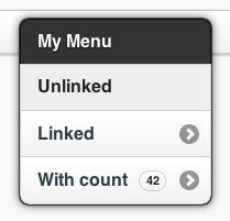
And the resulting output should resemble this:
Popup menu
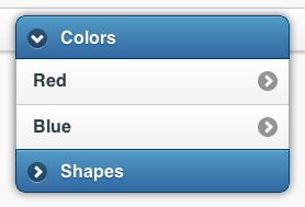
You can also use 1.2's collapsible lists in popups. Here's a quick example:
<a href="#nestedmenu" data-rel="popup" data-role="button">Nested Menu</a>
<div data-role="popup" id="nestedmenu" data-theme="none">
    <div data-role="collapsible-set" data-theme="b" data-content-theme="c" data-collapsed-icon="arrow-r" data-expanded-icon="arrow-d" style="margin:0; width:250px;">
        <div data-role="collapsible" data-inset="false">
            <h2>Colors</h2>
            <ul data-role="listview">
                <li><a href="#">Red</a></li>
                <li><a href="#">Blue</a></li>
            </ul>
        </div>
        <div data-role="collapsible" data-inset="false">
            <h2>Shapes</h2>
            <ul data-role="listview">
                <li><a href="#">Circle</a></li>
                <li><a href="#">Square</a></li>
            </ul>
        </div>
    </div>
</div>
And the results:
Popup menu
It's worth noting that data-inset="true" is required on the listview or the corners of your list will show up. Try and you'll see.
Forms

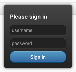
Another popular UX approach is to show a login form hovering over the top of a page. That's now possible with jQuery Mobile popups. Here's a simple username/password form.
<a href="#login" data-rel="popup" data-position-to="window" data-role="button">Login</a>
<div data-role="popup" id="login" data-theme="a">
    <form style="padding:10px 20px;">
        <h3>Please sign in</h3>
        <label for="un" class="ui-hidden-accessible">Username:</label>
        <input type="js" name="user" id="un" placeholder="username" />
        <label for="pw" class="ui-hidden-accessible">Password:</label>
        <input type="password" name="pass" id="pw" placeholder="password" />
        <button type="submit" data-theme="b">Sign in</button>
    </form>
</div>
Which gives you:
Popup menu
By default, popups center themselves over the object which triggered them. There's an optional attribute which you'll see in the next three examples. It's data-position-to="window" and you apply it to the element which triggers the popup. Try adding that to the Login button above to see what happens.
Dialogs

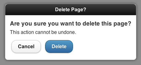
A common need for web applications is the ability to interact with the user. We just reviewed one approach: a login form. But, sometimes, you need to prompt the user with questions. A dialog is a perfect solution for this; and what do you know, popups have you covered! So what does that code look like? Here's a simple example:
<a href="#dialog" data-rel="popup" data-position-to="window" data-role="button" data-transition="pop">Dialog</a>
<div data-role="popup" id="dialog" data-overlay-theme="a" data-theme="c">
    <div data-role="header" data-theme="a">
        <h1>Delete Page?</h1>
    </div>
    <div data-role="content" data-theme="d">
        <h3>Are you sure you want to delete this page?</h3>
        <p>This action cannot be undone.</p>
        <a href="#" data-role="button" data-inline="true" data-rel="back" data-theme="c">No</a>
        <a href="#" data-role="button" data-inline="true" data-rel="back" data-theme="b">Yes, Delete it</a>
    </div>
</div>
Popup menu
In the popup content container, note another new attribute for your use: data-overlay-theme="a". This attribute is what applies the shaded background to the dialog box. It's affected by your theme, so be careful when working with themes created with ThemeRoller.

Photos

I can't count the number of times I've seen jQuery Mobile developers ask for some better way of handling image galleries. While popups aren't the perfect solution for large numbers of images, they're great for a handful of images that need to be viewed larger. Even better, it’s incredibly easy; check it out:
<a href="#photo" data-rel="popup" data-position-to="window" data-role="button" data-transition="fade">Photo</a>
<div data-role="popup" id="photo" data-overlay-theme="a" data-theme="d" data-corners="false">
    <a href="#" data-rel="back" data-role="button" data-theme="a" data-icon="delete" data-iconpos="nojs" class="ui-btn-right">Close</a><img src="http://lorempixel.com/450/300/food/" />
</div>
The above code gives you an elegant photo centered to the window, including a close window button.
Popup menu
How did they do that? Within the context of a popup, the anchor tag has attributes which behave slightly different than when used in other locations on the page. Specifically, the ui-btn-right class positions the image in the corner of the image rather than the side, while the data-icon and data-iconpos attributes allow you to style the button just as you would a regular button.
You can get pretty fancy with popups including, but not limited to, displaying inline video and even interactive maps. Check the jQuery Mobile documentation for popups and iframes.
Collapsible List Views

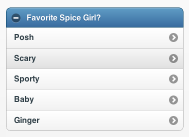
Another great new feature is the ability to combine collapsible sets with list views. Call 'em “Collapsible List Views” and you've got a brand new widget in jQuery Mobile 1.2. How do they work? I'm glad you asked. Simply create any list you like, then wrap it in a collapsible set. Collapsible List Views also support multiple lists – so get crazy!
<div data-role="collapsible" data-theme="b" data-content-theme="c">
    <h2>Favorite Spice Girl?</h2>
    <ul data-role="listview">
        <li><a href="index.html">Posh</a></li>
        <li><a href="index.html">Scary</a></li>
        <li><a href="index.html">Sporty</a></li>
        <li><a href="index.html">Baby</a></li>
        <li><a href="index.html">Ginger</a></li>
    </ul>
</div>
The code above would result in this Collapsible List View:
Popup menu

Enhancements

In addition to new widget types, jQuery Mobile 1.2 provides a number of useful enhancements to existing functionality. Let's take a look at some of the more valuable ones.

jQuery Support Changes

One of the biggest enhancements made in version 1.2 is the added support for jQuery 1.8. This brings some significant performance increases in the form of a completely rewritten Sizzle.js (the selector engine for jQuery), along with numerous other improvements.
The tradeoff is that the jQuery Mobile team decided that it was time to sunset support for jQuery 1.6. This may be unfortunate for some folks out there who are still using older versions of jQuery, but it’s a fair trade.
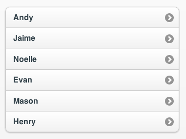
List View Autodividers

If you've ever had to manage a list of constantly changing people, places, or things in jQuery Mobile then, you've probably had to write some tricky code to display dynamic listview headers. Bummer that you spent all that time, because the jQuery Mobile team made it as easy as dropping in a single attribute.
data-autodividers="true"
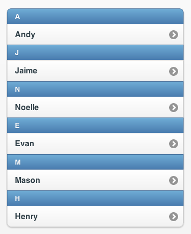
That turns this list:
Popup menu
Into:
Popup menu
Note that this does not manage sorting, grouping, or filtering. For that sort of functionality, consider trying my jQuery Mobile Tinysort plugin.

Read-Only Lists

jQuery Mobile offers "read-only" list views, but it was difficult to tell that they weren't clickable. Version 1.2 removes the list gradient, making the row a flat color. This should provide a better visual cue to your users.

Better Width adjustments on Form Elements

Version 1.2 fixes a semi-annoying issue with form elements, whereby they wouldn't take up the full width of their parent element in some cases.

Additional Devices Added

You might have noticed that new devices are being added almost on a daily basis. The jQuery Mobile team does their best to test against as many of these devices as possible. Newly added to the A grade platform list are the following devices/operating systems/browsers: iOS 6, Android 4.1 (Jellybean), Tizen, Firefox for Android, and Kindle Fire HD.

Full List of Changes

You can find a complete list of the changes made for version 1.2 on the jQuery Mobile blog.
I hope that some of these improvements will help to improve your applications. Remember that the jQuery Mobile team is on your side! If you see something that you think would be valuable, ask for it: create an issue in their Github repository, and suggest it. Better yet, fork their repo and add some code yourself!
read more

15 Stunning jQuery Lightbox Plug-ins for Your Upcoming Designs

If you see a website built on jQuery using images, they must have played with a lightbox in that context. That’s the power of the lightbox, it can transform any simple image library into an attractive and effective gallery. It’s an important and popular contribution from the jQuery side to the design community.
Thanks to the awesome jQuery community who make these stunning lightbox plug-ins, giving huge scope for designers to showcase images on websites. There is a huge collection of plug-ins each giving a different look and style to images.
We collected 15 stunning jQuery lightbox plug-ins for your reference. Hope you’ll find it worth having a look.
jQuery Lightbox Plug-ins


Stunning jQuery Lightbox Plug-ins

Lightview jQuery Plug-in

Lightview was built to change the way you overlay content on a website.
Lightview jQuery Plug-in
TopUp

TopUp is an easy to use JavaScript library for unobtrusively displaying images and Web pages in a Web 2.0 approach of pop-up. The library is jQuery and jQuery UI driven in order to maintain cross-browser compatibility and compactness.
TopUp
Highslide Lightbox Plug-in

Highslide JS is an image, media and gallery viewer written in JavaScript.
Highslide Lightbox Plug-in
Color Box

A lightweight customizable lightbox plug-in for jQuery 1.3+
Color Box
Lightbox 2

Lightbox 2 is a simple, unobtrusive script used to overlay images on the current page. It's a snap to set up and works on all modern browsers.
Lightbox 2
prettyPhoto

prettyPhoto is a jQuery lightbox clone. Not only does it support images, it also supports videos, flash, YouTube, frames and Ajax. It’s a full blown media lightbox.
prettyPhoto
Slimbox 2

Slimbox 2 is a 4 KB visual clone of the popular Light box 2 script by Lokesh Dhaka, written using the jQuery JavaScript library.
Slimbox 2
Shadowbox

Shadowbox is a web-based media viewer application that supports all of the web's most popular media publishing formats. Shadowbox is written entirely in JavaScript and CSS and is highly customizable.
Shadowbox
Pirobox Extended V.1.0.

One of the most important things with this plug-in is the ability to open any kind of file, from inline content to .swf files, from simple images to .pdf files.
Other things are: automatic image resizing and drag and drop.
Pirobox Extended V.1.0
GreyBox

GreyBox can be used to display websites, images and other content in a beautiful way.
GreyBox
jQuery Super Box

jQuery Super box! Is a script which allows you to display windows with the lightbox effect.
This script is a plug-in for jQuery (1.3.x).
jQuery Super Box
Fancy Box

Fancy Box is a tool for displaying images, HTML content and multimedia in a Mac-style "light box" that floats overtop of web page.
Fancy Box
Pirobox Extended V.1.1.

Pirobox Extended V.1.1 advanced version, Zoom In option with dragable image viewer for large dimension images.
Pirobox Extended V.1.1
jQuery Lightbox Plug-in

JQuery lightbox plug-in is simple, elegant, and unobtrusive, no need for extra markup, and is used to overlay images on the current page through the power and flexibility of jQuery´s selector.
jQuery Lightbox Plug-in
Ceebox

An overlay pop-up script for easily embedding flash video, displaying images, or showing HTML (either external sites via iframe or content on your own site via AJAX).
Ceebox

Conclusion

Do you use any of these lightboxes in your website design work? Do you have a favorite lightbox plug-in? If you do and we haven't listed it here, please share the link with us in the comments below. Your comments and opinions are always very welcome.

Written by: Carol Francis for Onextrapixel - Web Design & Development Online Magazine | One comment
read more

Creating a Filterable Portfolio with WordPress and jQuery

"Learn in this tutorial how to make a filterable Portfolio with jQuery integrated with WordPress, remember that this portfolio kind can make a big difference on your themes!


Step 1: Introduction

You can use the code from this tutorial in any theme that you’ve created or are creating, we’ll follow simple steps and in my case, I’ll use the default Twenty Eleven theme and running on WordPress 3.3. Okay, let’s work!
You can use the code used in this tutorial in any theme that you’ve created or are creating.

Step 2: Creating the Project Item on Admin

We’ll need to create a section on Admin bar called Project, in this section you’ll create all the portfolio entries with their respective thumbnail and demo link.
Open the functions.php file and at the end, let’s create a function to register the Project item. (You can see the complete function at the end of this step)
add_action('init', 'project_custom_init');   

/* SECTION - project_custom_init */
function project_custom_init()
{
 // the remainder code goes here
}
/* #end SECTION - project_custom_init --*/
In this code we are using the add_action function so that when WordPress begins to load our function will be called.
Inside the project_custom_init function lets add the code that registers a Custom Post Type called Project.
// The following is all the names, in our tutorial, we use "Project"
 $labels = array(
  'name' => _x('Projects', 'post type general name'),
  'singular_name' => _x('Project', 'post type singular name'),
  'add_new' => _x('Add New', 'project'),
  'add_new_item' => __('Add New Project'),
  'edit_item' => __('Edit Project'),
  'new_item' => __('New Project'),
  'view_item' => __('View Project'),
  'search_items' => __('Search Projects'),
  'not_found' =>  __('No projects found'),
  'not_found_in_trash' => __('No projects found in Trash'),
  'parent_item_colon' => '',
  'menu_name' => 'Portfolio'
 );

 // Some arguments and in the last line 'supports', we say to WordPress what features are supported on the Project post type
 $args = array(
  'labels' => $labels,
  'public' => true,
  'publicly_queryable' => true,
  'show_ui' => true,
  'show_in_menu' => true,
  'query_var' => true,
  'rewrite' => true,
  'capability_type' => 'post',
  'has_archive' => true,
  'hierarchical' => false,
  'menu_position' => null,
  'supports' => array('title','editor','author','thumbnail','excerpt','comments')
 );

 // We call this function to register the custom post type
 register_post_type('project',$args);
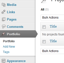
The code above will add an item on the Admin menu called Portfolio and it will be in this section that we’ll create all the portfolio items.
Now, inside the function, let’s add more code.
// Initialize Taxonomy Labels
 $labels = array(
  'name' => _x( 'Tags', 'taxonomy general name' ),
  'singular_name' => _x( 'Tag', 'taxonomy singular name' ),
  'search_items' =>  __( 'Search Types' ),
  'all_items' => __( 'All Tags' ),
  'parent_item' => __( 'Parent Tag' ),
  'parent_item_colon' => __( 'Parent Tag:' ),
  'edit_item' => __( 'Edit Tags' ),
  'update_item' => __( 'Update Tag' ),
  'add_new_item' => __( 'Add New Tag' ),
  'new_item_name' => __( 'New Tag Name' ),
 );

 // Register Custom Taxonomy
 register_taxonomy('tagportfolio',array('project'), array(
  'hierarchical' => true, // define whether to use a system like tags or categories
  'labels' => $labels,
  'show_ui' => true,
  'query_var' => true,
  'rewrite' => array( 'slug' => 'tag-portfolio' ),
 ));
Attention to the ‘hierarchical’ argument on the register_taxonomy function, if you type true you will have a system like categories for your portfolio items, but if you type false you will have a system like tags. I prefer the category style system.
Oh yeah! The project_custom_init() function is finished! See below for the full code of this function.
add_action('init', 'project_custom_init'); 

 /*-- Custom Post Init Begin --*/
 function project_custom_init()
 {
   $labels = array(
  'name' => _x('Projects', 'post type general name'),
  'singular_name' => _x('Project', 'post type singular name'),
  'add_new' => _x('Add New', 'project'),
  'add_new_item' => __('Add New Project'),
  'edit_item' => __('Edit Project'),
  'new_item' => __('New Project'),
  'view_item' => __('View Project'),
  'search_items' => __('Search Projects'),
  'not_found' =>  __('No projects found'),
  'not_found_in_trash' => __('No projects found in Trash'),
  'parent_item_colon' => '',
  'menu_name' => 'Project'

   );

  $args = array(
  'labels' => $labels,
  'public' => true,
  'publicly_queryable' => true,
  'show_ui' => true,
  'show_in_menu' => true,
  'query_var' => true,
  'rewrite' => true,
  'capability_type' => 'post',
  'has_archive' => true,
  'hierarchical' => false,
  'menu_position' => null,
  'supports' => array('title','editor','author','thumbnail','excerpt','comments')
   );
   // The following is the main step where we register the post.
   register_post_type('project',$args);

   // Initialize New Taxonomy Labels
   $labels = array(
  'name' => _x( 'Tags', 'taxonomy general name' ),
  'singular_name' => _x( 'Tag', 'taxonomy singular name' ),
  'search_items' =>  __( 'Search Types' ),
  'all_items' => __( 'All Tags' ),
  'parent_item' => __( 'Parent Tag' ),
  'parent_item_colon' => __( 'Parent Tag:' ),
  'edit_item' => __( 'Edit Tags' ),
  'update_item' => __( 'Update Tag' ),
  'add_new_item' => __( 'Add New Tag' ),
  'new_item_name' => __( 'New Tag Name' ),
   );
  // Custom taxonomy for Project Tags
  register_taxonomy('tagportfolio',array('project'), array(
  'hierarchical' => true,
  'labels' => $labels,
  'show_ui' => true,
  'query_var' => true,
  'rewrite' => array( 'slug' => 'tag-portfolio' ),
   ));

 }
 /*-- Custom Post Init Ends --*/
If you go to the Admin now, you will see a new item on menu called Portfolio like the image below:
Let’s create a new function that will ensure nice messages are shown when the user, for example, creates a new item on portfolio or something like this.
The code below must be typed below our last function and not inside it.
/*--- Custom Messages - project_updated_messages ---*/
 add_filter('post_updated_messages', 'project_updated_messages');

 function project_updated_messages( $messages ) {
   global $post, $post_ID;

   $messages['project'] = array(
  0 => '', // Unused. Messages start at index 1.
  1 => sprintf( __('Project updated. <a href="%s">View project</a>'), esc_url( get_permalink($post_ID) ) ),
  2 => __('Custom field updated.'),
  3 => __('Custom field deleted.'),
  4 => __('Project updated.'),
  /* translators: %s: date and time of the revision */
  5 => isset($_GET['revision']) ? sprintf( __('Project restored to revision from %s'), wp_post_revision_title( (int) $_GET['revision'], false ) ) : false,
  6 => sprintf( __('Project published. <a href="%s">View project</a>'), esc_url( get_permalink($post_ID) ) ),
  7 => __('Project saved.'),
  8 => sprintf( __('Project submitted. <a target="_blank" href="%s">Preview project</a>'), esc_url( add_query_arg( 'preview', 'true', get_permalink($post_ID) ) ) ),
  9 => sprintf( __('Project scheduled for: <strong>%1$s</strong>. <a target="_blank" href="%2$s">Preview project</a>'),
    // translators: Publish box date format, see http://php.net/date
    date_i18n( __( 'M j, Y @ G:i' ), strtotime( $post->post_date ) ), esc_url( get_permalink($post_ID) ) ),
  10 => sprintf( __('Project draft updated. <a target="_blank" href="%s">Preview project</a>'), esc_url( add_query_arg( 'preview', 'true', get_permalink($post_ID) ) ) ),
   );

   return $messages;
 }

 /*--- #end SECTION - project_updated_messages ---*/
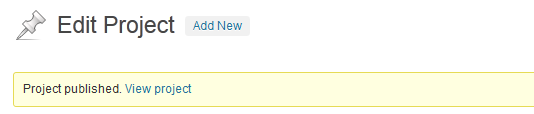
This function creates custom messages for when a user modifies the portfolio post, see a message example on image below:
You can see that with only this code you can add tags/categories to your portfolio and create new portfolio items! But let’s add more one feature, good idea? Sure!

Adding a Demo URL Meta Box

In this step, we’ll add a meta box on the portfolio item creation screen where the user can paste a url to the website or other page.
Let’s create three functions to add this meta box where we will save our URL for the portfolio item. The code goes below the last function that we’ve created.
/*--- Demo URL meta box ---*/

 add_action('admin_init','portfolio_meta_init');

 function portfolio_meta_init()
 {
  // add a meta box for WordPress 'project' type
  add_meta_box('portfolio_meta', 'Project Infos', 'portfolio_meta_setup', 'project', 'side', 'low');

  // add a callback function to save any data a user enters in
  add_action('save_post','portfolio_meta_save');
 }

 function portfolio_meta_setup()
 {
  global $post;

  ?>
   <div class="portfolio_meta_control">
    <label>URL</label>
    <p>
     <input type="text" name="_url" value="<?php echo get_post_meta($post->ID,'_url',TRUE); ?>" style="width: 100%;" />
    </p>
   </div>
  <?php

  // create for validation
  echo '<input type="hidden" name="meta_noncename" value="' . wp_create_nonce(__FILE__) . '" />';
 }

 function portfolio_meta_save($post_id)
 {
  // check nonce
  if (!isset($_POST['meta_noncename']) || !wp_verify_nonce($_POST['meta_noncename'], __FILE__)) {
  return $post_id;
  }

  // check capabilities
  if ('post' == $_POST['post_type']) {
  if (!current_user_can('edit_post', $post_id)) {
  return $post_id;
  }
  } elseif (!current_user_can('edit_page', $post_id)) {
  return $post_id;
  }

  // exit on autosave
  if (defined('DOING_AUTOSAVE') == DOING_AUTOSAVE) {
  return $post_id;
  }

  if(isset($_POST['_url']))
  {
   update_post_meta($post_id, '_url', $_POST['_url']);
  } else
  {
   delete_post_meta($post_id, '_url');
  }
 }

 /*--- #end  Demo URL meta box ---*/
I won’t explain in details this code because you can learn about meta boxes in this tutorial: Reusable Custom Meta Boxes or just do a little search through the WordPress Codex or on Google.
The code above just creates one meta box with one field where the user can type a URL. We need all these functions, the first just initializes the meta box, the second is the meta box code, and the last is a function to save the data.
Ok! After this, we can go on to next step and work on the front-end, because the back-end is done! We’ll then add the content after.

Step 3: Creating the Portfolio Page template

Now we’ll work to show our portfolio entries to the user! But first let’s create some categories and then add some items to the portfolio.
In this tutorial I’ll use a two column portfolio layout, with some adjustments on markup and CSS you can create a lots of layouts!
A few tips to create a portfolio item
  • Create the tags/categories first
  • In the “Add New Project” page you’ll have an editor like the post/page editor, then just type all the text and images that your user will see when they click on the “More Details” link
  • To add thumbnails we’ll use the Featured Image that is a default WordPress feature
  • In this tutorial I’ll use images with 400px x 160px (width and height), but feel free to use one that you like and that fits in your layout
  • Use http:// before the links on the meta box so you don’t get a 404 not found error
Ok, the first thing that we’ll need to do now is create a new Page Template called “Portfolio 2 Columns”, so let’s go!

Creating the Page Template

First, duplicate the page.php file. Then, rename it to page_portfolio_2c.php.
We need to edit this new file and paste the code below on the file’s first line:
<?php
/*
Template Name: Portfolio 2 Columns
*/
?>
This will show a new option on the page creation screen, but remember that this code MUST be pasted on the file’s first line!
Now just erase all the content inside content div, in this tutorial, I’m using the Twenty Eleven theme and after erasing, I have this code in my file:
<?php
/*
Template Name: Portfolio 2 Columns
*/
?>

<?php
get_header(); ?>

  <div id="primary">
   <div id="content" role="main">

    <?php // I removed all the lines here ?>

   </div><!-- #content -->
  </div><!-- #primary -->

<?php get_footer(); ?>
If you are using your own theme, then erase all the lines that get content from your page, like the_content() for example. We’ll create some custom code, so don’t leave other code here, in the portfolio page we just need your projects!
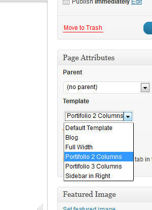
Now, go to WordPress Admin and create a new Page called “Portfolio” and don’t forget to select “Portfolio 2 Columns” in the Template field, like the image below.
Just add a title and leave the content blank, we don’t need it.
If you try to access the page now you’ll get only the header, footer and blank content. So, let’s add life to our filterable portfolio!

Step 4:The jQuery Filterable Portfolio

Let’s talk a little about the plugin that we’ll use to make the portfolio.

The plugin

In this tutorial I’ll make use of a plugin called Filterable, this plugin was created by GetHifi.
This plugin was written without jQuery’s compatibility mode, so I just changed it and the version that works fine with WordPress is in the Source Code file for this tutorial.
The plugin is a little old, to be more exact, it’s from 2009, but it’s on MIT License, so you can use on premium themes, commercial sites and wherever you like.
Just download the modified script that is on Source Code (link on tutorial top) and let’s begin! If you like, visit the homepage to get more details about it.

How Filterable works

Using Filterable is very simple! The first step is use the right markup, the plugin expects markup like the example below:
<ul id="portfolio-filter">
  <li><a href="#all">All</a>
  <li><a rel="jquery" href="#jquery">jQuery</a>
  <li><a rel="webdesign" href="#webdesign">Webdesign</a>
 </ul>
Here we have the filter items, when we click on one of these links, then all the magic will happen. Important: all the entries will need a class with the same text in the ‘href’ and ‘rel’ attributes.
And now, we have the portfolio items markup:
<div id="portfolio-wrapper">
  <ul id="portfolio-list">

   <li class="portfolio-item all webdesign">
    <!-- ALL CUSTOM MARKUP HERE -->
   </li>

   <li class="portfolio-item all jquery">
    <!-- ALL CUSTOM MARKUP HERE -->
   </li>

  </ul>
  <div class="clearboth"></div>
 </div>
Important: What really matters here is that all the items (li) must be inside a (ul), in other words, must be wrapped. Note that we use a div too, we use it because we’ll ‘float’ the li elements, so it is important to have another wrapper and a clear div to avoid structure breaking problems.
After this, we’ll need to call the filterable script in our functions.php file and initialize the filterable portfolio by calling the filterable() function, like the code below:
<script>
  jQuery(document).ready(function() {
   jQuery("#portfolio-list").filterable();
  });
 </script>
But for now, we’ll add our custom markup inside the li, but, we’ll need to generate all the filters and class names with PHP to get all the categories, portfolio entries and all the other details from WordPress! Let’s work!

Creating the Portfolio Filter

Let’s back to the page_portfolio_2c.php file and write the portfolio filter. The code actually is something like the code below:
<?php
/*
Template Name: Portfolio 2 Columns
*/
?>

<?php
get_header(); ?>

  <div id="primary">
   <div id="content" role="main">

    <!-- WE'LL ADD OUR CODE HERE, INSIDE CONTENT DIV -->

   </div><!-- #content -->
  </div><!-- #primary -->

<?php get_footer(); ?>
We need get all the terms/categories from WordPress, edit some names to use inside the class attribute and print a ul for the required template.
We’ll type the following code inside the #content div:
<?php
  $terms = get_terms("tagportfolio");
  $count = count($terms);
  echo '<ul id="portfolio-filter">';
  echo '<li><a href="#all" title="">All</a></li>';
   if ( $count > 0 )
   {
    foreach ( $terms as $term ) {
     $termname = strtolower($term->name);
     $termname = str_replace(' ', '-', $termname);
     echo '<li><a href="#'.$termname.'" title="" rel="'.$termname.'">'.$term->name.'</a></li>';
    }
   }
  echo "</ul>";
 ?>
The code above will generate a ul with the default element ‘All’, and do a loop on terms to print all other categories that have entries. Let’s do a more detailed explanation:
First, we create a variable called $terms, and we use the get_terms() function that returns an array with all terms. As a parameter, the function requires a string or an array of strings with the taxonomy name(s), we pass tagportfolio, that was the name we used in our functions.php file. You can get more detailed info under get_terms() in the WordPress Codex.
Then, we create a variable called $count and use the count() function to get the total number of elements in the array, we print the default markup and the All item.
After that, we verify if the $count variable is greater than zero, if yes, we have at least one category with items to print.
Inside if, we create a foreach loop to get all array values, and create a different li element for each element in the $terms array.
Inside foreach, we create a variable called $termname to store the term name, remember that we change the text to lower case, because this variable will be used inside the class attribute. Then, we just replace any white space with a - using the str_replace function, this line will enable you to use categories/terms with more than one word, like “WordPress Themes” for example. And last, we print an li element and use our variables to print the data in the right place.
If you test now, you’ll see a categories/terms list with the names that you created in WordPress Admin. Now, let’s work on the items.

Displaying the Portfolio Items

Now let’s display the portfolio items, we need do it following the required template shown above.
We’ll do it just adding the code below:
<?php
 $loop = new WP_Query(array('post_type' => 'project', 'posts_per_page' => -1));
 $count =0;
?>

<div id="portfolio-wrapper">
 <ul id="portfolio-list">

  <?php if ( $loop ) :

   while ( $loop->have_posts() ) : $loop->the_post(); ?>

    <?php
    $terms = get_the_terms( $post->ID, 'tagportfolio' );

    if ( $terms && ! is_wp_error( $terms ) ) :
     $links = array();

     foreach ( $terms as $term )
     {
      $links[] = $term->name;
     }
     $links = str_replace(' ', '-', $links);
     $tax = join( " ", $links );
    else :
     $tax = '';
    endif;
    ?>

    <?php $infos = get_post_custom_values('_url'); ?>

    <li class="portfolio-item <?php echo strtolower($tax); ?> all">
     <div class="thumb"><a href="<?php the_permalink() ?>"><?php the_post_thumbnail( array(400, 160) ); ?></a></div>
     <h3><a href="<?php the_permalink() ?>"><?php the_title(); ?></a></h3>
     <p class="excerpt"><a href="<?php the_permalink() ?>"><?php echo get_the_excerpt(); ?></a></p>
     <p class="links"><a href="<?php echo $infos[0]; ?>" target="_blank">Live Preview →</a> <a href="<?php the_permalink() ?>">More Details →</a></p>
    </li>

   <?php endwhile; else: ?>

    <li class="error-not-found">Sorry, no portfolio entries found.</li>

  <?php endif; ?>

 </ul>

 <div class="clearboth">
</div>
A lot of lines of code, no? But don’t worry, I’ll explain the code for you.
The first step is create a custom query, we do it with WP_Query function, I pass as parameter the custom post type “project”, that we created on functions.php file. This query will get all the projects that you’ve created.
Then, I do a loop like we do normally with post exhibition, for example.
Inside the while, we do the same process used on filter creation, but here we create a array called links where we’ll store all the terms of the post. Note that now, beyond the taxonomy name we pass the post ID in get_the_terms().
Then, we use join and create a unique string with all array elements, if the post terms are “WordPress” and “Design”, the $tax variable will be equal to “wordpress design”, we’ll use this to add the right classes to allow the portfolio to be filterable. If the post doesn’t have terms, we just set $tax being equal to a blank string.
After this, we create a variable called $infos where we’ll get the demo url from our Custom Post Field created in the functions.php file
Then, we just print the template markup and make use of functions like get_the_excerpt(), the_post_thumbnail (note that you can change the dimensions to fit your layout, if you for example, would like to create a three column portfolio.)
If you update the page, you will see all the items listed, but the filter still doesn’t work. Let’s fix it!

Using Filterable in WordPress

Now, let’s use our plugin. Did you already download it? If yes, copy and paste the filterable.js file inside the js/ folder.
In the functions.php file, let’s add the jQuery library to the ‘head’ tag first. To do it we’ll use a custom function and the wp_enqueue_script function.
function enqueue_filterable()
 {
  wp_register_script( 'filterable', get_template_directory_uri() . '/js/filterable.js', array( 'jquery' ) );
  wp_enqueue_script( 'filterable' );
 }
 add_action('wp_enqueue_scripts', 'enqueue_filterable');
Now, back to the page_portfolio_2c.php file and below the last code added but inside the content div, add the following code:
<script>
  jQuery(document).ready(function() {
   jQuery("#portfolio-list").filterable();
  });
 </script>
This only links the plugin to the page and calls the filterable() function to make our portfolio filterable.

Full Code

<?php
/*
Template Name: Portfolio 2 Columns
*/
?>

<?php
get_header(); ?>

  <div id="primary">
   <div id="content" role="main">

   <?php
     $terms = get_terms("tagportfolio");
     $count = count($terms);
     echo '<ul id="portfolio-filter">';
     echo '<li><a href="#all" title="">All</a></li>';
     if ( $count > 0 ){

      foreach ( $terms as $term ) {

       $termname = strtolower($term->name);
       $termname = str_replace(' ', '-', $termname);
       echo '<li><a href="#'.$termname.'" title="" rel="'.$termname.'">'.$term->name.'</a></li>';
      }
     }
     echo "</ul>";
   ?>

   <?php
    $loop = new WP_Query(array('post_type' => 'project', 'posts_per_page' => -1));
    $count =0;
   ?>

   <div id="portfolio-wrapper">
    <ul id="portfolio-list">

    <?php if ( $loop ) :

     while ( $loop->have_posts() ) : $loop->the_post(); ?>

      <?php
      $terms = get_the_terms( $post->ID, 'tagportfolio' );

      if ( $terms && ! is_wp_error( $terms ) ) :
       $links = array();

       foreach ( $terms as $term )
       {
        $links[] = $term->name;
       }
       $links = str_replace(' ', '-', $links);
       $tax = join( " ", $links );
      else :
       $tax = '';
      endif;
      ?>

      <?php $infos = get_post_custom_values('_url'); ?>

      <li class="portfolio-item <?php echo strtolower($tax); ?> all">
       <div class="thumb"><a href="<?php the_permalink() ?>"><?php the_post_thumbnail( array(400, 160) ); ?></a></div>
       <h3><a href="<?php the_permalink() ?>"><?php the_title(); ?></a></h3>
       <p class="excerpt"><a href="<?php the_permalink() ?>"><?php echo get_the_excerpt(); ?></a></p>
       <p class="links"><a href="<?php echo $infos[0]; ?>" target="_blank">Live Preview →</a> <a href="<?php the_permalink() ?>">More Details →</a></p>
      </li>

     <?php endwhile; else: ?>

     <li class="error-not-found">Sorry, no portfolio entries for while.</li>

    <?php endif; ?>

    </ul>

    <div class="clearboth"></div>

   </div> <!-- end #portfolio-wrapper-->

   <script>
    jQuery(document).ready(function() {
     jQuery("#portfolio-list").filterable();
    });
   </script>

   </div><!-- #content -->
  </div><!-- #primary -->

<?php get_footer(); ?>

Step 5: Some style

Now that we’ve coded everything that we need, let’s add some CSS to our style.css file, if you have other files just add the code there.
/* CLEARFIX
----------------------------------------------- */

.clearboth {
 display: block;
 margin: 0;
 padding: 0;
 clear: both;
}

/* PORTFOLIO FILTER STYLE
----------------------------------------------- */

#portfolio-filter {
 list-style-type: none;
}

#portfolio-filter li {
 display: inline;
 padding-right: 10px;
}

#portfolio-filter li a {
 color: #777;
 text-decoration: none;
}

#portfolio-filter li .current,
#portfolio-filter li:hover {
 color: #084a9a;
}

/* PORTFOLIO LIST STYLE
----------------------------------------------- */

#portfolio-wrapper {
 padding-bottom: 25px;
}

#portfolio-list {
 list-style-type: none;

}

#portfolio-list .portfolio-item {
 width: 400px;
 float: left;
 margin-right: 5px;
}

#portfolio-list .portfolio-item h3 a {
 color: #084a9a;
 text-transform: uppercase;
 font-weight: bold;
}

#portfolio-list .portfolio-item .excerpt
{
 text-align: justify;
 font-size: 14px;
 line-height: 18px;
 padding-right: 15px;
 margin-bottom: 5px;
}

#portfolio-list .portfolio-item .excerpt a {
 color: #555;
}

#portfolio-list .portfolio-item .excerpt a:hover {
 text-decoration: none;
}
Now, if you test again you’ll get a nice filterable portfolio! Wow, all the work is done!

Conclusion

And it’s done! Now you know how to create an amazing filterable portfolio with a free jQuery plugin that you can use in any work that you do.
I hope that you enjoy the content, thank you very much for reading!"
read more

Content Rotator with jQuery

"
View demo Download source
Today we want to share a fancy content rotator with you. It shows some image with a headline and sub-headline in each slide and allows navigating through the slides using the thumbnails that also contain a headline. Hiding the thumbnails will reveal a scrollable text container and the navigation arrows will move up so that one can navigate to the previous or next slides.
The beautiful images are by Andrey & Lili. The images are licensed under the Attribution-NonCommercial 3.0 Unported (CC BY-NC 3.0) License.
We also use the jQuery Mousewheel Plugin by Brandon Aaron and the jScrollPane Plugin by Kevin Luck.

Examples

We have two examples, one with autoplay and one without:
For the HTML structure we will have a main container, the content wrapper and the container for the thumbs. Each cr-content-container needs an ID assigned which we will reference in each thumb with data-content:
<div class="cr-container" id="cr-container">
 <div class="cr-content-wrapper" id="cr-content-wrapper">
  <div class="cr-content-container" id="content-1" style="display:block;">
   <img src="images/1.jpg"class="cr-img"/>
   <div class="cr-content">
    <div class="cr-content-headline">
     <h2>The slide title</h2>
     <h3>
      <span>Some sub-title</span>
      <a href="#" class="cr-more-link"> read more →</a>
     </h3>
    </div>
    <div class="cr-content-text">
     <p>Some text here...</p>
    </div>
   </div><!-- cr-content -->
  </div><!-- cr-content-container -->
  <div class="cr-content-container" id="content-2">
   ...
  </div><!-- cr-content-container -->
  ...
 </div><!-- cr-content-wrapper -->
 <div class="cr-thumbs">
  <div data-content="content-1" class="cr-selected">
   <img src="images/thumbs/1.jpg"/>
   <h4>The slide title</h4>
  </div>
  <div data-content="content-2">
   <img src="images/thumbs/2.jpg"/>
   <h4>Another slide title</h4>
  </div>
  ...
 </div><!-- cr-thumbs -->
</div><!-- cr-container -->
The default options are the following:
$('#cr-container').crotator({
 // slideshow on
 autoplay    : false,
 // slideshow interval
 slideshow_interval  : 3000,
 // if true the thumbs will be shown initially
 openThumbs   : true,
 // speed that the thumbs are shown / hidden
 toggleThumbsSpeed : 300
});
We hope you like this little content rotator and find it useful!
View demo Download source
"
read more

Bubble-Shaped Tooltips With jQuery: Grumble.js

"
Grumble.js, a jQuery plugin by the developers of Huddle.com, enables us to create tooltips as bubbles.
The positioning of these tooltips are very flexible and, with the help of "angle" and "distance" settings, they can be pixel-perfectly placed (by using CSS3 transforms and Matrix filters for IE).
Grumble.js
Bubbles come from a sprite image and the plugin decides which image to use according to the size of the text.
Tooltips are displayed with a fadeIn/fadeOut effect, can be set to auto-disappear or stay visible until they are closed.
There are also callbacks on every level: onShow, onBeginHide and onHide.
"
read more

Professional Javascript Select Boxes for jQuery & Prototype

"
Chosen is a javascript plug-in makes long, unwieldy select boxes much more user-friendly. It is currently available in both jQuery and Prototype flavors. Instead of forcing your users to scroll through a giant list of items, they can just start typing the name of the item they were looking for.
Add Chosen’s files to your app and then add the class chzn-select to your select box. Chosen automatically respects optgroups, selected state, the multiple attribute and browser tab order. You don’t need to do anything else except customize the style as you see fit.
chosen-select-javascript
Requirements: jQuery or Prototype Framework Demo: http://harvesthq.github.com/chosen/ License: MIT License
"
read more

How to Create a jQuery Image Cropping Plugin from Scratch – Part I

"
Web applications need to provide easy-to-use solutions for uploading and manipulating rich content. This process can create difficulties for some users who have minimal photo editing skills. Cropping is one of the most used photo manipulation techniques, and this step-by-step tutorial will cover the entire development process of an image cropping plug-in for the jQuery JavaScript library.


Step 1. Setting Up The Workspace

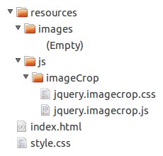
First, we are going to set up our project workspace for this tutorial. Begin by creating a hierarchy of directories and empty files named as exemplified in the image below:
Directory tree
Next, you’ll need to download the jQuery JavaScript library and place it inside the /resources/js/ folder. The image used in this tutorial must be named example.jpg and placed inside the /resources/images/ folder. You can use this image (thanks to gsso-stock), provided with the source files of this tutorial, or one of your own. And the last file is the outline.gif file, which must be placed inside the /resources/js/imageCrop/ folder.

Step 2. Creating The Test Page

To test our plug-in, we’ll need to attach it to an image. Before starting to work at it, we’ll create a simple page containg that image.

The HTML

Open up the index.html file in your favorite text editor and write the following code.
<!DOCTYPE html PUBLIC "-//W3C//DTD XHTML 1.0 Transitional//EN" "http://www.w3.org/TR/xhtml1/DTD/xhtml1-transitional.dtd">
<html lang="en" xml:lang="en" xmlns="http://www.w3.org/1999/xhtml">
   <head>
       <meta content="text/html; charset=UTF-8" http-equiv="Content-Type" />
       <title>jQuery Image Cropping Plug-In</title>
       <link href="style.css" media="screen" rel="stylesheet" type="text/css" />
       <link href="resources/js/imageCrop/jquery.imagecrop.css" media="screen" rel="stylesheet" type="text/css" />
       <script src="resources/js/jquery-1.6.2.min.js" type="text/javascript"></script>
       <script src="resources/js/imageCrop/jquery.imagecrop.js" type="text/javascript"></script>
   </head>

   <body>
       <div id="wrapper">
           <h1>jQuery Image Cropping Plug-In</h1>

           <div class="image-decorator">
               <img alt="jQuery Image Cropping Plug-In" height="360" id="example" src="resources/images/example.jpg" width="480" />
           </div><!-- .image-decorator -->
       </div><!-- #wrapper -->
   </body>
</html>
There’s nothing fancy here: just plain HTML code. We have loaded a stylesheet for the page, jQuery, our plug-in files (which are currently empty) and placed an image inside the document.

The CSS

Now edit style.css as shown above.
* {
   margin : 0;
   outline : 0;
   padding : 0;
}

body {
   background-color : #ededed;
   color : #646464;
   font-family : 'Verdana', 'Geneva', sans-serif;
   font-size : 12px;
   text-shadow : 0 1px 0 #ffffff;
}

h1 {
   font-size : 24px;
   font-weight : normal;
   margin : 0 0 10px 0;
}

div#wrapper {
   margin : 25px 25px 25px 25px;
}

div.image-decorator {
   -moz-border-radius : 5px 5px 5px 5px;
   -moz-box-shadow : 0 0 6px #c8c8c8;
   -webkit-border-radius : 5px 5px 5px 5px;
   -webkit-box-shadow : 0 0 6px #c8c8c8;
   background-color : #ffffff;
   border : 1px solid #c8c8c8;
   border-radius : 5px 5px 5px 5px;
   box-shadow : 0 0 6px #c8c8c8;
   display : inline-block;
   height : 360px;
   padding : 5px 5px 5px 5px;
   width : 480px;
}
We’ve customized the aspect of our page by changing the background color and adding some basic styling to the title and image.

Step 3. Writing A Basic jQuery Plug-In

Let’s begin by creating a basic jQuery plug-in.
"Learn more about how to write your own plug-in, via this post. It outlines the basics, best practices and common pitfalls to watch out for as you begin writing your plug-in."
Open /resources/js/imageCrop/jquery.imagecrop.js and add the following code.
// Always wrap a plug-in in '(function($) { // Plug-in goes here }) (jQuery);'
(function($) {
   $.imageCrop = function(object, customOptions) {};

   $.fn.imageCrop = function(customOptions) {
       //Iterate over each object
       this.each(function() {
           var currentObject = this,
               image = new Image();

           // And attach imageCrop when the object is loaded
           image.onload = function() {
               $.imageCrop(currentObject, customOptions);
           };

           // Reset the src because cached images don't fire load sometimes
           image.src = currentObject.src;
       });

       // Unless the plug-in is returning an intrinsic value, always have the
       // function return the 'this' keyword to maintain chainability
       return this;
   };
}) (jQuery);
We have just extended jQuery by adding a new function property to the jQuery.fn object. Now we have a very basic plug-in that iterates over each object and attaches imageCrop when the object is loaded. Note that the cached images don’t fire load sometimes, so we reset the src attribute to fix this issue.

Step 4. Adding Customizable Options

Allowing for customization options makes a plug-in far more flexible for the user.
$.imageCrop = function(object, customOptions) {
   // Rather than requiring a lengthy amount of arguments, pass the
   // plug-in options in an object literal that can be extended over
   // the plug-in's defaults
   var defaultOptions = {
       allowMove : true,
       allowResize : true,
       allowSelect : true,
       minSelect : [0, 0],
       outlineOpacity : 0.5,
       overlayOpacity : 0.5,
       selectionPosition : [0, 0],
       selectionWidth : 0,
       selectionHeight : 0
   };

   // Set options to default
   var options = defaultOptions;

   // And merge them with the custom options
   setOptions(customOptions);
};
We have defined an array with the default options, then merged them with the custom options by calling the setOptions function. Let’s go further and write the body of this function.
...

// Merge current options with the custom option
function setOptions(customOptions) {
   options = $.extend(options, customOptions);
};
The $.extend() function merges the content of two or more objects together into the first object.

The Options

The following list describes each option of the plug-in.
  • allowMove – Specifies if the selection can be moved (default value is true).
  • allowResize – Specifies if the selection can be resized (default value is true).
  • allowSelect – Specifies if the user can make a new selection (default value is true).
  • minSelect – The minimum area size to register a new selection (default value is [0, 0]).
  • outlineOpacity – The outline opacity (default value is 0.5).
  • overlayOpacity – The overlay opacity (default value is 0.5).
  • selectionPosition – The selection position (default value is [0, 0]).
  • selectionWidth – The selection width (default value is 0).
  • selectionHeight – The selection height (default value is 0).

Step 5. Setting Up The Layers

On this step, we’ll modify the DOM to get prepared for the next step: the plug-in’s interface.
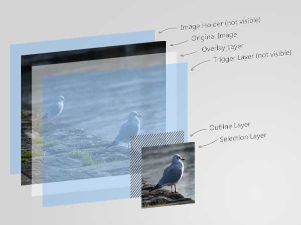
Layers overview
First, we’ll initialize the image layer.
...

// Initialize the image layer
var $image = $(object);
Now initialize an image holder.
...

// Initialize an image holder
var $holder = $('<div />')
   .css({
       position : 'relative'
   })
   .width($image.width())
   .height($image.height());

// Wrap the holder around the image
$image.wrap($holder)
   .css({
       position : 'absolute'
   });
As you can see, the holder layer has the same size as the image and a relative position. Next, we call the .wrap() function to place the image inside the holder.
Above the image will be the overlay layer.
...

// Initialize an overlay layer and place it above the image
var $overlay = $('<div id="image-crop-overlay" />')
   .css({
       opacity : options.overlayOpacity,
       position : 'absolute'
   })
   .width($image.width())
   .height($image.height())
   .insertAfter($image);
This layer is the same size as the image, but also has been given absolute positioning. We get the value for the opacity from the options.overlayOpacity and let jQuery apply it. This element has also an id, so we can change its properties through the plug-in’s stylesheet. At the bottom, we call the .insertAfter() method to place the overlay layer right after the image.
The next layer is the trigger layer; we’ll place it after the overlay layer, just as we did with the previous ones.
...

// Initialize a trigger layer and place it above the overlay layer
var $trigger = $('<div />')
   .css({
       backgroundColor : '#000000',
       opacity : 0,
       position : 'absolute'
   })
   .width($image.width())
   .height($image.height())
   .insertAfter($overlay);
The background color doesn’t really matter but it must be different than transparent (which is by default). This layer is invisible from the user but it will handle some events.
We’ll place the outline layer above the trigger layer.
...

// Initialize an outline layer and place it above the trigger layer
var $outline = $('<div id="image-crop-outline" />')
   .css({
       opacity : options.outlineOpacity,
       position : 'absolute'
   })
   .insertAfter($trigger);
And finally the last layer.
...

// Initialize a selection layer and place it above the outline layer
var $selection = $('<div />')
   .css({
       background : 'url(' + $image.attr('src') + ') no-repeat',
       position : 'absolute'
   })
   .insertAfter($outline);
The .attr() method returns the value of a specified attribute. We used it to get the image src, and set it as the background for the selection layer.

Absolute Positioning Inside Relative Positioning

You might already know this, but an element with a relative positioning provides you with the control to absolutely position elements inside of it. This is why the holder layer has a relative position and all of its children an absolute position.
An excellent explanation of this trick is covered in this article.

Step 6. Updating The Interface

First, we’ll initialize some variables.
...

// Initialize global variables
var selectionExists,
   selectionOffset = [0, 0],
   selectionOrigin = [0, 0];
The selectionExists will inform us if a selection exists. The selectionOffset will contain the offset relative to the image origin, and the selectionOrigin will indicate the origin of the selection. Things will be much more clear after a few steps.
The following conditions are required if the selection exists when the plug-in is loaded.
...

// Verify if the selection size is bigger than the minimum accepted
// and set the selection existence accordingly
if (options.selectionWidth > options.minSelect[0] &&
   options.selectionHeight > options.minSelect[1])
       selectionExists = true;
   else
       selectionExists = false;
Next we’ll call the updateInterface() function for the first time to initialize the interface.
...

// Call the 'updateInterface' function for the first time to
// initialize the plug-in interface
updateInterface();
We’ll write the body of this function shortly. Right now, let’s take care of our first event.
...

if (options.allowSelect)
   // Bind an event handler to the 'mousedown' event of the trigger layer
   $trigger.mousedown(setSelection);
We call .mousedown() if options.allowSelect is true. This will bind an event handler to the mousedown event of the trigger layer. So, if a user clicks the image, the setSelection() will be invoked.
...

// Get the current offset of an element
function getElementOffset(object) {
   var offset = $(object).offset();

   return [offset.left, offset.top];
};

// Get the current mouse position relative to the image position
function getMousePosition(event) {
   var imageOffset = getElementOffset($image);

   var x = event.pageX - imageOffset[0],
       y = event.pageY - imageOffset[1];

   x = (x < 0) ? 0 : (x > $image.width()) ? $image.width() : x;
   y = (y < 0) ? 0 : (y > $image.height()) ? $image.height() : y;

   return [x, y];
};
The first function, getElementOffset(), returns the left and top coordinates of the specified object relative to the document. We’ve retrieved this value by calling the .offset() method. The second function, getMousePosition(), returns the current mouse position, but relative to the image position. So, we’ll work with values that are only between 0 and the image width/height on the x/y-axis, respectively.
Let’s write a function to update our layers.
...

// Update the overlay layer
function updateOverlayLayer() {
   $overlay.css({
       display : selectionExists ? 'block' : 'none'
   });
};
This function checks the value of the selectionExists variable, and determines if the overlay layer should be displayed or not.
...

// Update the trigger layer
function updateTriggerLayer() {
   $trigger.css({
       cursor : options.allowSelect ? 'crosshair' : 'default'
   });
};
The updateTriggerLayer() function changes the cursor to crosshair or default, depending on the options.allowSelect value.
Next, we’ll write the updateSelection() function. It will update not only the selection layer, but the outline layer as well.
...

// Update the selection
function updateSelection() {
   // Update the outline layer
   $outline.css({
       cursor : 'default',
       display : selectionExists ? 'block' : 'none',
       left : options.selectionPosition[0],
       top : options.selectionPosition[1]
   })
   .width(options.selectionWidth)
   .height(options.selectionHeight);

   // Update the selection layer
   $selection.css({
       backgroundPosition : ( - options.selectionPosition[0] - 1) + 'px ' + ( - options.selectionPosition[1] - 1) + 'px',
       cursor : options.allowMove ? 'move' : 'default',
       display : selectionExists ? 'block' : 'none',
       left : options.selectionPosition[0] + 1,
       top : options.selectionPosition[1] + 1
   })
   .width((options.selectionWidth - 2 > 0) ? (options.selectionWidth - 2) : 0)
   .height((options.selectionHeight - 2 > 0) ? (options.selectionHeight - 2) : 0);
};
First, this function sets the properties of the outline layer: the cursor, the display, the size and its position. Next comes the selection layer; the new value of the background position will make the images overlap seamlessly.
Now, we need a function to update the cursor when needed. For example, when we make a selection, we want the cursor to remain a crosshair no matter which layer we are over.
...

// Update the cursor type
function updateCursor(cursorType) {
   $trigger.css({
           cursor : cursorType
       });

   $outline.css({
           cursor : cursorType
       });

   $selection.css({
           cursor : cursorType
       });
};
Yes, it’s as simple as it looks. Just change the cursor type to the specified one!
And now, the last function of this step; we need it to update the plug-in’s interface in different situations – on selecting, on resizing, on releasing the selection, and even when the plug-in initializes.
...

// Update the plug-in's interface
function updateInterface(sender) {
   switch (sender) {
       case 'setSelection' :
           updateOverlayLayer();
           updateSelection();

           break;
       case 'resizeSelection' :
           updateSelection();
           updateCursor('crosshair');

           break;
       default :
           updateTriggerLayer();
           updateOverlayLayer();
           updateSelection();
   }
};
As you can see, the updateInterface() function filters some cases and calls the necessary functions we’ve just written.

Step 7. Setting The Selection

Up until now, we took care of the customization options and the interface, but nothing related to how the user interacts with the plug-in. Let’s write a function that sets a new selection when the image is clicked.
...

// Set a new selection
function setSelection(event) {
   // Prevent the default action of the event
   event.preventDefault();

   // Prevent the event from being notified
   event.stopPropagation();

   // Bind an event handler to the 'mousemove' and 'mouseup' events
   $(document).mousemove(resizeSelection).mouseup(releaseSelection);

   // Notify that a selection exists
   selectionExists = true;

   // Reset the selection size
   options.selectionWidth = 0;
   options.selectionHeight = 0;

   // Get the selection origin
   selectionOrigin = getMousePosition(event);

   // And set its position
   options.selectionPosition[0] = selectionOrigin[0];
   options.selectionPosition[1] = selectionOrigin[1];

   // Update only the needed elements of the plug-in interface
   // by specifying the sender of the current call
   updateInterface('setSelection');
};
First, the setSelection function calls two methods: event.preventDefault() and event.stopPropagation(). This prevents the default action and any parent handlers from being notified of the event. The .mousemove() method binds an event handler to the mousemove event. This will call the resizeSelection() function every time the user moves the mouse pointer. To notify that a new selection is being made, the selectionExists variable is made true and the selection size is set to 0. Next, we get the selection origin by calling our previously written function, getMousePosition(), and pass its value to the options.selectionPosition. Finally, we call the updateInterface() function to update the plug-in’s interface according to the changes made.

Step 8. Resizing The Selection

In the previous step, we wrote a function for setting a new selection. Let’s now write a function for resizing that selection.
...

// Resize the current selection
function resizeSelection(event) {
   // Prevent the default action of the event
   event.preventDefault();

   // Prevent the event from being notified
   event.stopPropagation();

   var mousePosition = getMousePosition(event);

   // Get the selection size
   options.selectionWidth = mousePosition[0] - selectionOrigin[0];
   options.selectionHeight = mousePosition[1] - selectionOrigin[1];

   if (options.selectionWidth < 0) {
       options.selectionWidth = Math.abs(options.selectionWidth);
       options.selectionPosition[0] = selectionOrigin[0] - options.selectionWidth;
   } else
       options.selectionPosition[0] = selectionOrigin[0];

   if (options.selectionHeight < 0) {
       options.selectionHeight = Math.abs(options.selectionHeight);
       options.selectionPosition[1] = selectionOrigin[1] - options.selectionHeight;
   } else
       options.selectionPosition[1] = selectionOrigin[1];

   // Update only the needed elements of the plug-in interface
   // by specifying the sender of the current call
   updateInterface('resizeSelection');
};
To resize the selection, we need to retrieve the current mouse position. Because the returned value is relative to the image size, we need to take care only of the negative values. It will never exceed the image bounds. As you know, we can’t have a negative value for the width or height properties of an element. To solve this, we call Math.abs() to get the absolute value and then we reposition the selection.

Step 9. Releasing The Selection

And now the final function:
...

// Release the current selection
function releaseSelection(event) {
   // Prevent the default action of the event
   event.preventDefault();

   // Prevent the event from being notified
   event.stopPropagation();

   // Unbind the event handler to the 'mousemove' event
   $(document).unbind('mousemove');

   // Unbind the event handler to the 'mouseup' event
   $(document).unbind('mouseup');

   // Update the selection origin
   selectionOrigin[0] = options.selectionPosition[0];
   selectionOrigin[1] = options.selectionPosition[1];

   // Verify if the selection size is bigger than the minimum accepted
   // and set the selection existence accordingly
   if (options.selectionWidth > options.minSelect[0] &&
       options.selectionHeight > options.minSelect[1])
       selectionExists = true;
   else
       selectionExists = false;

   // Update only the needed elements of the plug-in interface
   // by specifying the sender of the current call
   updateInterface('releaseSelection');
};
When the selection is being released, the releaseSelection() function removes the previously attached event handlers in the setSelection() function by calling the .unbind() method. Next, it updates the selection origin and tests the minimum size accepted for the selection to exist.
Now, we are almost ready. Close this file and prepare for the next step.

Step 10. Styling The Plug-In

Open the /resources/js/imageCrop/jquery.imagecrop.css stylesheet, and add the following lines.
div#image-crop-overlay {
   background-color : #ffffff;
   overflow : hidden;
}

div#image-crop-outline {
   background : #ffffff url('outline.gif');
   overflow : hidden;
}
There’s nothing complicated here; we’ve added some styling to the overlay and outline layers.

Step 11. Testing The Final Result

To test our plug-in, we need to attach it to an image. Let’s do that and edit the index.html page.
Open the script tag …
<script type="text/javascript">
   ...
</script>
… and write the following JavaScript code.
$(document).ready(function() {
   $('img#example').imageCrop({
       overlayOpacity : 0.25
   });
});
We’ve attached our plug-in to the image element with the example id, and set some custom options. We used the .ready() method to determine when the DOM is fully loaded.
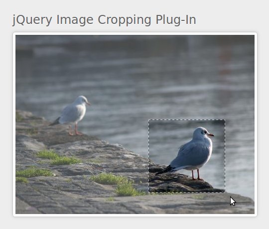
Plug-in preview
And that’s it! Save the file and open up your browser to test it out.

What’s Next

Now we have a basic image cropping jQuery plug-in that allows us to select an area of an image. In the next tutorial, we’ll add more customization options, build a preview pane, write some server-side scripting to crop the image… and much more. I hope you’ve enjoyed the time we’ve spent together and found this tutorial to be useful. Thanks for reading!
"
read more

jQuery Tutorial: Building a jQuery Scroller

"

Building a jQuery News Scroller

If you’re working on a site where a number of important stories or features need to be showcased within a small area, a news scroller is a great option. Without taking up much page real estate, you can highlight several stories along with descriptions and links to view the details. The scrolling effect helps attract and hold user interest. In this tutorial, I’ll guide you through the easy process of creating this type of news scroller with jQuery. We’ll start with an HTML list of stories that’s styled using CSS, then use jQuery to make it automatically scroll. When the user hovers over the jQuery Scroller, it will pause so they can read the abstract and click the link if they’re interested.
Before getting started, be sure to view the demo to see how the scroller works. Here’s what the finished project will look like:
finished

jQuery Scroller Tutorial Details

  • Technologies: HTML, CSS, JavaScript, jQuery
  • Difficulty: Intermediate
  • Estimated Completion Time: 20-30 minutes

Intro: Preparations

You should create an empty HTML file and save it somewhere convenient now; we’ll be working with it throughout this tutorial. Because we’ll be working exclusively with client-side code, there’s no need for a server – you can preview directly on your computer. In the demo files we’ll use inline CSS and JavaScript, but you can externalize these if desired.
Tip: For this type of tutorial, it can be helpful to use jsBin or jsFiddle to follow along. These free online tools let you experiment with HTML, JavaScript and CSS without having to create any files on your computer. Best of all, you can save, version and share your experiments. It’s a great way to perfect a technique without cluttering up your computer with tons of files.
If you’re creating your own HTML file, here’s the code you should have to start:
<!DOCTYPE html PUBLIC "-//W3C//DTD XHTML 1.0 Transitional//EN"
   "http://www.w3.org/TR/xhtml1/DTD/xhtml1-transitional.dtd">

<html xmlns="http://www.w3.org/1999/xhtml">
<head>
 <meta http-equiv="Content-Type" content="text/html; charset=UTF-8" />

 <title>jQuery News Scroller</title>
 <style type="text/css">
 /* CSS will go here */

 </style>
</head>

<body>

 <!-- Markup will go here -->

 <script type="text/javascript" src="http://ajax.googleapis.com/ajax/libs/jquery/1.6.1/jquery.min.js"></script>
 <script type="text/javascript">
 // JavaScript will go here

 </script>
</body>
</html>
Note the designated places for markup, CSS and JavaScript. Additionally, note that we have included jQuery 1.6.1 from Google’s CDN.

Step 1: The HTML Markup

We’ll use a dedicated <div> to hold the scroller. In keeping with best practices, all of the content will be placed in an unordered list (<ul>), with a list item (<li>) for each separate story. By using an HTML list to define the links, we ensure that the ticker will gracefully degrade for users with JavaScript disabled, and that search engines will still be able to see and follow all of the links. Add the following HTML markup to your page:
<div class="newsScroller" id="newsScroll">
   <ul>
       <li>
           <a class="title" href="#">My Story 1</a>
           <span class="desc">
               Lorem Ipsum is simply dummy text of the printing and typesetting industry. Lorem Ipsum has been dummy text ever since the 1500s, when an unknown printer took a galley of type and scrambled it to make a type specimen book.
           </span>
           <a class="link" href="#">More...</a>
       </li>
       <li>
           <a class="title" href="#">My Story 2</a>
           <span class="desc">
               Lorem Ipsum is simply dummy text of the printing and typesetting industry. Lorem Ipsum has been the industry's standard dummy text ever since the 1500s, when an unknown printer took a galley of type and scrambled it to make a type specimen book.
           </span>
           <a class="link" href="#">More...</a>
       </li>
       <li>
           <a class="title" href="#">My Story 3</a>
           <span class="desc">
               Lorem Ipsum is simply dummy text of the printing and typesetting industry. Lorem Ipsum has been the industry's standard dummy text ever since the 1500s, when an unknown printer took a galley of type and scrambled it to make a type specimen book.
           </span>
           <a class="link" href="#">More...</a>
       </li>
       <li>
           <a class="title" href="#">My Company's News Ticker</a>
           <span class="desc">
               &copy; 2011 My Company
           </span>
       </li>
   </ul>
</div>
We have four items: three stories, then a quick ‘about’ item with a copyright. For each of the real items, there’s a title link to the story, a description, and another “more” link to the story at the bottom. If desired, you can customize this structure once you’ve completed the project. The nice thing about the way we’re going to build this is that you can place anything within the <li> items – including images or any other markup.
Update the list now to contain an <li> for each of the features you want in the scroller.

Step 2: Styling

If you preview now, you’ll see a simple HTML list of stories complete with links. Now it’s time to make the jQuery Scrollerlook nice and take the first step towards interaction.
We’re going to explicitly specify width and height dimensions for the wrapper <div>, then use the overflow property to make the user be able to scroll through the list of links (since there’s more content than fits within the specified size). In a minute we’ll override part of this CSS with JavaScript so that the scrolling happens automatically and no scrollbar shows, but we want the CSS default to allow for user control. This way, the scroller will still be usable even if the user has disabled JavaScript.
In the <style> tag in the <head>, add the following CSS:
.newsScroller {
   height: 120px;
   width: 260px;
   overflow-x: hidden;
   overflow-y: scroll;
   font: 10px/15px Verdana,Arial,sans-serif;
   color: #333;
   border: 1px solid #999;
}
.newsScroller ul {
   margin: 0;
   padding: 4px;
}
.newsScroller li {
   list-style-type: none;
   margin: 0 0 16px 0;
   padding: 0;
}
.newsScroller a.title {
   display: block;
   font-weight: bold;
   text-transform:uppercase;
   text-decoration: none;
}
.newsScroller a.title, .newsScroller a.title:visited, .newsScroller a.title:hover {
   color: #F90;
}
.newsScroller a.title:hover
{
   text-decoration: underline;
}
First, we add the dimensions and scrollbar to the jQuery Scroller, along with some basic font styling and a border. Next, we reset the margins and padding for the HTML list and its items, also disabling the default list bullets. We end up with a block of items that have some spacing around all of them and between each of them. Finally, we add some basic styling to each of the links. You can customize this styling as desired.
If you preview now, you’ll see something remarkably similar to the finished product:
no_js_preview
This is what anyone with JavaScript disabled will see. Even though it’s not optimal, it’s still fully functional – which is what we were aiming for. This approach represents the best practice of progressive enhancement; the content is always usable, but the more advanced a user’s browsing environment is, the more functionality they’ll receive.

Step 3: Making It Work

Now we’re ready to add the jQuery-enhanced JavaScript to make the jQuery Scroller work automatically. I’ll show you the overall chunk first, then break down what each portion is doing.
Add the following chunk of JavaScript to the <script> tag at the bottom of the page:
$(function()
{
   $('#newsScroll').each(function()
   {
       var scroller = $(this);
       var list = scroller.children('ul');

       var listH = list.height();
       var scrollerH = scroller.height();
       list.css({
           marginTop: scrollerH,
           marginBottom: scrollerH
       });
       scroller.css({
           overflow: 'hidden'
       });

       var isOver = false;
       scroller.bind('mouseenter mouseleave', function(e) {
           isOver = (e.type == 'mouseenter');
       });

       var scroll = 0;
       setInterval(function()
       {
           if (isOver) return;
           scroll++;
           var newTop = scroll % (listH + scrollerH);
           scroller.scrollTop(newTop);
       }, 30);

   });
});
If you preview now, you should see the working jQuery Scrollerthat scrolls through all of your feature items. If you hover over the scroller, it will pause; if you move your mouse away again, it will continue. Now, let’s break down what all of that code is doing.
Breaking Down the JavaScript – Overview
In plain English, here’s what the JavaScript is doing:
  • Everything is wrapped in a document-ready trigger, so it will be called once the document is ready for manipulation
  • We locate the news jQuery Scroller and its content
  • We measure the wrapper and the contents so we know how far to scroll
  • We override the default CSS with the appropriate styles to make auto-scrolling work properly
  • We create a listener for mouse interaction with the jQuery Scroller
  • We start the auto-scroller timer
Breaking Down the JavaScript – Details
Now, lets take an in-depth look at what each of these pieces of code is doing.
Note that we use the #newsScroll selector to locate the scroller. If you had multiple scrollers in your page, you could change this to div.newsScroller instead, since we applied a class of newsScroller to our jQuery Scroller.
Chunk 1 – Finding the content
var scroller = $(this);
var list = this.children('ul');
In this first chunk, we create a jQuery reference to the current scroller. Then, we locate the actual list (the content that will be scrolled).
Chunk 2 – Making measurements, Updating CSS styles
var listH = list.height();
var scrollerH = scroller.height();
list.css({
   marginTop: scrollerH,
   marginBottom: scrollerH
});
scroller.css({
   overflow: 'hidden'
});
In this next major chunk, we first measure the list’s height and the scroller’s height. These measurements are needed so that we can then apply extra space to each end (via margin-top and margin-bottom), and later know how much scrolling is needed. Without adding the extra space, the scrolling would have a disturbing “jump” when first starting and then when looping. Here’s a diagram explaining what we want:
scrolling_diagram
We start at the Initial State. The content chunk scrolls vertically for [content height] + [visible box height] pixels, until we reach the End State, then immediately resets to the Initial State again. The end result is that there’s a short empty space on each loop, letting the user know that the scroller is looping.
Finally in the chunk, we remove the default scrollbars by overriding the overflow property that was set earlier via a CSS rule.
Chunk 3 – Detecting user interaction
var isOver = false;
scroller.bind('mouseenter mouseleave', function(e) {
   isOver = (e.type == 'mouseenter');
});
Because we want the jQuery Scroller to pause when the user hovers over it, we need to add a mouseenter listener. Correspondingly, we also need to add a mouseleave listener for un-pausing it. In this chunk, we create a variable to track whether the user is over the scroller, then add a compound listener that updates that variable whenever there’s interaction. By using a single listener for both events and looking at the event.type property, we create code that’s more compact, efficient and readable. The isOver flag will be used in the next chunk to control pausing.
Chunk 4 – Starting the auto-scrolling
var scroll = 0;
setInterval(function()
{
   if (isOver) return;
   scroll++;
   var newTop = scroll % (listH + scrollerH);
   scroller.scrollTop(newTop);
}, 30);
First, we create a tracker for the scrolling position. Then, we start an interval that calls a scroll function every 30 milliseconds. To reduce the speed of the jQuery Scroller, this value should be increased; to speed it up, this value should be decreased. In the scroll function, we immediately exit if the user is currently hovering over the scroller. This makes the scroller pause when hovered-over. Otherwise, we first increment the scroll position tracker. Then, we use the modulus operator (%) to calculate the new appropriate scroll position. Finally, we apply that new scroll position. In calculating the scroll position, note that we loop after reaching [height of list] + [height of content], as described earlier and shown in the diagram.

Summary

You’ve now created a simple news jQuery Scroller to display featured story snippets on your site. The scroller features cross-browser compatibility, progressive enhancement, and automatically pauses and resumes based on user interaction. To enhance the scroller, you could start adding images and other content to the snippets, or use a server-side script (like PHP) to dynamically output the snippets and links. There are numerous possibilities! Moreover, you’ve learned about how jQuery’s document querying and manipulation methods can be leveraged to quickly and easily create nifty, useful widgets for your page. Have fun with your new knowledge!

Author : Nathan Rohler

Nathan Rohler, who works as the lead developer for DWUser.com, is passionate about creating beautiful and moving web experiences. DWUser.com offers software tools for developers and designers, including an easy and free jQuery slider builder, EasyRotator.
"
read more