How to Build a Kick-Butt CSS3 Mega Drop-Down Menu: "
Often used on e-commerce or large scale websites, mega menus are becoming more and more popular, as they offer an effective solution to displaying a lot of content while keeping a clean layout. In this tutorial, we’ll learn how to build a cross-browser, awesome CSS-only drop-down mega menu, using nice CSS3 features.
Step 1: Building the Navigation Bar
Let’s begin with a basic menu, built with an unordered list and some basic CSS styling.
<ul id="menu">
<li><a href="#">Home</a></li>
<li><a href="#">About</a></li>
<li><a href="#">Services</a></li>
<li><a href="#">Portfolio</a></li>
<li><a href="#">Contact</a></li>
</ul>
Creating the Menu Container
We’ll now apply some basic CSS styling. For the menu container, we define a fixed width that we center by setting the left and right margins to “auto”.
#menu {
list-style:none;
width:940px;
margin:30px auto 0px auto;
height:43px;
padding:0px 20px 0px 20px;
}
Now, let’s see how we can improve it with some CSS3 features. We need to use different syntaxes for Webkit-based browsers (like Safari) and for Mozilla-based browsers (like Firefox).
For rounded corners, the syntax will be :
-moz-border-radius: 10px
-webkit-border-radius: 10px;
border-radius: 10px;
For the background, we’ll use gradients and a fallback color for older browsers. To keep consistency when choosing colors, there is an awesome tool called
Facade that helps you find lighter and darker tones of a basic color.
background: #014464;
background: -moz-linear-gradient(top, #0272a7, #013953);
background: -webkit-gradient(linear, 0% 0%, 0% 100%, from(#0272a7), to(#013953));
The first line applies a simple background color (for older browsers); the second and third lines create a gradient from the top to the bottom using two colors : #0272a7 and #013953.
We can now add a darker border and polish the design with a “fake” inset border created with the “box-shadow” feature. The syntax is the same for all compatible browsers: the first value is the horizontal offset, the second one is the vertical offset, the third one is the blur radius (a small value makes it sharper; it will be 1 pixel in our example). We set all offsets to 0 so the blur value will create a uniform light border :
-moz-box-shadow:inset 0px 0px 1px #edf9ff;
-webkit-box-shadow:inset 0px 0px 1px #edf9ff;
box-shadow:inset 0px 0px 1px #edf9ff;
Here’s the final CSS code for the #menu container :
#menu {
list-style:none;
width:940px;
margin:30px auto 0px auto;
height:43px;
padding:0px 20px 0px 20px;

/* Rounded Corners */

-moz-border-radius: 10px;
-webkit-border-radius: 10px;
border-radius: 10px;

/* Background color and gradients */

background: #014464;
background: -moz-linear-gradient(top, #0272a7, #013953);
background: -webkit-gradient(linear, 0% 0%, 0% 100%, from(#0272a7), to(#013953));

/* Borders */

border: 1px solid #002232;

-moz-box-shadow:inset 0px 0px 1px #edf9ff;
-webkit-box-shadow:inset 0px 0px 1px #edf9ff;
box-shadow:inset 0px 0px 1px #edf9ff;
}
Styling Menu Items
We will begin with all menu items aligned to the left and space them with a margin-right (the padding will be necessary for the hover state) :
#menu li {
float:left;
display:block;
text-align:center;
position:relative;
padding: 4px 10px 4px 10px;
margin-right:30px;
margin-top:7px;
border:none;
}
For the hover state and the drop down, I have chosen a grey color scheme for the background.
The fallback color will be a light grey (#F4F4F4) and the gradient will be applied from the top (#F4F4F4) to the bottom (#EEEEEE). Rounded corners will be applied only on top corners as we’ll have the drop down sticking right under the menu items.
background: #F4F4F4;
background: -moz-linear-gradient(top, #F4F4F4, #EEEEEE);
background: -webkit-gradient(linear, 0% 0%, 0% 100%, from(#F4F4F4), to(#EEEEEE));
The left and right padding is slightly smaller here because we have a border of 1 pixel appearing on hover. If we keep the same padding, menu items will be pushed two pixels on the right because of the left and right borders added on mouse hover. To avoid that, we’ll remove 1 pixel of padding on both sides, so we have 9 pixels instead of 10.
border: 1px solid #777777;
padding: 4px 9px 4px 9px;
Then, we add rounded corners to the top only so the drop down will stick perfectly under the parent menu item :
-moz-border-radius: 5px 5px 0px 0px;
-webkit-border-radius: 5px 5px 0px 0px;
border-radius: 5px 5px 0px 0px;
Here is the final CSS for the menu items on hover :
#menu li:hover {
border: 1px solid #777777;
padding: 4px 9px 4px 9px;

/* Background color and gradients */

background: #F4F4F4;
background: -moz-linear-gradient(top, #F4F4F4, #EEEEEE);
background: -webkit-gradient(linear, 0% 0%, 0% 100%, from(#F4F4F4), to(#EEEEEE));

/* Rounded corners */

-moz-border-radius: 5px 5px 0px 0px;
-webkit-border-radius: 5px 5px 0px 0px;
border-radius: 5px 5px 0px 0px;
}
For the links, we’ll apply a nice text shadow using a simple syntax : the first and second values are horizontal and vertical offsets for the shadow (1 pixel in our example), the third one is the blur (1 pixel too) and then we have the (black) color :
text-shadow: 1px 1px 1px #000;
Here is the final CSS for the links :
#menu li a {
font-family:Arial, Helvetica, sans-serif;
font-size:14px;
color: #EEEEEE;
display:block;
outline:0;
text-decoration:none;
text-shadow: 1px 1px 1px #000;
}
On mouse hover, as the background is grey, we’ll use a darker color (#161616) for the links and the white color for the text shadow :
#menu li:hover a {
color:#161616;
text-shadow: 1px 1px 1px #FFFFFF;
}
Finally, we need a way to indicate if there’s a drop down or not by using a simple arrow image as background, it will be positioned on the right using padding and the top margin will align to it properly. On hover this top margin will be set to 7 pixels instead of 8 as we have an additional border appearing on mouse hover (otherwise, the arrow would be pushed 1 pixel down on hover) :
#menu li .drop {
padding-right:21px;
background:url('img/drop.png') no-repeat right 8px;
}
#menu li:hover .drop {
background:url('img/drop.png') no-repeat right 7px;
}
Here is our final code for the menu container and links; only the “home” item doesn’t have any drop down content for now :
<ul id="menu">
<li><a href="#">Home</a></li>
<li><a href="#" class="drop">About</a></li>
<li><a href="#" class="drop">Services</a></li>
<li><a href="#" class="drop">Portfolio</a></li>
<li><a href="#" class="drop">Contact</a></li>
</ul>
#menu {
list-style:none;
width:940px;
margin:30px auto 0px auto;
height:43px;
padding:0px 20px 0px 20px;

/* Rounded Corners */

-moz-border-radius: 10px;
-webkit-border-radius: 10px;
border-radius: 10px;

/* Background color and gradients */

background: #014464;
background: -moz-linear-gradient(top, #0272a7, #013953);
background: -webkit-gradient(linear, 0% 0%, 0% 100%, from(#0272a7), to(#013953));

/* Borders */

border: 1px solid #002232;

-moz-box-shadow:inset 0px 0px 1px #edf9ff;
-webkit-box-shadow:inset 0px 0px 1px #edf9ff;
box-shadow:inset 0px 0px 1px #edf9ff;
}

#menu li {
float:left;
display:block;
text-align:center;
position:relative;
padding: 4px 10px 4px 10px;
margin-right:30px;
margin-top:7px;
border:none;
}

#menu li:hover {
border: 1px solid #777777;
padding: 4px 9px 4px 9px;

/* Background color and gradients */

background: #F4F4F4;
background: -moz-linear-gradient(top, #F4F4F4, #EEEEEE);
background: -webkit-gradient(linear, 0% 0%, 0% 100%, from(#F4F4F4), to(#EEEEEE));

/* Rounded corners */

-moz-border-radius: 5px 5px 0px 0px;
-webkit-border-radius: 5px 5px 0px 0px;
border-radius: 5px 5px 0px 0px;
}

#menu li a {
font-family:Arial, Helvetica, sans-serif;
font-size:14px;
color: #EEEEEE;
display:block;
outline:0;
text-decoration:none;
text-shadow: 1px 1px 1px #000;
}

#menu li:hover a {
color:#161616;
text-shadow: 1px 1px 1px #FFFFFF;
}
#menu li .drop {
padding-right:21px;
background:url('img/drop.png') no-repeat right 8px;
}
#menu li:hover .drop {
background:url('img/drop.png') no-repeat right 7px;
}
And the result is :
Step 2: Coding the Drop Down
A “classic” drop down menu usually contains lists nested within parent list items and looks like:
<ul id="menu">
<li><a href="#">Item 1</a><
<ul>
<li><a href="#">Subitem 1</a></li>
<li><a href="#">Subitem 2</a></li>
<li><a href="#">Subitem 3</a></li>
</ul>
</li>
<li><a href="#">Item 2</a><
<ul>
<li><a href="#">Subitem 1</a></li>
<li><a href="#">Subitem 2</a></li>
</ul>
</li>
</ul>
General Structure
For our Mega Menu, instead of nested lists, we’ll simply use standard DIVs, which will work like any nested list :
<ul id="menu">
<li><a href="#">Item 1</a>
<div>
Drop down Content
<div>
</li>
<li><a href="#">Item 2</a>
<div>
Drop down Content
<div>
</li>
</ul>
This will be the basic structure for the drop down. The idea behind it is to be able to include any kind of content, such as paragraphs, images, custom lists or a contact form, organized into columns.
Drop Down Containers
Containers with different sizes will hold the entire drop down content. I’ve chosen the tag names according to the number of columns they will contain.
To hide the drop downs, we’ll use absolute positioning with a negative left margin :
position:absolute;
left:-999em;
The background fallback color is the same as the one used for the menu items. Modern browsers will display a gradient starting with #EEEEEE at the top (to match the parent menu item gradient) and ending with #BBBBBB at the bottom:
background:#F4F4F4;
background: -moz-linear-gradient(top, #EEEEEE, #BBBBBB);
background: -webkit-gradient(linear, 0% 0%, 0% 100%, from(#EEEEEE), to(#BBBBBB));
We’ll again use rounded corners, except for the top left one :
-moz-border-radius: 0px 5px 5px 5px;
-webkit-border-radius: 0px 5px 5px 5px;
border-radius: 0px 5px 5px 5px;
.dropdown_1column,
.dropdown_2columns,
.dropdown_3columns,
.dropdown_4columns,
.dropdown_5columns {
margin:4px auto;
position:absolute;
left:-999em; /* Hides the drop down */
text-align:left;
padding:10px 5px 10px 5px;
border:1px solid #777777;
border-top:none;

/* Gradient background */
background:#F4F4F4;
background: -moz-linear-gradient(top, #EEEEEE, #BBBBBB);
background: -webkit-gradient(linear, 0% 0%, 0% 100%, from(#EEEEEE), to(#BBBBBB));

/* Rounded Corners */
-moz-border-radius: 0px 5px 5px 5px;
-webkit-border-radius: 0px 5px 5px 5px;
border-radius: 0px 5px 5px 5px;
}
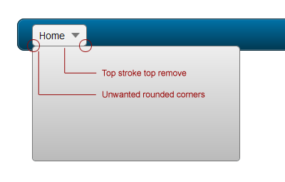
To illustrate this, let’s see how it would look if we hadn’t paid attention to detail:
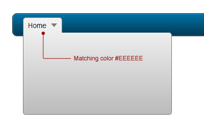
Now here is our example:
As you can see, the drop down sticks nicely to its parent menu item.
In order to have a perfect drop down container, we need to specify the width for each one :
.dropdown_1column {width: 140px;}
.dropdown_2columns {width: 280px;}
.dropdown_3columns {width: 420px;}
.dropdown_4columns {width: 560px;}
.dropdown_5columns {width: 700px;}
And to show the drop downs on mouse hover, we’ll simply use :
#menu li:hover .dropdown_1column,
#menu li:hover .dropdown_2columns,
#menu li:hover .dropdown_3columns,
#menu li:hover .dropdown_4columns,
#menu li:hover .dropdown_5columns {
left:-1px;top:auto;
}
Using the Drop Down Containers
Our classes are ready to be included in our menu. We’ll use each one of them starting from the 5-column, layout to the single column drop down :
<ul id="menu">
<li><a href="#">Home</a></li>
<li><a href="#" class="drop">5 Columns</a>
<div class="dropdown_5columns">
<p>5 Columns content</p>
</div>
</li>
<li><a href="#" class="drop">4 Columns</a>
<div class="dropdown_4columns">
<p>4 Columns content</p>
</div>
</li>
<li><a href="#" class="drop">3 Columns</a>
<div class="dropdown_3columns">
<p>3 Columns content</p>
</div>
</li>
<li><a href="#" class="drop">2 Columns</a>
<div class="dropdown_2columns">
<p>2 Columns content</p>
</div>
</li>
<li><a href="#" class="drop">1 Column</a>
<div class="dropdown_1column">
<p>1 Column content</p>
</div>
</li>
</ul>
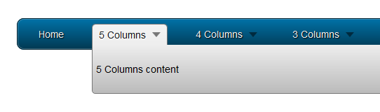
Here is a preview of the code above :
Step 3: Creating the Drop Down Container Columns
Now that we have the containers ready, we’ll create columns of increasing sizes, following the principles of the 960 grid system.
.col_1,
.col_2,
.col_3,
.col_4,
.col_5 {
display:inline;
float: left;
position: relative;
margin-left: 5px;
margin-right: 5px;
}
.col_1 {width:130px;}
.col_2 {width:270px;}
.col_3 {width:410px;}
.col_4 {width:550px;}
.col_5 {width:690px;}
Using Columns
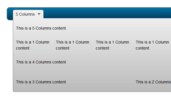
Here is an example of a drop down containing several columns. In this example, we have different combinations using all kinds of columns :
<ul id="menu">
<li><a href="#" class="drop">5 Columns</a>
<div class="dropdown_5columns">
<div class="col_5">
<p>This is a 5 Columns content</p>
</div>
<div class="col_1">
<p>This is a 1 Column content</p>
</div>
<div class="col_1">
<p>This is a 1 Column content</p>
</div>
<div class="col_1">
<p>This is a 1 Column content</p>
</div>
<div class="col_1">
<p>This is a 1 Column content</p>
</div>
<div class="col_1">
<p>This is a 1 Column content</p>
</div>
<div class="col_4">
<p>This is a 4 Columns content</p>
</div>
<div class="col_1">
<p>This is a 1 Column content</p>
</div>
<div class="col_3">
<p>This is a 3 Columns content</p>
</div>
<div class="col_2">
<p>This is a 2 Columns content</p>
</div>
</div>
</li>
</ul>
Code preview :
Step 4: Aligning to the Right
Now, let’s see how we can align our menu and the drop down content to the right edge of the navigation bar; not only the menu item, but the drop down container should also be changed.
To accomplish this, we’ll add a new class called
.menu_right to the parent list item, so we reset the right margin and float it to the right :
#menu .menu_right {
float:right;
margin-right:0px;
}
Next, let’s see the drop down. In the previous CSS code, rounded corners were applied to all corners except the left-top one to, in order to match the background of the parent menu item. Now we want this drop down to stick to the right edge of the parent menu item. So, we’ll overwrite the border-radius values with a new class called .align_right, and set the top-right corner to 0.
#menu li .align_right {
/* Rounded Corners */
-moz-border-radius: 5px 0px 5px 5px;
-webkit-border-radius: 5px 0px 5px 5px;
border-radius: 5px 0px 5px 5px;
}
Last but not least, we want to make the drop down appear on the right; so we’ll use our new class and reset the left value, then make it stick to the right :
#menu li:hover .align_right {
left:auto;
right:-1px;
top:auto;
}
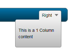
Now it’s ready to be used in the menu :
<li class="menu_right"><a href="#" class="drop">Right</a>
<div class="dropdown_1column align_right">
<div class="col_1">
<p>This is a 1 Column content</p>
</div>
</div>
</li>
And a small preview of the code above :
Step 5: Adding and Styling Content
Now that we have the whole structure ready, we can add as much content as we want: text, lists, images, etc.
General Stylings
Let’s begin with some basic styling for paragraphs and headings :
#menu p, #menu h2, #menu h3, #menu ul li {
font-family:Arial, Helvetica, sans-serif;
line-height:21px;
font-size:12px;
text-align:left;
text-shadow: 1px 1px 1px #FFFFFF;
}
#menu h2 {
font-size:21px;
font-weight:400;
letter-spacing:-1px;
margin:7px 0 14px 0;
padding-bottom:14px;
border-bottom:1px solid #666666;
}
#menu h3 {
font-size:14px;
margin:7px 0 14px 0;
padding-bottom:7px;
border-bottom:1px solid #888888;
}
#menu p {
line-height:18px;
margin:0 0 10px 0;
}
.strong {
font-weight:bold;
}
.italic {
font-style:italic;
}
We can apply a nice blue color to the links within the drop down :
#menu li:hover div a {
font-size:12px;
color:#015b86;
}
#menu li:hover div a:hover {
color:#029feb;
}
Lists Stylings
Let’s revamp our lists; we have to reset some styling such as the background color or the borders which are used in the navigation bar :
#menu li ul {
list-style:none;
padding:0;
margin:0 0 12px 0;
}
#menu li ul li {
font-size:12px;
line-height:24px;
position:relative;
text-shadow: 1px 1px 1px #ffffff;
padding:0;
margin:0;
float:none;
text-align:left;
width:130px;
}
#menu li ul li:hover {
background:none;
border:none;
padding:0;
margin:0;
}
Styling Images
.imgshadow {
background:#FFFFFF;
padding:4px;
border:1px solid #777777;
margin-top:5px;
-moz-box-shadow:0px 0px 5px #666666;
-webkit-box-shadow:0px 0px 5px #666666;
box-shadow:0px 0px 5px #666666;
}
And to create a paragraph with an image on the left :
.img_left {
width:auto;
float:left;
margin:5px 15px 5px 5px;
}
Text Boxes
To highlight some content, here is an example of a dark box with rounded corners and a subtle inset shadow :
#menu li .black_box {
background-color:#333333;
color: #eeeeee;
text-shadow: 1px 1px 1px #000;
padding:4px 6px 4px 6px;

/* Rounded Corners */
-moz-border-radius: 5px;
-webkit-border-radius: 5px;
border-radius: 5px;

/* Shadow */
-webkit-box-shadow:inset 0 0 3px #000000;
-moz-box-shadow:inset 0 0 3px #000000;
box-shadow:inset 0 0 3px #000000;
}
Restylings Lists
And to finish, here’s another way to style your lists using, again, some CSS3 :
#menu li .greybox li {
background:#F4F4F4;
border:1px solid #bbbbbb;
margin:0px 0px 4px 0px;
padding:4px 6px 4px 6px;
width:116px;

/* Rounded Corners */
-moz-border-radius: 5px;
-webkit-border-radius: 5px;
border-radius: 5px;
}
#menu li .greybox li:hover {
background:#ffffff;
border:1px solid #aaaaaa;
padding:4px 6px 4px 6px;
margin:0px 0px 4px 0px;
}
Step 6: Handling Browser Compatibility and IE6
All browsers handle hover on non-anchor tags . . . except Internet Explorer 6; so our Mega Menu is still not working with this old browser. We can fix this problem thanks to a behavior file that will add this functionality. You can find it
here, and use conditional comments to target IE6 only; more explanations can be found via
this article from CSS-Tricks.
To target IE6, we’ll use the following code :
<!--[if IE 6]>
<style>
body {behavior: url("csshover3.htc");}
</style>
<![endif]-->
I’ve used a few PNG files in this tutorial, and, as everyone knows, IE6 doesn’t support transparency so we have different solutions :
- Convert them to GIF or PNG-8 format
- Use a script
- Set a background color other than the default grey with TweakPNG for example
I’ll let you choose the one that fits to your needs. Now, let’s review a full working example.
Final Example
HTML Part
<!DOCTYPE html PUBLIC "-//W3C//DTD XHTML 1.0 Transitional//EN" "http://www.w3.org/TR/xhtml1/DTD/xhtml1-transitional.dtd">
<html xmlns="http://www.w3.org/1999/xhtml">
<head>
<meta http-equiv="Content-Type" content="text/html; charset=utf-8" />

<link rel="stylesheet" href="menu.css" type="text/css" media="screen" />

<title>Mega Drop Down Menu</title>
<!--[if IE 6]>
<style>
body {behavior: url("csshover3.htc");}
#menu li .drop {background:url("img/drop.gif") no-repeat right 8px;
</style>
<![endif]-->

</head>

<body>

<ul id="menu">

<li><a href="#" class="drop">Home</a><!-- Begin Home Item -->

<div class="dropdown_2columns"><!-- Begin 2 columns container -->

<div class="col_2">
<h2>Welcome !</h2>
</div>

<div class="col_2">
<p>Hi and welcome here ! This is a showcase of the possibilities of this awesome Mega Drop Down Menu.</p>
<p>This item comes with a large range of prepared typographic stylings such as headings, lists, etc.</p>
</div>

<div class="col_2">
<h2>Cross Browser Support</h2>
</div>

<div class="col_1">
<img src="img/browsers.png" width="125" height="48" alt="" />
</div>

<div class="col_1">
<p>This mega menu has been tested in all major browsers.</p>
</div>

</div><!-- End 2 columns container -->

</li><!-- End Home Item -->

<li><a href="#" class="drop">5 Columns</a><!-- Begin 5 columns Item -->

<div class="dropdown_5columns"><!-- Begin 5 columns container -->

<div class="col_5">
<h2>This is an example of a large container with 5 columns</h2>
</div>

<div class="col_1">
<p class="black_box">This is a dark grey box text. Fusce in metus at enim porta lacinia vitae a arcu. Sed sed lacus nulla mollis porta quis.</p>
</div>

<div class="col_1">
<p>Phasellus vitae sapien ac leo mollis porta quis sit amet nisi. Mauris hendrerit, metus cursus accumsan tincidunt.</p>
</div>

<div class="col_1">
<p class="italic">This is a sample of an italic text. Consequat scelerisque. Fusce sed lectus at arcu mollis accumsan at nec nisi porta quis sit amet.</p>
</div>

<div class="col_1">
<p>Curabitur euismod gravida ante nec commodo. Nunc dolor nulla, semper in ultricies vitae, vulputate porttitor neque.</p>
</div>

<div class="col_1">
<p class="strong">This is a sample of a bold text. Aliquam sodales nisi nec felis hendrerit ac eleifend lectus feugiat scelerisque.</p>
</div>

<div class="col_5">
<h2>Here is some content with side images</h2>
</div>

<div class="col_3">

<img src="img/01.jpg" width="70" height="70" class="img_left imgshadow" alt="" />
<p>Maecenas eget eros lorem, nec pellentesque lacus. Aenean dui orci, rhoncus sit amet tristique eu, tristique sed odio. Praesent ut interdum elit. Sed in sem mauris. Aenean a commodo mi. Praesent augue lacus.<a href="#">Read more...</a></p>

<img src="img/02.jpg" width="70" height="70" class="img_left imgshadow" alt="" />
<p>Aliquam elementum felis quis felis consequat scelerisque. Fusce sed lectus at arcu mollis accumsan at nec nisi. Aliquam pretium mollis fringilla. Nunc in leo urna, eget varius metus. Aliquam sodales nisi.<a href="#">Read more...</a></p>

</div>

<div class="col_2">

<p class="black_box">This is a black box, you can use it to highligh some content. Sed sed lacus nulla, et lacinia risus. Phasellus vitae sapien ac leo mollis porta quis sit amet nisi. Mauris hendrerit, metus cursus accumsan tincidunt.Quisque vestibulum nisi non nunc blandit placerat. Mauris facilisis, risus ut lobortis posuere, diam lacus congue lorem, ut condimentum ligula est vel orci. Donec interdum lacus at velit varius gravida. Nulla ipsum risus.</p>

</div>

</div><!-- End 5 columns container -->

</li><!-- End 5 columns Item -->

<li><a href="#" class="drop">4 Columns</a><!-- Begin 4 columns Item -->

<div class="dropdown_4columns"><!-- Begin 4 columns container -->

<div class="col_4">
<h2>This is a heading title</h2>
</div>

<div class="col_1">

<h3>Some Links</h3>
<ul>
<li><a href="#">ThemeForest</a></li>
<li><a href="#">GraphicRiver</a></li>
<li><a href="#">ActiveDen</a></li>
<li><a href="#">VideoHive</a></li>
<li><a href="#">3DOcean</a></li>
</ul>

</div>

<div class="col_1">

<h3>Useful Links</h3>
<ul>
<li><a href="#">NetTuts</a></li>
<li><a href="#">VectorTuts</a></li>
<li><a href="#">PsdTuts</a></li>
<li><a href="#">PhotoTuts</a></li>
<li><a href="#">ActiveTuts</a></li>
</ul>

</div>

<div class="col_1">

<h3>Other Stuff</h3>
<ul>
<li><a href="#">FreelanceSwitch</a></li>
<li><a href="#">Creattica</a></li>
<li><a href="#">WorkAwesome</a></li>
<li><a href="#">Mac Apps</a></li>
<li><a href="#">Web Apps</a></li>
</ul>

</div>

<div class="col_1">

<h3>Misc</h3>
<ul>
<li><a href="#">Design</a></li>
<li><a href="#">Logo</a></li>
<li><a href="#">Flash</a></li>
<li><a href="#">Illustration</a></li>
<li><a href="#">More...</a></li>
</ul>

</div>

</div><!-- End 4 columns container -->

</li><!-- End 4 columns Item -->

<li class="menu_right"><a href="#" class="drop">1 Column</a>

<div class="dropdown_1column align_right">

<div class="col_1">

<ul class="simple">
<li><a href="#">FreelanceSwitch</a></li>
<li><a href="#">Creattica</a></li>
<li><a href="#">WorkAwesome</a></li>
<li><a href="#">Mac Apps</a></li>
<li><a href="#">Web Apps</a></li>
<li><a href="#">NetTuts</a></li>
<li><a href="#">VectorTuts</a></li>
<li><a href="#">PsdTuts</a></li>
<li><a href="#">PhotoTuts</a></li>
<li><a href="#">ActiveTuts</a></li>
<li><a href="#">Design</a></li>
<li><a href="#">Logo</a></li>
<li><a href="#">Flash</a></li>
<li><a href="#">Illustration</a></li>
<li><a href="#">More...</a></li>
</ul>

</div>

</div>

</li>

<li class="menu_right"><a href="#" class="drop">3 columns</a><!-- Begin 3 columns Item -->

<div class="dropdown_3columns align_right"><!-- Begin 3 columns container -->

<div class="col_3">
<h2>Lists in Boxes</h2>
</div>

<div class="col_1">

<ul class="greybox">
<li><a href="#">FreelanceSwitch</a></li>
<li><a href="#">Creattica</a></li>
<li><a href="#">WorkAwesome</a></li>
<li><a href="#">Mac Apps</a></li>
<li><a href="#">Web Apps</a></li>
</ul>

</div>

<div class="col_1">

<ul class="greybox">
<li><a href="#">ThemeForest</a></li>
<li><a href="#">GraphicRiver</a></li>
<li><a href="#">ActiveDen</a></li>
<li><a href="#">VideoHive</a></li>
<li><a href="#">3DOcean</a></li>
</ul>

</div>

<div class="col_1">

<ul class="greybox">
<li><a href="#">Design</a></li>
<li><a href="#">Logo</a></li>
<li><a href="#">Flash</a></li>
<li><a href="#">Illustration</a></li>
<li><a href="#">More...</a></li>
</ul>

</div>

<div class="col_3">
<h2>Here are some image examples</h2>
</div>

<div class="col_3">
<img src="img/02.jpg" width="70" height="70" class="img_left imgshadow" alt="" />
<p>Maecenas eget eros lorem, nec pellentesque lacus. Aenean dui orci, rhoncus sit amet tristique eu, tristique sed odio. Praesent ut interdum elit. Maecenas imperdiet, nibh vitae rutrum vulputate, lorem sem condimentum.<a href="#">Read more...</a></p>

<img src="img/01.jpg" width="70" height="70" class="img_left imgshadow" alt="" />
<p>Aliquam elementum felis quis felis consequat scelerisque. Fusce sed lectus at arcu mollis accumsan at nec nisi. Aliquam pretium mollis fringilla. Vestibulum tempor facilisis malesuada. <a href="#">Read more...</a></p>
</div>

</div><!-- End 3 columns container -->

</li><!-- End 3 columns Item -->

</ul>

</body>

</html>
CSS Part
body, ul, li {
font-size:14px;
font-family:Arial, Helvetica, sans-serif;
line-height:21px;
text-align:left;
}

/* Navigation Bar */

#menu {
list-style:none;
width:940px;
margin:30px auto 0px auto;
height:43px;
padding:0px 20px 0px 20px;

/* Rounded Corners */

-moz-border-radius: 10px;
-webkit-border-radius: 10px;
border-radius: 10px;

/* Background color and gradients */

background: #014464;
background: -moz-linear-gradient(top, #0272a7, #013953);
background: -webkit-gradient(linear, 0% 0%, 0% 100%, from(#0272a7), to(#013953));

/* Borders */

border: 1px solid #002232;

-moz-box-shadow:inset 0px 0px 1px #edf9ff;
-webkit-box-shadow:inset 0px 0px 1px #edf9ff;
box-shadow:inset 0px 0px 1px #edf9ff;
}

#menu li {
float:left;
text-align:center;
position:relative;
padding: 4px 10px 4px 10px;
margin-right:30px;
margin-top:7px;
border:none;
}

#menu li:hover {
border: 1px solid #777777;
padding: 4px 9px 4px 9px;

/* Background color and gradients */

background: #F4F4F4;
background: -moz-linear-gradient(top, #F4F4F4, #EEEEEE);
background: -webkit-gradient(linear, 0% 0%, 0% 100%, from(#F4F4F4), to(#EEEEEE));

/* Rounded corners */

-moz-border-radius: 5px 5px 0px 0px;
-webkit-border-radius: 5px 5px 0px 0px;
border-radius: 5px 5px 0px 0px;
}

#menu li a {
font-family:Arial, Helvetica, sans-serif;
font-size:14px;
color: #EEEEEE;
display:block;
outline:0;
text-decoration:none;
text-shadow: 1px 1px 1px #000;
}

#menu li:hover a {
color:#161616;
text-shadow: 1px 1px 1px #FFFFFF;
}
#menu li .drop {
padding-right:21px;
background:url('img/drop.png') no-repeat right 8px;
}
#menu li:hover .drop {
background:url('img/drop.png') no-repeat right 7px;
}

/* Drop Down */

.dropdown_1column,
.dropdown_2columns,
.dropdown_3columns,
.dropdown_4columns,
.dropdown_5columns {
margin:4px auto;
float:left;
position:absolute;
left:-999em; /* Hides the drop down */
text-align:left;
padding:10px 5px 10px 5px;
border:1px solid #777777;
border-top:none;

/* Gradient background */
background:#F4F4F4;
background: -moz-linear-gradient(top, #EEEEEE, #BBBBBB);
background: -webkit-gradient(linear, 0% 0%, 0% 100%, from(#EEEEEE), to(#BBBBBB));

/* Rounded Corners */
-moz-border-radius: 0px 5px 5px 5px;
-webkit-border-radius: 0px 5px 5px 5px;
border-radius: 0px 5px 5px 5px;
}

.dropdown_1column {width: 140px;}
.dropdown_2columns {width: 280px;}
.dropdown_3columns {width: 420px;}
.dropdown_4columns {width: 560px;}
.dropdown_5columns {width: 700px;}

#menu li:hover .dropdown_1column,
#menu li:hover .dropdown_2columns,
#menu li:hover .dropdown_3columns,
#menu li:hover .dropdown_4columns,
#menu li:hover .dropdown_5columns {
left:-1px;
top:auto;
}

/* Columns */

.col_1,
.col_2,
.col_3,
.col_4,
.col_5 {
display:inline;
float: left;
position: relative;
margin-left: 5px;
margin-right: 5px;
}
.col_1 {width:130px;}
.col_2 {width:270px;}
.col_3 {width:410px;}
.col_4 {width:550px;}
.col_5 {width:690px;}

/* Right alignment */

#menu .menu_right {
float:right;
margin-right:0px;
}
#menu li .align_right {
/* Rounded Corners */
-moz-border-radius: 5px 0px 5px 5px;
-webkit-border-radius: 5px 0px 5px 5px;
border-radius: 5px 0px 5px 5px;
}
#menu li:hover .align_right {
left:auto;
right:-1px;
top:auto;
}

/* Drop Down Content Stylings */

#menu p, #menu h2, #menu h3, #menu ul li {
font-family:Arial, Helvetica, sans-serif;
line-height:21px;
font-size:12px;
text-align:left;
text-shadow: 1px 1px 1px #FFFFFF;
}
#menu h2 {
font-size:21px;
font-weight:400;
letter-spacing:-1px;
margin:7px 0 14px 0;
padding-bottom:14px;
border-bottom:1px solid #666666;
}
#menu h3 {
font-size:14px;
margin:7px 0 14px 0;
padding-bottom:7px;
border-bottom:1px solid #888888;
}
#menu p {
line-height:18px;
margin:0 0 10px 0;
}

#menu li:hover div a {
font-size:12px;
color:#015b86;
}
#menu li:hover div a:hover {
color:#029feb;
}
.strong {
font-weight:bold;
}
.italic {
font-style:italic;
}
.imgshadow {
background:#FFFFFF;
padding:4px;
border:1px solid #777777;
margin-top:5px;
-moz-box-shadow:0px 0px 5px #666666;
-webkit-box-shadow:0px 0px 5px #666666;
box-shadow:0px 0px 5px #666666;
}
.img_left { /* Image sticks to the left */
width:auto;
float:left;
margin:5px 15px 5px 5px;
}
#menu li .black_box {
background-color:#333333;
color: #eeeeee;
text-shadow: 1px 1px 1px #000;
padding:4px 6px 4px 6px;

/* Rounded Corners */
-moz-border-radius: 5px;
-webkit-border-radius: 5px;
border-radius: 5px;

/* Shadow */
-webkit-box-shadow:inset 0 0 3px #000000;
-moz-box-shadow:inset 0 0 3px #000000;
box-shadow:inset 0 0 3px #000000;
}
#menu li ul {
list-style:none;
padding:0;
margin:0 0 12px 0;
}
#menu li ul li {
font-size:12px;
line-height:24px;
position:relative;
text-shadow: 1px 1px 1px #ffffff;
padding:0;
margin:0;
float:none;
text-align:left;
width:130px;
}
#menu li ul li:hover {
background:none;
border:none;
padding:0;
margin:0;
}
#menu li .greybox li {
background:#F4F4F4;
border:1px solid #bbbbbb;
margin:0px 0px 4px 0px;
padding:4px 6px 4px 6px;
width:116px;

/* Rounded Corners */
-moz-border-radius: 5px;
-webkit-border-radius: 5px;
border-radius: 5px;
}
#menu li .greybox li:hover {
background:#ffffff;
border:1px solid #aaaaaa;
padding:4px 6px 4px 6px;
margin:0px 0px 4px 0px;
}
Interesting and Relevant Links
Conclusion
I hope you’ve enjoyed this tutorial on creating mega menus. Thanks for following along!

"


 "
" Posted in: Web Application