Sliding Background Image Menu with jQuery: "
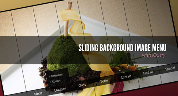
 View demoDownload source Today we want to share another jQuery menu with you. This menu will have several panels, each one corresponding to a different background image that will show on all panels when we hover over a panel label. Also, a submenu will slide out from the bottom. This menu comes with some configuration possibilities, such as the size of the image, the hover effect and custom default states.
The idea of this navigation is based on the Beautiful Background Image Navigation with jQuery, a tutorial that had a similar effect. Since it was very popular and a lot of our readers asked for some very useful additions, we decided to revamp it and make it easier to customize.
The beautiful gastronomy photography is by Manoel Petry: Manoel Petry’s Flickr Photostream Manoel Petry’s Website The images are licensed under a Creative Commons Attribution-NonCommercial-ShareAlike 2.0 Generic License.
Examples
Take a look at all the examples (you can also navigate from them to all the other demos):- Show/hide
- Fade
- Sequential fade
- Side slide
- Side slide (bounce)
- Sequential slide
- Up/down
- Sequential up/down
- Alternating up/down
- Alternating up/down (2)
- Sequential alternating up/down
<div id="sbi_container" class="sbi_container">
 <div class="sbi_panel" data-bg="images/1.jpg">
  <a href="#" class="sbi_label">About</a>
  <div class="sbi_content">
   <ul>
    <li><a href="#">Subitem</a></li>
    <li><a href="#">Subitem</a></li>
    <li><a href="#">Subitem</a></li>
   </ul>
  </div>
 </div>
 <div class="sbi_panel" data-bg="images/2.jpg">
  ...
 </div>
 ...
</div>
The “data-bg” attribute contains the path to the background image that will appear when hovering over the label of the respective panel.Let’s take a look at an example for using the alternating vertical up/down sliding effect:
$('#sbi_container').bgImageMenu({
 defaultBg : 'images/default.jpg',
 menuSpeed : 300,
 border  : 1,
 type  : {
  mode  : 'verticalSlideAlt',
  speed  : 450,
  easing  : 'easeOutBack'
 }
});
The following parameters can be used/set: defaultBg: the default image shown when no label is hovered pos: if no defaultBg set, pos will indicate the panel that should be shown/open width: the width of the container and the images (they should all be of the same size) height: the height of the container and the images border: the width of the margin between the panels menuSpeed: the speed with which the menu should slide upmode: the type of animation; you can use def | fade | seqFade | horizontalSlide | seqHorizontalSlide | verticalSlide | seqVerticalSlide | verticalSlideAlt | seqVerticalSlideAlt speed: the speed of the panel animation easing: the easing effect for the animation seqfactor: delay between each item animation for seqFade | seqHorizontalSlide | seqVerticalSlide | seqVerticalSlideAlt
We hope you find this little menu interesting and useful, enjoy!
View demoDownload source


 Posted in:


